DPChallenge: A Digital Photography Contest You are not logged in. (log in or register
 
Browse Settings
Currently viewing:
Registered UserMadMordegon

Show comments:

Per page:

Order:

Comments:


Comments Received by MadMordegon
Pages:   ... ...
Showing 101 - 110 of ~160
Image Comment
Flowing on a wave of Energy
01/13/2004 01:40:18 PM
Flowing on a wave of Energy
by MadMordegon

Comment by MadMordegon:
surfing is accually one of the oldest sports played by humans.

thanks for the comments.
Flowing on a wave of Energy
01/11/2004 05:27:36 PM
Flowing on a wave of Energy
by MadMordegon

Comment by Rooster:
sweet shot! Love the sepia tone. 9
Photographer found comment helpful.
Flowing on a wave of Energy
01/11/2004 11:37:03 AM
Flowing on a wave of Energy
by MadMordegon

Comment by tomlewis1980:
I'm not sure I like the use of the sepia tone, which gives photos a very dated look, however surfing has the feeling of a modern activity. I therefore think black and white may have better suited the image.
Photographer found comment helpful.
Flowing on a wave of Energy
01/11/2004 05:52:27 AM
Flowing on a wave of Energy
by MadMordegon

Comment by blindjustice:
Nice composition, the sepia tone doesn't do it for me because the background is not varied enough for the tone to be interesting. THe sea ends up looking like rough concrete. And man- its tough to hang ten on that puny wave!
Photographer found comment helpful.
Flowing on a wave of Energy
01/10/2004 04:41:22 PM
Flowing on a wave of Energy
by MadMordegon

Comment by Dseale:
very good shot. But i think it would have looked better with original color...ds
Photographer found comment helpful.
Flowing on a wave of Energy
01/10/2004 08:50:36 AM
Flowing on a wave of Energy
by MadMordegon

Comment by MikeO:
The expanse of water at the top adds great impact to the photo. good effort. You get my top vote
Photographer found comment helpful.
good exuses
01/10/2004 12:29:13 AM
good exuses
by MadMordegon

Comment by Harz_Joerg:
Greetings from the Critique Club

Initial thoughts/My opinion
Great funny submission, technically well made, should have done better. Has some compositional issues.

Content/Composition
The general concept in combination it well thought of. Of course some voters might have had problems in seeing the motivation, but to me that is not an issue.
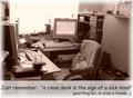
To me the image is actually too clean: the main focal point, the chair and the PC in the back, are too clean and very inviting. Only the left desk looks a little messy, but still not too strong. And that's my main issue: intention and image do not fit as well as they probably could. Also the overexposed window brings too much order in the image.
The soft light and the warm colour choice make it very cosy, even for people (not me :)) who like a tidy desk.
So turning the camera more to the messy parts might have been a better choice.
I do like the way the light is set though: as mentioned, the softness is great and that the window is overexposed is something I like as an compositional element too.

Camera work -technically
Looks good to me: everything is sharp and exposure is good too.

Digital Processing - Technical
Again good work here: especially I like how you brightened up the lower portion for the text. In principle I do like that for the border too, but where the bright areas of the border overlap with the one for the text there is a sharp boundary which is not so good.
I like the font you selected.

Fits the challenge
Yes it does (see above). I only would have skipped the second line: it's not necessary to get the message through.

Good luck for your further submissions
Photographer found comment helpful.
Flowing on a wave of Energy
01/09/2004 07:51:14 AM
Flowing on a wave of Energy
by MadMordegon

Comment by Shannon:
I don't personally care for the sepia tones with this shot..would have liked to seen it in full color. 7
Photographer found comment helpful.
Flowing on a wave of Energy
01/09/2004 06:12:31 AM
Flowing on a wave of Energy
by MadMordegon

Comment by Dave Gordon:
I really like the way you've captured the shape of the wave and the placement of the surfer. I think a tighter crop might have worked better, say about two-thirds of the total.
Photographer found comment helpful.
Flowing on a wave of Energy
01/08/2004 05:36:01 PM
Flowing on a wave of Energy
by MadMordegon

Comment by train:
Nice action But I dont like the sepia tone
The sea is a lovely colour and I think the natural colour would give the image more life. as it is it looks more like a ploughed field with a wave.
Although having said that probably the next comment you get will say it looks great in Sepia Great image though
Photographer found comment helpful.
Pages:   ... ...
Showing 101 - 110 of ~160


Home - Challenges - Community - League - Photos - Cameras - Lenses - Learn - Help - Terms of Use - Privacy - Top ^
DPChallenge, and website content and design, Copyright © 2001-2025 Challenging Technologies, LLC.
All digital photo copyrights belong to the photographers and may not be used without permission.
Current Server Time: 04/08/2025 06:14:44 PM EDT.