| Image |
Comment |
| 08/18/2002 07:10:00 PM |
|
| 08/16/2002 07:44:00 PM |
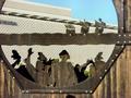
The new settlersby gja2600Comment by HBunch: I see what you are trying to get at. However, These were the new settlers in 1492 (I think that's right). Which would technically make them very very old settlers. WE would be the new settlers. But I think that this does make a great point, that EVERYTHING is new at one point or another. So, setting that aside, Could the photo be centered a little better? I do understand that sometimes, for strange reasons (like maybe there's a huge silly resteraunt ad to the left) that it is better if it's not centered. If that's the case, then we'll just have to deal with it. I do see one too many heads in the photo though, and that is an easy fix, just do a little cropping to the bottom, and ta da! This is a very interesting photo. Was this taken on the east coast somewhere? You captured this nicely, good luck with the challenge. |
| 08/15/2002 12:05:00 PM |
The new settlersby gja2600Comment by PixelatedVisions: Contrast a little too high, and maybe a different background to show the full effect of the intricate cut out design.. if it could be taken at a different angle maybe? Not sure if it was possible. |
| 08/15/2002 11:18:00 AM |
The new settlersby gja2600Comment by Swashbuckler: What was wrong with the old settlers? (pun on your title) The busy, busy background is very distracting, focus is a bit soft around the edges, and you caught yourself in the frame. I like the shadow across the forehead of the man's silhouette, makes it look like he has a hat on. 7 Swash |
| 08/14/2002 07:24:00 AM |
|
| 08/13/2002 10:48:00 AM |
|
| 08/13/2002 09:04:00 AM |
|
| 08/12/2002 05:08:00 PM |
|
| 08/12/2002 03:52:00 PM |
The new settlersby gja2600Comment by HillWalk: This picture would be better if it didn't have such a mixed background. Perhaps if you tilted it so the sky would be the background. |
| 08/12/2002 02:13:00 PM |
The new settlersby gja2600Comment by alanfreed: Subject seems a little out of focus, and tyhe background is a little distracting. Might have been better with the ships against a plain sky, a little closer up? |
Home -
Challenges -
Community -
League -
Photos -
Cameras -
Lenses -
Learn -
Help -
Terms of Use -
Privacy -
Top ^
DPChallenge, and website content and design, Copyright © 2001-2025 Challenging Technologies, LLC.
All digital photo copyrights belong to the photographers and may not be used without permission.
Current Server Time: 04/09/2025 02:11:32 PM EDT.