| Image |
Comment |
| 11/03/2004 11:03:26 AM |
|
 Photographer found comment helpful. Photographer found comment helpful. |
| 11/03/2004 08:40:15 AM |
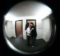
A Girl's Dilemmaby KatspetkatComment by MrYu: This looks a little over-photoshopped... on the face especially. plus a flash right between the eyes... all negative factors with me. But a nice illustration of the challenge. 6. Edit: lowering to 4. This time i am using the full scale, instead of my usual 5-10. Also, i didn't mention a whole lot of blown highlights on the labels and caps. |
| 11/03/2004 07:35:58 AM |
A Girl's Dilemmaby KatspetkatComment by Imagineer: Challenge link: medium, but more like 'Choices'.
Image critique: Not very appealing I'm afraid. Composition is OK, but lighting is flat (face-on flash), burns out the highlights and the shot suffers from sever sharpening and/or compression artifacts.
Out of challenge interest: none. |
| Photographer found comment helpful. |
| 11/03/2004 05:25:49 AM |
|
| Photographer found comment helpful. |
| 11/03/2004 05:25:07 AM |
A Girl's Dilemmaby KatspetkatComment by BigSmiles: I dont like what you've done with her eyes... It's just a bit too much. The quality of this picture is off somehow I can't put my finger on it. |
| Photographer found comment helpful. |
| 11/01/2004 08:56:13 PM |
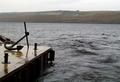
Longing for a Holdby KatspetkatComment by PerezDesignGroup: First things first. Your horizon is not level. A leveled horizon helps "solidify" the pic. Next is the issue of composition. You have an extremely busy left side and a plain right side. Sometimes you can pull this off with strong negative space but I don't feel it works too well in this one because the negative space is very busy, or rather, choppy. I really like what's going on at the pier. I wish I could see more detail on the wet dock, etc. Focus and exposure are good. 5. |
| Photographer found comment helpful. |
| 11/01/2004 05:59:20 AM |
Longing for a Holdby KatspetkatComment by nothingmuch: In my opinion the most impressive part of the image is pushed aside... If the anchor were bigger, and more centered, and shot from an angle where some of it extends into the sky so that the eye can catch the contrast of the metal against the pier, as well as against the sky and find a shape immediately, this short would have been much more focused.
It bothers me that the anchor ends on the shoreline, but not exactly, and I also do not see the reason for so much of the water - being cut off on the other side it does not convey a great depth, it is neither stormy nor calm, and it's color and texture is very much the same throughout the whole picture.
The rocks on the left also seem to me like they would complement the anchor just as well, if not better than the water.
Moreover, the details of the pier, like the little rocks, and the way the wood is cut, and all that is sort of dampenned because of the size of the subject. |
| Photographer found comment helpful. |
| 04/26/2004 03:05:06 PM |
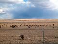
The Herdby KatspetkatComment by egillibsen: I like this one alot, rain in the distant but still sunny colours. If you would have moved just a litle closer and cut the fence out if would have been even better ;-) |
| Photographer found comment helpful. |
| 04/18/2004 10:28:12 PM |
|
| Photographer found comment helpful. |
| 04/18/2004 06:24:06 PM |
|
| Photographer found comment helpful. |
Home -
Challenges -
Community -
League -
Photos -
Cameras -
Lenses -
Learn -
Help -
Terms of Use -
Privacy -
Top ^
DPChallenge, and website content and design, Copyright © 2001-2025 Challenging Technologies, LLC.
All digital photo copyrights belong to the photographers and may not be used without permission.
Current Server Time: 04/07/2025 11:47:24 AM EDT.