| Image |
Comment |
| 05/02/2004 04:42:45 PM |
|
| 05/02/2004 07:45:13 AM |
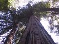
Redwoodby axsdenyComment by alanbataar: It seems a little flat -- perhaps some more density in the mid-range (in photoshop/levels/ slide the middle -- gray -- slider to the right) would dramatically improve the shot. Also, since the sky is almost totally blown out, re-shooting with less exposure would be appropriate as well. |
| 04/30/2004 11:00:18 PM |
|
| 04/28/2004 05:40:07 PM |
Redwoodby axsdenyComment by t_online: redwoods are actually a good choice, but the pictures needs something in proportion to the tree ... e.g. somebody standing next to it? |
| 04/28/2004 03:14:00 PM |
Redwoodby axsdenyComment by autool: Composition: Subject Placement, Cropping, Background 8
Technical: Focus, Exposure, Lighting, Processing 8
Appeal: Is it Interesting, Motivating, Etc.? 5
How well does it meet the challenge: 7
Total Averaged Rating 7 Dick
|
| 04/28/2004 12:38:17 PM |
Redwoodby axsdenyComment by melismatica: It illustrates proportion but I don't really like the shot. Perhaps if you had moved around to the other side, placing the sun over your shoulder instead of behind the tree? There is that large expanse of overexposed sky that just detracts too much from the subject. A vertical composition probably would have worked much better. You could have cut out all the distractions to the right and left and the vertical image plane would have naturally led the eye upward. My eye keeps wandering off to that other tree and to that hot spot instead of focusing on the central tree. |
| 04/27/2004 10:46:56 PM |
|
Home -
Challenges -
Community -
League -
Photos -
Cameras -
Lenses -
Learn -
Help -
Terms of Use -
Privacy -
Top ^
DPChallenge, and website content and design, Copyright © 2001-2025 Challenging Technologies, LLC.
All digital photo copyrights belong to the photographers and may not be used without permission.
Current Server Time: 04/08/2025 03:07:43 PM EDT.