DPChallenge: A Digital Photography Contest You are not logged in. (log in or register
 
Browse Settings
Currently viewing:
Registered Uservisitor

Show comments:

Per page:

Order:

Comments:


Comments Received by visitor
Pages:  
Showing 11 - 20 of ~65
Image Comment
Trapped
02/23/2004 08:58:48 PM
Trapped
by visitor

Comment by lganchero:
looks so refreshing to me... don't know why...
Photographer found comment helpful.
Trapped
02/23/2004 03:20:09 AM
Trapped
by visitor

Comment by jonpink:
not my cup of tea sorry. Looks over sharpened.
Photographer found comment helpful.
Trapped
02/20/2004 08:50:58 AM
Trapped
by visitor

Comment by e301:
Pretty - might have been even more effective without those foreground drops - on the less is more proposition. Don't get a strong sense of texture from it, but its a good image nevertheless.
Photographer found comment helpful.
Trapped
02/19/2004 02:23:51 AM
Trapped
by visitor

Comment by TampaDan:
Interesting shot. The out-of-foocus drop in the lower left detracts, I think.
Photographer found comment helpful.
Trapped
02/18/2004 04:08:14 PM
Trapped
by visitor

Comment by arbil14:
good composition...
Photographer found comment helpful.
Trapped
02/18/2004 06:27:48 AM
Trapped
by visitor

Comment by jpochard:
I think this would have been stronger cropped to isolate that water drop. Okay for texture.
Photographer found comment helpful.
Trapped
02/18/2004 12:20:10 AM
Trapped
by visitor

Comment by tkalect:
Nice macro!
Photographer found comment helpful.
Trapped
02/17/2004 11:46:38 PM
Trapped
by visitor

Comment by KING:
[World Record Attempt]
+ There are textures visible. I like the natural colours and the small spot in the bubble has its appeal in some strange kind of way.
- Photo could use more DOF (this is especially noticable on the bubble in front).
Photographer found comment helpful.
Romancing the stone?
11/07/2003 10:21:06 AM
Romancing the stone?
by visitor

Comment by ScottK:
Hi Visitor. Here are some quick thoughts:

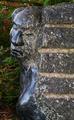
As an entry in the Grace challenge, this is an OK subject. I can see it fitting in the graceful lines of the sculpture. But those lines don't stand out very well, and aren't the most striking features in your shot, so that hurts it somewhat as a challenge entry.

Two things stand out as problematic with this shot: composition and light. The angle is pretty square from the side. That might have worked OK, but I think would have been help by including less of the brick wall and/or more negative space to the left. The negative space would have helped accent the lines of the statue over the bold roughness of the bricks. Granted, I can see that the problem with doing that probably would have been the backgroud - it may detract from the effect and in fact minimize the statue even more. So, perhaps a different angle, more straight on to the statue (from the left of this view), still including the brick, but making it less central, would have helped. Of course, without being able to be there and see myself, I can only guess.

Lighting caused a couple of problems for you. It looks like the whole scene was more or less in shadow, so you lost a lot of tonal range right off the top. And because you have a dark wall, with a dark statue, in front of a dark background, nothing really pops to the forefront. If you could have gotten the picture at a time of day when the sun was on the wall and/or statue, but the bushes were still shaded or shadowy, I think you would have gotten the best effect - a dark background, with a well-lit subject. Then add in that the statue is a bit glossy, if you could have dealt with any reflections, the statue would have shined a bit, but the wall would probably still be a bit dark since it's rough, and the contrasts might have really come out then.

I know a lot of these possibilities may be unrealistic - the background is what it is, and the sun may never be in a really good location reletive to this scene. But those are the things that come to my mind as ways to maybe improve the results. Hope this helps. :)

Scott.
Photographer found comment helpful.
Romancing the stone?
11/05/2003 02:49:38 PM
Romancing the stone?
by visitor

Comment by Firstrich1:
Hey Vistor:)

I did not vote this challenge but would have given this a 6. that you took a picture of a sculpture may not have helped. I read a thread where some folks questioned if ok to take pictures of some one elses work...just a thought. The composition of the image is on the dark side over all, not lending itself to standing out. The next issue I see is the face is taking my eyes to the left side and then out of the frame, I would have tried to have had more space in front of and to the right of the sculpture..this being done by fliping the image (DPC legal I believe) or taking the shot from another angle. On the monitor I'am Using here at work the Sculpture fades into the background at the bottom where it becomes difficult to determine where the two meet. I do think it does say grace just not with the impact one would hope for. I entered the tool challenge awhile back and had only three comments. I think I just did not have the most interesting shot and the folks that judged it felt the same...techincal was good but just no POW! anyway my thoughts. Hope I helped

Good luck in the future.

Richard
Photographer found comment helpful.
Pages:  
Showing 11 - 20 of ~65


Home - Challenges - Community - League - Photos - Cameras - Lenses - Learn - Help - Terms of Use - Privacy - Top ^
DPChallenge, and website content and design, Copyright © 2001-2025 Challenging Technologies, LLC.
All digital photo copyrights belong to the photographers and may not be used without permission.
Current Server Time: 04/07/2025 11:36:21 AM EDT.