untitledby
kateasanovComment by fotomann_forever: ::: Greetings from Critique Club :::
Hi, as requested, here is an indepth critique of your submission.
First Impression - the most important one:
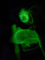
Interesting image, but not sure green is the best color for it.
Composition:
The crop could stand to be a bit tighter, but the composition is not bad for a portrait type image.
Subject:
Well defined, we definitely see the subject.
Technical (Color, focus, and light):
Color: as I stated in first impression, green may not have been the best color for this image. Green on people, just gives the impression of sickliness.
Focus: Decently sharp. A bit more Unsharp Mask may have helped some.
Light: The important parts of the image are lit, but the lighting becomes a bit flat in the face.
To grow its vote?:
Overall, it was a tough competition and a 5.3 is a respectable score. I still have to stick with not using green on people though :-)
Summary:
You do some good work, looking at your profile.
Hope to see more from you soon,
Leroy