|
|
| Image |
Comment |
| 01/13/2010 02:49:10 PM | |  Photographer found comment helpful. Photographer found comment helpful. |
| 01/11/2010 03:01:29 PM | | | Photographer found comment helpful. |
| 01/10/2010 09:41:20 PM | | | Photographer found comment helpful. |
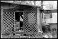
| 12/31/2009 06:22:15 PM | Watch Your Stepby picklenoseComment by JacksonGariety: Here's your Critique from the critique club, as requested! =D
Very interesting photo. I love the rustic metal in the upper-right, the broken window, the log coming down in the shed visible through the door. TO keep these interesting elements the focus of the image, try not to let the sky get blown out above, that's a bit distracting to me and make sure your shot is in-focus when you take the photo. In an editing program such as Photoshop, you might want to try coping down a bit from the top or in from the left to leave out any un-needed image area to help put the focus on the shed, and sharpen with Un-Sharp mask (USM). A little sharpening would help bring out detail in the wood and metal and try getting in closer with your camera to really bring out the dilapidated elements of this scene. Overall the area has lots of potential, so don't give up trying to photograph it. I love the criss-cross of the wooden mesh and how it's falling apart. The image is a bit busy with branches and leaves, but my eye is directed mainly towards the door of the shed, where the open window is blowing through. The contrast there is very appealing and maybe changing your angle so you could see more of the might have raised your score. I'd love to see more detail on the inside and outside of the shed itself, to draw my attention away from the clutter around it. I personally don't think the B&W adds anything to the photo either, and actually detracts from the images detail. What I would have personally done would be to maybe get in closer and present how rustic and dilapidated your subject is at a different and and shorter proximity. The best photos communicate what the subject is very well, The sharper this image is, the more color it has, the more detail it has, and the more you can bring the viewers attention to the shack itself, the better your outcome will be. Try going out again and photographing the inside of the shed with higher contrast, and make dead sure you and the viewer will both know what you're trying to communicate and how run-down this shed is. Hope that helped, and I'd love to see your outtakes and if you decide to go back there, message me. :)
- [user]Coleman Gariety[/user]
The Critique Club |
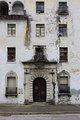
| 12/22/2009 07:51:05 PM | MENby picklenoseComment by ericwoo: Hey there from the Critique Club
My thoughts on the image: I tend to agree with most of your commenters here in that this is a fairly uninteresting composition. The centered yet awkwardly tilted building leaves me with an feeling that this was more of a snapshot that an intentionally composed image. I do find that the building appears to hold a great deal of interest, and I think the composition possibilities here are near limitless.
My ideas for improvement: Put more time into the initial composition of the capture. I am not sure if tighter or wider would be better with this one, but I'd like to see combinations of both. While I am no stickler for the 'rules' of photography, this particular structure presents with far to many possibilities to be closed in with a centered composition. I'd also like to see more contrast to the overall image. Perhaps shooting this one at a different time of day would have presented you with some great shadows and more highlights that the flatness that this particular lighting yielded.
Where I would have/did score this entry: I did vote in this challenge, and you pulled a 5 from me. I do think that it meets the challenge perfectly, but with some better execution and composition, this vote would surely have grown.
Thank you for the opportunity to provide a critique on your entry,
Eric
|
| 12/21/2009 07:09:34 PM | Watch Your Stepby picklenoseComment by geinafets: The curtains in the window make me think someone might still live here...
BnW is pretty tricky. I'm not sure this image has enough balance between black, gray, and white to pull it off better than it would in color. There is a lot of gray, and it is all a pretty uniform tone of gray too.
A vignette/dodging and burning would have helped tell the viewer which part of the image you want us to pay attention to. A shallower depth of field would have helped with that too. Since your title is "Watch Your Step," it makes me think you want the view to focus on the cinder block on the ground. Maybe get down to their level, use a shallow depth of field to focus on them, and put the out-of-focus cinder block door step and part of the door frame in the background. | | Photographer found comment helpful. |
| 12/21/2009 12:39:04 PM | Watch Your Stepby picklenoseComment by kaiser_chief: The composition of this is a little messy, nothing really grabs the eye as the subject..........The B&W does not really work for me here....and the crop is very tight | | Photographer found comment helpful. |
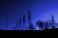
| 12/20/2009 04:10:20 PM | Tethered Titansby picklenoseComment by jasonlprice: Greetings from the Critique Club
Let me start off by saying that I really like the deeply saturated blues and I think you accomplished your goal in post processing very well. I know with a subject like "powerlines" it is difficult to tell a story, so I think a successful approach to this challenge would be to go "graphic". In other words, forget about a story and concentrate on the beautiful shapes and lines, even to the point of abstractness. Your photo seems to be a "tweener", or part graphic abstract and part story telling. I suppose in certain situations that could be a good thing, but I think it hurt your photo in this case. The story just wasn�t bold enough to grab the attention of voters.
If I were entering this photo, I would have gone to the graphic side preferring a tight crop on the 6 power "poles". That would have created a very strong diagonal and diminishing line with no clutter (good for quick voters). The right side of the photo takes away from the overall balance of the image because of the trees and out of place power pole. The brighter area on the right steals all the attention away from the wonderful shapes and patterns of the 6 poles. I would have also not left so much black on the bottom. I would have left some, but not as much. Take your hand and cover the right 1/3rd of the photo and see if you like it more.
As far as processing and exposure go, I think you did an excellent job. The photo is plenty sharp with all lines being visible and no halos from over sharpening. There is a "crispness" to the photo that is excellent. My only recommendation here would be to watch the banding in the sky. The transition of blues is not as smooth as it could be, perhaps because of what you did to adjust the colors and saturation.
On the story telling side, think about these 3 elements of your story: Main subject, Supporting Elements, and background. For this challenge, the story being told is "Tethered Titans", the main subject is the actual power lines and Titans, the supporting elements are the trees, tall sign post, ground, and small posts and other items. The background is the beautiful blue sky. I think all of the elements of this story are competing with each other rather than being in harmony to support the main subject.
I really enjoyed critiquing your photo and spending some time getting to know it. I have touched on some things that might have helped it score better, but a good score isn�t always what the photographer wants. Thanks for allowing me to post my thoughts.
Jason Price
| | Photographer found comment helpful. |
| 12/19/2009 08:55:25 PM | Watch Your Stepby picklenoseComment by NikonJeb: Potentially a good start, but it's busy with no clear focal point. Definitely run down, but there's also no clear definition of rural.....5 | | Photographer found comment helpful. |
| 12/18/2009 01:04:09 PM | Watch Your Stepby picklenoseComment by MaryO: I didn't know you could bend latticed wood that way! Interesting scene; might benefit from a slight contrast boost. | | Photographer found comment helpful. |
Home -
Challenges -
Community -
League -
Photos -
Cameras -
Lenses -
Learn -
Help -
Terms of Use -
Privacy -
Top ^
DPChallenge, and website content and design, Copyright © 2001-2025 Challenging Technologies, LLC.
All digital photo copyrights belong to the photographers and may not be used without permission.
Current Server Time: 04/07/2025 09:51:00 AM EDT.
|