|
|
| Image |
Comment |
| 03/31/2010 01:19:50 AM | |  Photographer found comment helpful. Photographer found comment helpful. |
| 03/23/2010 12:11:28 PM | | | Photographer found comment helpful. |
| 03/23/2010 05:18:18 AM | | | Photographer found comment helpful. |
| 03/21/2010 02:12:53 PM | | | Photographer found comment helpful. |
| 03/18/2010 01:07:48 AM | | | Photographer found comment helpful. |
| 03/09/2010 06:45:31 PM | | | Photographer found comment helpful. |
| 03/07/2010 08:24:48 PM | | | Photographer found comment helpful. |
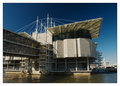
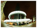
| 03/05/2010 04:09:37 PM | Decomissioned poluter - now landscape Artby duartixComment by JacksonGariety: Here's Your Critique and Feedback as Requested...
Wow, this is interesting! An odd use of fish-eye but I believe it works. First thing that kinda bothers me (a very minor issue) is that the building itself, as interesting as it is, is kind of difficult to make out form the background as it dissipate into the sky. maybe you were trying to go for this, but I would personally prefer it to be a bit sharper, closer to the camera, brighter, and just a tad bit further away from the bottom edge of the photo. Otherwise, your subject is quite eye-catching in its entirety. It would just settle with me a bit more if I could make out the top edge of the building. The soft-focus and coloring is done VERY well here, I would be surprised you didn't get a higher score had the building been more clearly exaggerated here. Second problem I see, and probably just as important as the first, is your work of framing the subject. Your use of fish-eye works because it wraps the building around the top of the image, framing your subject in the center. I would like this photo a million times better had there been a building to the right that framed your subject to the right side as well, the way the shot is composed, it just doesn't sit right with me.
Other then those minor technical details, I love this image, I really wish it had gotten more approval form the DPC voters. Had the building been sharper, more distinct, brighter and further away from the edge, this photo could have gone up to a 5.5 in my book, and with the a second building framing the subject to the right, this could have easily gotten a 6 or even a 7 from me. Congradz!
Please, feel free to message me if you have any questions! :D
-  ColemanGariety ColemanGariety
The DPChallenge Critique Club | | Photographer found comment helpful. |
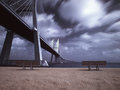
| 03/04/2010 11:45:19 AM | Tagus park gardens on Infraredby duartixComment by Gatorguy: Hi, Critique Club here...
This is a fabulous photograph. The colors are just right, I love the IR, and the curve of the bridge leads the eye right into the picture, although unfortunately stopped by the bench. The dramatic clouds are icing on the cake.
My suggestions: I think the hot spot is really distracting and would probably consider making this a pano crop to get rid of it. I would have liked to see the bridge extending all the way out, maybe just a couple feet to the left to avoid the bench would have done it.
Finally, and a testiment to how nice the photo is, I don't necessarily think this is a good fit for the challenge. I'm actually surprised it recieved the relatively few low votes it did.
If I had voted in this challenge I would have voted either a 5 or a 6, simply because I tend to have a hard line on images meeting challenge descriptions. If this were a free study, or other challenge, and 8 or 9 for the hot spot and the bench.
Of course these are just one person's opinions and are offered for your consideration only. | | Photographer found comment helpful. |
| 03/04/2010 04:38:34 AM | | | Photographer found comment helpful. |
Home -
Challenges -
Community -
League -
Photos -
Cameras -
Lenses -
Learn -
Help -
Terms of Use -
Privacy -
Top ^
DPChallenge, and website content and design, Copyright © 2001-2025 Challenging Technologies, LLC.
All digital photo copyrights belong to the photographers and may not be used without permission.
Current Server Time: 04/07/2025 09:50:24 AM EDT.
|