DPChallenge: A Digital Photography Contest You are not logged in. (log in or register
 
Browse Settings
Currently viewing:
Registered Userburfino

Show comments:

Per page:

Order:

Comments:


Comments Received by burfino
Pages:  
Showing 41 - 50 of ~79
Image Comment
Don't Forget the Little Guy
03/01/2010 10:42:49 AM
Don't Forget the Little Guy
by burfino

Comment by mattlistener:
Dull subject, too much blurry background.
Photographer found comment helpful.
Falling Apart
02/24/2010 03:54:48 PM
Falling Apart
by burfino

Comment by snaffles:
Greetings from the Critique Club!

Very interesting shot, I love the low POV. Like the disintegrating feel very evident here, like that old bucket may just turn to dust and splinters before our eyes.

Technically, I am not crazy about the bottom third or so being oof. You could have cropped out most of it and still managed to convey the sense of depth I can see you trying to capture. I can see some of the tonemapping, so I would suggest it be kept as unobtrusive as possible. You want people to see the photo, not the pp.

Artistically, the tones are good and the simple comp means that there is little to distract from the bucket. I have that lens too and it's useful for such close work.

Overall a very good job, keep shooting and I look forward to critiquing more of your work.

Feel free to PM me with any questions,

Susan
Photographer found comment helpful.
108 Breaths
02/23/2010 04:56:10 PM
108 Breaths
by burfino

Comment by duartix:
Greetings from the Critique Club ;)

Artistic Merit
Pros:
* Interesting take on the theme.
* Good use of contrasting complementary colors.
* Good detail.
Cons:
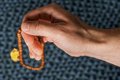
* The crop doens't help. As pointed out in the comments there is too much arm and the beads are too cornered in the frame.
* Not enough subject and too much background.

Technical Merit
Pros:
* Spot on exposure.
Cons:
* The lighting in the hand is a bit uneven.
* Not enough DOF for the subject. Taking in consideration the title the beads should be in focus. Of course you would have extra problems with the background that is already a distraction even though it's blurred. Another choice of background with less texture or placing it at a longer distance might have helped.

Emotional Merit
Pros:
* A good choice of subject. Faith definitely counts these days even though it can't be counted like the beads.
Cons:
* This subject deserved a more determined grip on the hand. This one lacks resolve and more character, probably becasue it belongs to someone young. Hands alone work better if old and gritted beeing much easily associated with faith.

Result
You managed to get a middle of the pack score which wasn't too bad on a challenge where there was some strong pictures and some very good ones even though a bit shoehorned (check #2 or #3). I guess your idea really score the points but the technical aspects let the photo down.

I see this is one of your best results so far which is quite nice as it's always exciting to have your top photos beeing replaced by better ones.
Keep them coming you'll get better with every challenge.

All the best
Duarte Bruno
Photographer found comment helpful.
Falling Apart
02/19/2010 09:16:00 AM
Falling Apart
by burfino

Comment by Luci11e:
Great job! I like the tones and the composition; the subject is very interesting; a photo that I could easily see hanging in someone's home.
Photographer found comment helpful.
Falling Apart
02/17/2010 11:11:25 PM
Falling Apart
by burfino

Comment by AlinNZ:
Nice effect
Photographer found comment helpful.
Falling Apart
02/17/2010 07:03:24 AM
Falling Apart
by burfino

Comment by duartix:
Beautiful tones.
My only 10*.
Faved.
Photographer found comment helpful.
Falling Apart
02/17/2010 04:45:54 AM
Falling Apart
by burfino

Comment by ragamuffingirl:
I would have cropped this a little differently - more off the bottom.
Photographer found comment helpful.
Falling Apart
02/16/2010 11:28:27 PM
Falling Apart
by burfino

Comment by Abra:
On my computer your photo subject first appeared a little too centred. But then I scrolled down and realised there was more to see. Then I scrolled even further and now feel there is a fraction too much foreground for me. I still like the photo, especially the tones.
Photographer found comment helpful.
108 Breaths
02/16/2010 11:07:52 AM
108 Breaths
by burfino

Comment by paynekj:
I wonder if you could have put more of the focus on the beads rather than the hand. Good idea though.
Photographer found comment helpful.
Leaning Shed on Steaming Winter Pond
02/14/2010 05:24:10 PM
Leaning Shed on Steaming Winter Pond
by burfino

Comment by Melethia:
Greetings from the Critique Club!

I quite liked this when voting - the mist coming off the water implies a chill in the air. And though there is snow on the ground as well, this may be a bit too subtle (believe it or not) for the "in your face" voters. It's a quiet "cold". I like the gentle results you got from the tonemapping - really supplements the soft feel of the mist well. And THAT said, there are those that aren't fond of tonemapping/HDR. If you like it and you like the way it makes your picture look, then do what you wish. You handled it nicely here in my opinion.

Composition is pretty strong - nice lines and good "rule of thirds" with the land versus water ratio. Perhaps a bit busy, but it tells a good story with what you've included.

Can't say I agree with the score - I'd have placed it higher - but more important is whether you are pleased with the shot, and I would hope you are.
Photographer found comment helpful.
Pages:  
Showing 41 - 50 of ~79


Home - Challenges - Community - League - Photos - Cameras - Lenses - Learn - Help - Terms of Use - Privacy - Top ^
DPChallenge, and website content and design, Copyright © 2001-2025 Challenging Technologies, LLC.
All digital photo copyrights belong to the photographers and may not be used without permission.
Current Server Time: 04/07/2025 09:50:18 AM EDT.