|
|
| Image |
Comment |
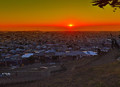
| 11/24/2015 02:07:33 PM | Sunset in SFby tigerluongComment by Lydia: Greetings from the Critique Club!
This is a lovely scene, Frank!
I love how you've composed this and included that loving couple to give it a "story".
The sun being about on the "Thirds" makes this extra pleasing.
I find myself wishing that third person weren't interrupting "my couple"... I've already bought into them as mine when he arrives... Perhaps if you'd waited until he's passed by?
There is a great amount of noise/breakdown in the image... and some really odd yellow coloring around the limbs upper right that I think lowered the scores from the voters. And I agree with giantmike that the saturation is a bit higher than I would expect the colors to be naturally.
Thanks for entering this... I hope you'll continue, Frank.
It's good to have you here at DPC!
|
| 11/02/2015 04:47:28 AM | |
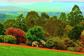
| 09/23/2015 05:43:56 AM | Olinda park in springby tigerluongComment by sidpixel: *Hello from Sid and the Critique club*
A landscape that contributes little to the open challenge.
You probably felt the scene you had in front of you, colourful and appealing as it was, needed a little help in post processing, however, I feel you need to be made aware that the end result has not worked at all. If, as I suspect, you are relatively new to post processing the temptation is to tweak and then tweak and then tweak some more but you quickly reach a point where it becomes detrimental to the end result, as you have here. Your goal should always be to get the best possible image in camera and if necessary to enhance the quality to extract the very best quality in the end result this requires very subtle processing where less is most definitely more.
The colours are way over saturated, there is probably little resemblance to the original. The image is very heavily pixelated suggesting that the submitted jpeg has been too heavily compressed, there are large swathes of the background that lack any detail, the path in the foreground lacks any detail. If you look carefully you will see sudden transitions from blue to green and these areas form blocks of a single colour, all part of the jpeg compression technique.
All of this is a very tough way for you to learn but, to be honest, the image's quality, or rather lack of, is reflected in the voters perceptions too. Sorry to be so negative but I feel I owe it to you to help you improve. Thanks for your submission, Sid |  Photographer found comment helpful. Photographer found comment helpful. |
| 08/31/2015 08:15:31 AM | City after rainby tigerluongComment by sidpixel: *Hello from Sid and the Critique Club*
A flawed cityscape that makes a mediocre contribution to the open challenge.
The first thing that hits me with your image is that it is tilted and it is tilted to an extent that is evident as a fault rather than a deliberate exaggerated enhancement. If you wanted to use the technique you would use a much more obvious slant that introduces a nother element to the image. The title is also ill-fitted unless we are to believe that all the water we see here is a result of phenomenally heavy rain fall!
The sky is not adding a lot to the image and would benefit from cropping but there are also artefacts throughout particularly noticeable around the buildings. I think more emphasis on the foreground as opposed to the sky would have been better. The reds prove what a dominant colour it is in this near monotones the reds are all very strong and vibrant, I am assuming you didn't saturate the reds specifically?
I think a little more attention to important detail would have helped you here, good luck with your future entries. Apologies for the late critique, but as they say, better late than never, Sid | | Photographer found comment helpful. |
| 08/24/2015 02:48:10 AM | It is meal timeby tigerluongComment by sidpixel: *Hello from Sid and the Critique Club*
An appealing nature study that meets the open challenge.
Having commented and voted highly I get another opportunity to comment in more detail about your entry! I still like the subject and the way you have captured them but with closer inspection there are also aspects of the processing that I am not so keen on.
I assume you have used flash here which has blown highlights on the edge of the birds beaks and detail on the adult bird. Although you have used a low ISO there appears to be significant noise which is most unexpected it is probably a result of processing which has left quite an unnatural look.
I repeat I do like the subject, given your technical details your camera must have been very closely positioned to them assumedly triggered remotely? I'm sorry you didn't do better with this image but I have to say I think the processing let it down in the end. Thanks for your entry and good luck with your future entries, Sid | | Photographer found comment helpful. |
| 08/20/2015 10:07:32 AM | Sunset in Tanzaniaby tigerluongComment by sidpixel: *Hello from Sid and the Critique Club*
A very appealing sunset assumed to meet the challenge.
What a grab shot! In itself it is a very appealing shot of a lovely location in a good composition. I like both the left and right of the image and the position of the sun.
Like your commenter I have a problem with the sudden transitions they feel unnatural to the overall detriment of the image. You would undoubtedly have had little detail in the shadows and to get it back it looks as though you have pushed the curves beyond normal limits. I am having problems reconciling the feint red trees I am seeing between the silhouetted trees on the right, this may be down to selection problems.
Is that really the colour of the sky? You are in a part of the world I have never experienced and this may well be the case but those, like me, who haven't seen skies of such intensity are bound to ask the same question and unfortunately it may well affect their reaction to it, lovely as it is.
Thank you for submitting an appealing image, Sid | | Photographer found comment helpful. |
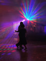
| 08/13/2015 09:02:07 AM | Dancing nightby tigerluongComment by sidpixel: *Hello from Sid and the Critique Club*
An interesting shot in difficult lighting.
I like the intimate moment you have captured that conveys a lovely warm and inviting atmosphere where the people are all enjoying themselves. I'm not sure if the people in the background add that much but they are sufficiently out of focus for it not to be an issue.
Although the exposure is generally dark I think you have done the right thing to anonymise the couple through silhouettes but capture the bright colours of the lighting. Your composition is generally good in terms of the lighting itself but it has made the couple a little too central for my liking. Perhaps if the radiating light in the background had been moved a little higher and further right it might have improved the overall composition. The light pattern on the floor is essential and works well. Your focus on the couple is good too.
I like your image and feel that it was undervalued here, anyway, good luck with your future entries, Sid. | | Photographer found comment helpful. |
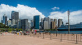
| 07/21/2015 07:20:43 AM | Sunny Harbour by tigerluongComment by sidpixel: *Hello from Sid and the Critique Club*
The lovely blue sky and white clouds adds an appealing backdrop to a rather ordinary snapshot.
Hope you had an enjoyable holiday in Sydney, I've never had the pleasure myself so I am unfamiliar with the area. Looking at your image I have several issues which stop me from appreciating it as much as you would probably like me to so I will try to address them in a constructive way that I hope you will feel of benefit to you.
First of all I do not have a strong focal point so my eyes are wandering randomly over the image trying to settle on something. The foreground is dominated by the empty paved area, in the distance there are red and yellow traffic features whose colours dominate, I am then confronted with a fence that is also acting as a barrier to me getting to the relatively more interesting parts of the image. When I get past that I have a telegraph pole that splits a huge boat in two that in itself has also had its stern chopped off.
Just looking at the space we have here I would have moved probably right to the waters edge so that I could remove all these unwanted distractions. I don't think I can use the telegraph pole as an interesting feature so I would have positioned myself to the left of it. I think there is potential to contrast the boat on the right of my frame with the skyscrapers simply due to its sheer size. I probably could only capture the front half but that has enough repetition of the windows to form a counterpoint to the windows of the buildings. So, I now have the front half of the boat on my right the harbour waters leading me into the buildings in the background, I think this would have made a much more interesting image.
This was probably just a holiday snap taken while enjoying everything your location has to offer but it is no excuse not to carefully weigh up all the options in front of you and then carefully check all the detail in your viewfinder before committing to the image. Although each digital image is effectively free of cost you should regard it as if you are using film and take your time to make every single image special, the more you do this the more you will learn and the more you will get out of your photography. Keep at it, Sid | | Photographer found comment helpful. |
| 05/07/2015 05:33:26 PM | |
| 05/01/2015 05:14:51 AM | |
Home -
Challenges -
Community -
League -
Photos -
Cameras -
Lenses -
Learn -
Help -
Terms of Use -
Privacy -
Top ^
DPChallenge, and website content and design, Copyright © 2001-2025 Challenging Technologies, LLC.
All digital photo copyrights belong to the photographers and may not be used without permission.
Current Server Time: 04/07/2025 09:49:34 AM EDT.
|