DPChallenge: A Digital Photography Contest You are not logged in. (log in or register
 
Browse Settings
Currently viewing:
Registered Userskybelow

Show comments:

Per page:

Order:

Comments:


Comments Received by skybelow
Pages:  
Showing 11 - 20 of ~27
Image Comment
Final Goodbye
02/11/2004 11:14:06 PM
Final Goodbye
by skybelow

Comment by krympegass:
I like this ! coll effect with the reflection in the doorknob.
Final Goodbye
02/11/2004 07:02:50 PM
Final Goodbye
by skybelow

Comment by JPR:
Very nice. Finally a good use of this technique!
Final Goodbye
02/11/2004 01:13:49 PM
Final Goodbye
by skybelow

Comment by JoelHSmith:
Fantastic.
Final Goodbye
02/11/2004 08:06:20 AM
Final Goodbye
by skybelow

Comment by BrennanOB:
Vey clever invertion, the hand looks like a positive with underlighting, making the doorknob look very ominous indeed. Nice crop and drama .
Final Goodbye
02/11/2004 06:43:03 AM
Final Goodbye
by skybelow

Comment by jmsetzler:
This is nice work. It's one of the better 'negative' images I have seen here.
Final Goodbye
02/11/2004 12:30:59 AM
Final Goodbye
by skybelow

Comment by Amor_E_Morte:
nice reflection on the doorknob.
Final Goodbye
02/10/2004 10:13:03 PM
Final Goodbye
by skybelow

Comment by candie:
beautiful detail
Final Goodbye
02/10/2004 09:40:13 PM
Final Goodbye
by skybelow

Comment by jsmiley:
looks like a crystal ball. nice one
Final Goodbye
02/10/2004 07:29:26 PM
Final Goodbye
by skybelow

Comment by labuds:
nice negative... a bit too negative though
rested noise
11/17/2003 09:44:16 PM
rested noise
by skybelow

Comment by Quadrajet:
Greetings from the critique club.

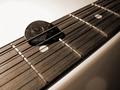
The first thing I noticed when I saw your photo (during the voting) was the composition. I’m a fan of diagonals and the angle you’ve chosen for this image is great. I especially like the placement of the pick. How it’s just above horizontal center and to the left of vertical center. I feel it adds a sense of stability to the strong diagonal lines.

I feel that the choice of sepia tone works well in this instance. I feel that a color version of this shot would have taken away from the simple lines and composition.

The light is coming from an interesting angle, in that it casts some wonderful shadows from the strings and the light glinting off lines on the pick really emphasize the texture.

I like the depth of field you’ve chosen. Not so shallow that it completely obscures the strings in the background, but just enough to give the shot some depth.

The following is strictly my opinion. In a controlled, digital studio shot such as this one, lens flare should be non-existent. The photographer has the ability to position the light anywhere he/she wants it and then review the image to see if there are any anomalies. In the lower right hand corner you have (what appears to be) some lens flare. If you weren’t using one already, a lens hood may have helped reduce the chance of lens flare in this shot. One other thing I noticed is a bit of digital noise in the lower right hand corner, which is a bit distracting, but not anything too major.

I hope this helps,
Quadrajet


Pages:  
Showing 11 - 20 of ~27


Home - Challenges - Community - League - Photos - Cameras - Lenses - Learn - Help - Terms of Use - Privacy - Top ^
DPChallenge, and website content and design, Copyright © 2001-2025 Challenging Technologies, LLC.
All digital photo copyrights belong to the photographers and may not be used without permission.
Current Server Time: 04/17/2025 09:52:27 AM EDT.