| Image |
Comment |
| 10/10/2010 01:53:50 PM |
|
| 10/08/2010 07:53:20 AM |
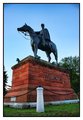
The Dukeby lucky_85Comment by giantmike: Good low perspective to make it look like the monument is even taller than it is. Nice job keeping any distracting elements out of the background. |
| 10/06/2010 12:28:59 PM |
The Dukeby lucky_85Comment by kaiser_chief: The colour through this is great. The reds through the bricks against the blue does contrast well, and the statue does stand out well against the sky.........The angle does ensure that his name is also a main part of the image, which helps us identify him, rather than it being just another horse statue.
Colour noise though is apparent in the upper area of the image which needs some attention. The image is very centered and the crop is pretty tight.
But a good image and amoung the better entries I have seen. |
| 10/03/2010 01:21:32 PM |
White sandsby lucky_85Comment by giantmike: Interesting choice for this challenge. This looks like it would be such beautiful photo in normal view, but as negative, it loses its oomph. |
| 10/01/2010 03:29:58 PM |
|
| 10/01/2010 04:25:00 AM |
White sandsby lucky_85Comment by Silent-Shooter: Would it have been better with a tighter crop on the left so you didnt cut the chair in half? The sky looks really good but maybe not enough sand is shown given your title |
| 09/29/2010 11:39:00 PM |
|
| 09/21/2010 12:58:13 PM |
|
| 09/21/2010 12:21:34 PM |
|
| 09/20/2010 03:31:40 AM |
|
Home -
Challenges -
Community -
League -
Photos -
Cameras -
Lenses -
Learn -
Help -
Terms of Use -
Privacy -
Top ^
DPChallenge, and website content and design, Copyright © 2001-2025 Challenging Technologies, LLC.
All digital photo copyrights belong to the photographers and may not be used without permission.
Current Server Time: 04/07/2025 09:51:10 AM EDT.