| Image |
Comment |
| 09/17/2009 07:58:00 AM |
|
| 09/16/2009 06:36:03 PM |
Timeby ShaylaComment by vikas: Meets the challenge : 3/3
Execution : 0/2 - Its not sharp enough, crop doesn't work, missing hands and black background are distracting!
Originality : 0/2 - Quite a few clock shots in the challenge
and everything else : 0/3
total : 3/10 |
| 09/16/2009 06:24:30 AM |
Timeby ShaylaComment by fitz3000: flash is fired which makes this photo not so looking good, plus the size of the photo is very small |
| 09/16/2009 01:17:53 AM |
Timeby ShaylaComment by ericwoo: Always, always, always use the full resolution and image size that DPC allows in any given challenge. 640 px is very small on most monitors by today's standards. Yours is just over half of the allowed resolution. Also, the hot spot there by the 9 is distracting. 1. |
| 09/15/2009 01:10:49 PM |
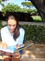
Oh Noby ShaylaComment by Lydia: I think the lighting/positioning of the girl (perhaps to her left into the shade?) could be better to get rid of the blown out spots and the odd shadows making her nose look exceptionally large. Good idea for topic, though. (not voting) |
| 09/15/2009 11:20:20 AM |
Oh Noby ShaylaComment by thilom: I felt there wasn't enough detail in the subject of the photo. |
| 09/13/2009 06:03:14 PM |
Oh Noby ShaylaComment by kandykarml: I think if you shot this in the early evening then you wouldn't have gotten all of the blown out highlights on the left side of her shirt.. it's a big distraction. and, maybe try cropping it with out cutting off the book she's reading. |
| 09/12/2009 10:51:04 AM |
Oh Noby ShaylaComment by fitz3000: I think the place where your subject is shot is not well chosen, too many trees and green stuff, it's really distracting |
| 09/11/2009 01:30:13 PM |
Oh Noby ShaylaComment by fldave: Lighting is a bit harsh and this is an awkward crop. I like the idea, though. |
| 09/11/2009 11:57:39 AM |
Oh Noby ShaylaComment by ineedauniquename: nic idea, the lighting doesn't quite work. If it were my photo I'd try editing using curves. The white shirt is challenging from an exposure point of view unless you make a feature of it. |
Home -
Challenges -
Community -
League -
Photos -
Cameras -
Lenses -
Learn -
Help -
Terms of Use -
Privacy -
Top ^
DPChallenge, and website content and design, Copyright © 2001-2025 Challenging Technologies, LLC.
All digital photo copyrights belong to the photographers and may not be used without permission.
Current Server Time: 04/18/2025 01:58:23 AM EDT.