DPChallenge: A Digital Photography Contest You are not logged in. (log in or register
 
Browse Settings
Currently viewing:
Registered UserJrP

Show comments:

Per page:

Order:

Comments:


Comments Received by JrP
Pages:  
Showing 11 - 20 of ~39
Image Comment
Cinti Union Terminal
06/23/2021 01:59:53 PM
Cinti Union Terminal2nd Place
by JrP

Comment by LevT:
Congrats on your first ribbon Jacquie! Nicely framed!
Photographer found comment helpful.
Cinti Union Terminal
06/23/2021 05:34:30 AM
Cinti Union Terminal2nd Place
by JrP

Comment by nam:
Very neat place. Congratulations on 2nd place.
Photographer found comment helpful.
Cinti Union Terminal
06/23/2021 01:38:56 AM
Cinti Union Terminal2nd Place
by JrP

Comment by Agricio:
Wonderful!
Photographer found comment helpful.
Cinti Union Terminal
06/22/2021 09:05:10 AM
Cinti Union Terminal2nd Place
by JrP

Comment by spencelg:
In my top three.
Photographer found comment helpful.
Cinti Union Terminal
06/17/2021 01:16:51 PM
Cinti Union Terminal2nd Place
by JrP

Comment by PennyStreet:
Awesome capture.. great color!
Photographer found comment helpful.
Three Blooms
06/09/2021 04:42:47 AM
Three Blooms
by JrP

Comment by jomari:
This is really lovely. I was your 10.
Photographer found comment helpful.
Three Blooms
06/08/2021 07:46:31 PM
Three Blooms
by JrP

Comment by tnun:
lovely. can it really be this beautiful? and which Magnolia stellata is this?
Photographer found comment helpful.
Celebrate Boldly
11/12/2010 01:28:20 AM
Celebrate Boldly
by JrP

Comment by wiesener:
As I commented on another picture in this challenge, this theme seems a bit worn out to me...


EDIT:
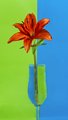
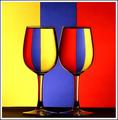
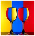
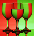
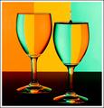
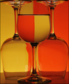
The previous comment might have come off a bit harsh. One of my first thoughts after looking through some previous challenges on the site was that this site has a weird obsession with wine glasses and cutlery (especially forks)! :P

At least you are bringing a new element into the theme, which works pretty well. I love the sharpness of the petals, and the color of the flower is great in itself. I'd love to see a somewhat wider crop with the color line completely centered, as it is now it seems a little too far to the right and perhaps also leaning slightly.

As for the challenge, I feel that the colors don't quite fit. The color of the flower is neither completely red nor completely orange, and as such it doesn't really complement neither the green or the blue from the background, though it might have worked as an "in-between" if the green and blue were darker or at least a bit more saturated.

Still, those are just my 2 cents of course, and other people will probably have a different opinion :) Besides, I'm just a baby when it comes to photography, so you shouldn't really put much weight on my opinion anyway :P
Celebrate Boldly
11/10/2010 07:36:07 AM
Celebrate Boldly
by JrP

Comment by lawrysimm:
Hmm... not quite sure what to make of this one. Orange and blue are complementary colours ok, but the green has such a prominance in this shot without it's complementary of red being present. Whilst I wouldn't go so far as to say that this does not meet the challenge, I do feel as though it is slightly off kilter with the challenge. I sort of find the stem distracting in a number of places - i.e. where it is to the left of the centre line - I think it would look better if it were full on the line. Also the blurred section in the glass, although I realise this is due to the shape of the glass rather than your technique.
New Jeans!
11/01/2010 03:25:51 PM
New Jeans!
by JrP

Comment by gregsnyder:
6.5
Pages:  
Showing 11 - 20 of ~39


Home - Challenges - Community - League - Photos - Cameras - Lenses - Learn - Help - Terms of Use - Privacy - Top ^
DPChallenge, and website content and design, Copyright © 2001-2025 Challenging Technologies, LLC.
All digital photo copyrights belong to the photographers and may not be used without permission.
Current Server Time: 04/07/2025 09:49:11 AM EDT.