| Image |
Comment |
| 07/29/2002 11:30:00 AM |
Pharmaceutical Corporations - Greed and Profit Over Healthby MrsKroComment by Froober: Intriguing and unique photo. I think to emphasize the 'corp' aspect of this you would place the pills in the foreground of the picture as to show the lilly, merck, etc labels on the pills. I do like the idea. 7 Lisa If this sounds snooty it's because I've been goaded into leaving the words great and nice out of my critiques and to use more colorful and accurate vocabulary. Sorry to make you the guinea pig. ;) |
| 07/29/2002 05:21:00 AM |
|
| 07/29/2002 04:15:00 AM |
|
| 07/28/2002 09:20:00 PM |
|
| 07/28/2002 08:27:00 PM |
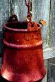
Weatheredby MrsKroComment by KarenB: Karen: I really liked this. #43? Hmm. Well, it's a keeper. (I had given it a 9!) |
| 07/28/2002 12:17:00 PM |
Weatheredby MrsKroComment by jmsetzler: rustic :) I like this.. the color and contrast is extremely nice, as is the composition.. the framing on this shot is just about perfect :) good work :) = 8 - jmsetzler |
| 07/26/2002 02:55:00 PM |
Weatheredby MrsKroComment by Ronin: An interesting photo,.. althought I can tell if thats the actual texture of the can or if it has just been over sharpened.. I really do like the colors and the contrast from the fence. |
| 07/26/2002 06:21:00 AM |
Weatheredby MrsKroComment by balynch: This photograph has nice color but the levels have been stretched to the point that the rust no longer looks lifelike. The natural beauty of the rust would have made a nice texture in and of itself. In spite of this, the composition and artistry is excellent. *5* -balynch |
| 07/25/2002 04:05:00 PM |
Weatheredby MrsKroComment by KarenB: Love the textures, the colors, the subject. Wishing the bottom of the bucket wasn't cut off....though I can't decide if that detracts from the photo. |
| 07/25/2002 09:03:00 AM |
Weatheredby MrsKroComment by hokie: very beautiful, like a still life painting..my only quip from giving this a 10 is the slight clip on the bottom of the bucket..but still one of my favoriote shots and the compostion is excellent.. 9...hokie |
Home -
Challenges -
Community -
League -
Photos -
Cameras -
Lenses -
Learn -
Help -
Terms of Use -
Privacy -
Top ^
DPChallenge, and website content and design, Copyright © 2001-2025 Challenging Technologies, LLC.
All digital photo copyrights belong to the photographers and may not be used without permission.
Current Server Time: 04/09/2025 05:27:16 AM EDT.