DPChallenge: A Digital Photography Contest You are not logged in. (log in or register
 
Browse Settings
Currently viewing:
Registered Userdrphotos-dm

Show comments:

Per page:

Order:

Comments:


Comments Received by drphotos-dm
Pages:   ...
Showing 21 - 30 of ~147
Image Comment
Hello Danny, Come sit on us, Danny
02/14/2010 01:43:39 PM
Hello Danny, Come sit on us, Danny
by drphotos-dm

Comment by rooum:
Wonderful and eerie. Those two EXIT signs complement the two chairs perfectly. Nice Shining reference as well! My pick for the Blue. 10.
Hello Danny, Come sit on us, Danny
02/12/2010 08:52:03 PM
Hello Danny, Come sit on us, Danny
by drphotos-dm

Comment by OmanOtter:
Ha! Before I even scrolled down and saw the title, I thought "The Shining!" Very well done!
Hello Danny, Come sit on us, Danny
02/09/2010 05:48:45 AM
Hello Danny, Come sit on us, Danny
by drphotos-dm

Comment by bmartuch:
Good job on the lighting.
Hello Danny, Come sit on us, Danny
02/09/2010 03:05:41 AM
Hello Danny, Come sit on us, Danny
02/09/2010 12:50:10 AM
Hello Danny, Come sit on us, Danny
by drphotos-dm

Comment by Cinnamon_Girl:
Lol! Very creepy :D Good job!
Hello Danny, Come sit on us, Danny
02/08/2010 11:30:33 AM
Hello Danny, Come sit on us, Danny
by drphotos-dm

Comment by love:
redrum redrum.. I'm running away quickly! 6
Hello Danny, Come sit on us, Danny
02/07/2010 11:43:47 PM
Hello Danny, Come sit on us, Danny
by drphotos-dm

Comment by Art Roflmao:
uh... my name's not Danny. *runs back to the elevator* :)
Isn't she GORGEOUS
02/07/2010 05:41:47 PM
Isn't she GORGEOUS
by drphotos-dm

Comment by Senay:
Greetings from the Critique Club!

Sorry about the wait for your critique, this is coming out of the backlog!

I think the comments you received during the challenge provided a good outline as to what could be improved in this picture. The most obvious thing is the lighting. To the left side it is too bright and the right side is too dark. Also the rope in the background is in an unfortunate spot as it looks like it is a javelin in his side.

I think the most important aspect of your image that could use improvement is the lighting and angle. Try taking some pics when the light is not as direct and harsh and from a more frontal angle to its face.

If you have any questions click here to message me!

Senay
FIREWOOD
02/01/2010 01:35:15 PM
FIREWOOD
by drphotos-dm

Comment by snaffles:
Greetings from the Critique Club!

Ahh, woodies, gotta love them. The pun goes over especially well here, as certain lunatics umm, members are known for both their liberal use of woodies and fire.

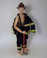
The shot itself is well focused and lit with what lights you have (not unlike mine :-) The settings for the shot are good, and you didn't overdo the pp. The details, the fireman's outfit and axe, are all great.

However, the image is a bit static, you need to tell more of a story here. SOmtimes it's a tossup - use a studio setting and have complete control over everything, or take your chances and woodie/camera to a location where you may have to put up with inconsistent lighting, but end up with a more colourful and creative shot.

All in all, a good effort and you finished well, so keep on shooting and have fun! Look forward to seeing more of your entries.

Feel free to PM me with any questions,

Susan
The making of MAIN STREET
01/30/2010 02:21:48 PM
The making of MAIN STREET
by drphotos-dm

Comment by Marc923:
You're probably getting hammered. But I'm giving you a 9 for some nice out of the box thinking.
Pages:   ...
Showing 21 - 30 of ~147


Home - Challenges - Community - League - Photos - Cameras - Lenses - Learn - Help - Terms of Use - Privacy - Top ^
DPChallenge, and website content and design, Copyright © 2001-2025 Challenging Technologies, LLC.
All digital photo copyrights belong to the photographers and may not be used without permission.
Current Server Time: 04/07/2025 09:52:03 AM EDT.