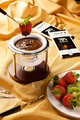
Chocolate Fondueby
macobeeComment by Citadel: Greetings from the critique club!
First of all, thank you so much for including your lighting setup. It really helps us understand what you were trying to do when we do our critiques for these types of images and helps other learn as well.
In terms of the lighting it does look a little too bright in the top left and on the upper left edge of the bowl. It almost looks like that light (the soft box if I am reading your setup correctly) was a bit brighter than the light with the snoot. I'd be curious to see what this looks like shot without the softbox. Otherwise, the lighting is pretty good.
The focus for this image might be a little soft. Or at the very least there might not be enough DOF. (I think that might be it) Composition is ok and you have your elements positioned in a pleasing way. Maybe getting a little lower would add more emphasis to the brand name on the bowl. Then again getting lower would necessitate increasing your DOF even more I think.
For the challenge? Terrific choice of subject. The textures and the colors you presented really sold the viewers and made them want to be person getting that chocolate covered strawberry out of the bowl. At the end of the day, in my opinion, that was the most important goal and you suceeded at it.
Congratulations on your personal best and I hope you didn't get too full "cleaning up your set". :)