| Image |
Comment |
| 10/07/2009 05:53:00 PM |
|
 Photographer found comment helpful. Photographer found comment helpful. |
| 10/04/2009 04:16:20 AM |
|
| Photographer found comment helpful. |
| 10/03/2009 01:12:03 AM |
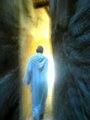
Guidedby qui-bowComment by Paul: OK, I'm going through the Free Study submissions, purposefully finding those images I think are shot with a less conventional eye - this is one of those images! Thanks for offering something that isn't just DPC friendly eye-candy (though of course there's nothing wrong with eye-candy). I'll be picking one of these images for my Mu (most underrated) award:
Positives: What an interesting image - full of story and a little mystery. I'm not sure of the context but the robe, the stone, the light communicates druids to me. I like the blur / motion too - I like the linear aberrations it causes. I think the yellow colouration, the light gives is excellent.
Critical stuff: I'm not too keen on the blue hue - desaturation of that channel with an increase in luminance to a higher key image feels like it might have been more effective but without trying that, how can I say.
Overall: A very effective image which clearly communicates a vision. I really like it. |
| Photographer found comment helpful. |
| 10/01/2009 01:00:43 PM |
Guidedby qui-bowComment by Leo: I like the blur for this image, the composition with the person (impression of a monk) walking a "corridor" toward the light has a very mystic feel. I'm trying to guess your technique; slow shutter? deliberate slight OOF? and just a bit of camera movement during the shutter snap? Please put details in the photog's notes when the challenge is done voting. Good luck on the voting. |
| Photographer found comment helpful. |
| 05/05/2009 10:33:43 PM |
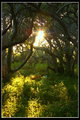
Lost in the Greenby qui-bowComment by ralfw: I like the composition in this shot because of the way the dark along the top right, offsets the light along the bottom left. Brilliant flare too - well captured! Leaving it near the vertical center works ok too, however I might have nudged it a bit more right for myself.
For the DPC voting crowd, I think the following would have helped as well: sharpness, landscape or a square crop due to monitor aspects versus portrait crop, and a tad smaller border.
This is a new style for you - as I wasn't able to pick it out of the bunch as yours, well done. During voting, I voted it a solid 5, wishing I had a "5.5" button based on the attributes of the submission. Bottom line, I like it! I am looking forward to more surprises from you. - ralfw |
| Photographer found comment helpful. |
| 04/30/2009 06:05:48 PM |
Lost in the Greenby qui-bowComment by CindyG: Coming back to comment - Nice sunflare and the trees have lots of character with their twisty branches. The exposure, composition and depth of focus look great. Overall though, I feel that this seems to be lacking something - more contrast? a little bit of a saturation boost? something else? I'm just not sure exactly. |
| Photographer found comment helpful. |
| 04/29/2009 04:17:52 PM |
|
| Photographer found comment helpful. |
| 04/29/2009 03:02:52 AM |
|
| Photographer found comment helpful. |
| 04/08/2009 10:13:41 PM |
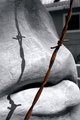
Rust Never Sleepsby qui-bowComment by ralfw: I like the desat choice on this. It caught my eye because of the composition, and after gazing for a bit, realized that only the rust was in color. Good choice to desat all but the rust!
Also - regarding composition, the shadow of the barbed wire makes this shot even better. Very nice. |
| Photographer found comment helpful. |
| 03/07/2009 05:20:19 PM |
|
| Photographer found comment helpful. |
Home -
Challenges -
Community -
League -
Photos -
Cameras -
Lenses -
Learn -
Help -
Terms of Use -
Privacy -
Top ^
DPChallenge, and website content and design, Copyright © 2001-2025 Challenging Technologies, LLC.
All digital photo copyrights belong to the photographers and may not be used without permission.
Current Server Time: 04/07/2025 09:49:09 AM EDT.