|
|
| Image |
Comment |
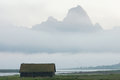
| 08/10/2009 09:57:14 PM | Boathouse and foggy mountainby yermunComment: Greetings from the Critique Club...
Landscape photography is much more difficult than most people realize. The scene before you in this photograph is rather breathtaking, but what seems to happen here is that the image itself doesn't communicate that level of awe to the viewer. I have been in this same situation many times. I look around at my surroundings and I'm simply overwhelmed with what I see and feel. My camera, on the other hand, can't seem to recreate the feel of the breeze on my face, the smells in the air, and the adrenaline rush that I feel while standing before the subject. I suppose an image like this will always have more personal appeal to the photographer who experienced the photograph than to an arbitrary viewer such as myself who looks through the digital window of my computer screen and tries to recreate the same experience.
|
| 08/09/2009 08:37:34 PM | No More Photos!by dixonp1Comment: Greetings from the Critique Club...
Portraits are tough choices for challenge entries. Any time you present a portrait, you must come up with some sort of hook that will connect a viewer with a subject who they have no previous connection with. In this photo, I am easily able to make a connection with your subject :) She's cute and she's showing an emotion that you woudn't normally expect to see, especially in a studio setting. I'm not a studio photographer in any way, but I can only imagine how difficult it can be to work with children. Capturing photos like this one is definitely a sign of an excellent portrait photographer, especially if you can do it with any consistency :) One of the reasons I'm not a particular fan of studio portraiture is the simple fact that the subject rarely shows me anything on an emotional side at all.
Your photo scored fairly well in the free study, so it seems that most people really enjoyed it. As far as the photo itself is concerned, I can't really offer you any suggestions for improvement. I really like it as it is. Your choice of background colors is fantastic, and I think that adds a lot to the overall impact of the image. The only aspect of this image that I don't like, and it's completely on a personal subjective level, is the border. I know parents and people who might purchase this photo probably eat that stuff up, but in my humble opinion, it's arguing with your subject for attention. I personally prefer borders as a tool that separate the image from its surroundings and help the viewer focus on the image rather than the environment in which it is located. I think that looking at this image on a computer screen would be greatly enhanced by leaving that element behind...
Keep up the good work :) |
| 08/08/2009 05:47:29 PM | Trying to break the confederate line.by cowboy221977Comment: Greetings form the Critique Club...
I really think it's sad that only about 1/3 of the participants in this challenge took the time to vote on your image. That's unfortunate :(
This photo didn't really deserve a score of 4.4 to be quite honest. It lacks a high level of visual and/or emotional impact, which is a rather serious requirement to rise to the top of a free study challenge (or any challenge for that matter). The photo does show a carefully composed and well thought out composition though. I can see that it's not just some random image that was captured on a bus ride through a park :) Compositionally, I like what you have done here, but I think the image would be stronger if you had filled the frame a little more with your subject. Another technique that might have provided some more impact would have been to use a longer lens with a larger aperture to blur out the foreground and background to boost the presence of your subject within the frame.
I found the comments you receive rather entertaining as well. The only one that has much merit is the "Lacks wow factor" comment because, in a nutshell, that's the simple reason this photo didn't do well in this challenge. I didn't participate or vote in this challenge either, but if this photo placed at #409 out of 419 total images, the overall quality of images in this challenge must have been fantastic. Your score is probably also skewed because you didn't get an adequate sampling of voters to properly evaluate your image. Sad but true...
The comment about the soldiers is the kind of comment that really bothers me as a photographer. The person who left this appears to be a decent photographer based on his scores and the quality of his images, but this comment, to me, is simply insulting and shouldn't have been provided as it is. I think it's insulting when someone tells you that you should have photographed something other than what you chose to shoot. I'm sure if he was shooting this subject he would have rounded up some soldiers from somewhere or passed up on the shoot because the subject as it is wasn't worthy. Bah...
The comment about flat colors isn't really significant either. Most photos you see that have hyper-saturated colors usually have a good bit of noise from the post processing.
At any rate, don't let the score on this photo get you down...
|  Photographer found comment helpful. Photographer found comment helpful. |
| 08/07/2009 12:59:02 AM | Draughts (circa 1836)by blachlymComment: Greetings from the Critique Club...
Welcome to DPChallenge :) 5.1 is not a terrible score but you didn't manage to make it into the top 50% of the images in this challenge. It's not an easy thing to do around here, but with a little time and patience you will get there soon enough if you stick to it. Since you are new here, I'll share a few ideas that will help you move up in the ranks.
1. Meeting the challenge
That's obviously critical. If you don't obviously meet the challenge topic with your image, you won't usually do very well. Your photo, in this case, meets the challenge with no questions asked. That's a good thing. That being said, meeting the challenge is a relatively small part of doing well on this site. Meeting the challenge doesn't carry as much merit as you will lose if you don't meet it.
2. Visual / emotional impact
Visual and emotional impact are probably the two most important elements of a challenge photo. A high level of this coupled with meeting the challenge produces winning images. Your photo doesn't have much of this in my opinion. In this environment of photographers from multiple backgrounds and skill levels, postcard type photography tends to do well.
3. Technicals
In my personal opinion, if you have high levels of the first two parts of this discussion, the technicals don't matter as much. The comments you received in this challenge seem to complain mainly about the lack of sharpness in the photo, which may be from the slow shutter speed which caused some motion blur. If the visual and/or emotional impact of the image is high enough, the technicals become less of an issue. If the technicals are good as well, it just adds to the overall performance of the image.
Subject choice is always the toughest part of artistic photography. Viewer subjectivity will make or break you every time. Some people will like it and some won't, and deep down as an artist, you always want to impress someone. Don't forget to make yourself happy with the image though. If you are shooting stuff for someone else rather than to satisfy your own interests in the art, you won't get very far in the long run :)
|
| 08/05/2009 12:13:09 PM | Mourning dewby PloucComment: Greetings from the Critique Club...
A score of 4.74 isn't particularly impressive in this challenge unfortunately. You have to ask yourself why viewers didn't like this image, and there are several potential explanations that I'll touch on here. The first one that comes to mind for me is your choice of subject. In a "Life and Death" challenge, I would expect to see a lot of tombstones. It's a stereotypical choice of subject for this challenge and it's also an easily accessible subject, so I expect that this challenge was full of them (I didn't vote in the challenge so I don't really know this to be true... It's just an assumption.) With the establishment of a stereotypical choice of subjects, you are forced to provide a much higher level of visual and/or emotional impact. The perspective you chose is interesting, but the light and environment just don't seem to provide any particular interest. The interesting detail in this cross seem to be at the top rather than the bottom, and your choice of perspective doesn't really highlight the interesting part of the subject. The top of the cross also argues with the tree in the background for attention. I'm not sure how to suggest improving this photo other than exploring your compositional opportunities and working with some more interesting light options... | | Photographer found comment helpful. |
| 08/05/2009 11:34:52 AM | The Light of Life by hallgrgComment: Greetings from the Critique Club...
This photo obviously meets the challenge very well :) I don't often grab a first place image through the Critique Club queue, but I got lucky today. Great images are always rather easy to critique, because it's difficult to find anything critical to say about them. Your creative use of lighting and post processing on this image create a lot of visual and emotional impact in the story you are telling with your camera. The theme is obvious, and I particularly like the contrast provided between life and death through the use of the old tombstone and the young girl. On the technical side, the only suggestion I have for you would be to have used a slightly smaller aperture than the chosen f/1.4. The focus on the young girl is strong, but in my humble opinion, I think the cross on the tombstone should get equal attention in the realm of sharpness and focus. The camera angle with these subjects allowed the cross to fall slightly behind the depth of field with this technique.
The great images continue to flow from Iceland :) Great work... Kudos :) | | Photographer found comment helpful. |
| 08/04/2009 07:04:33 PM | An Age Gone Byby JulietNNComment: Greetings from the Critique Club... (better late than never!)
I think the light and warmth offered in this image is extremely nice. It tells an interesting story of a young girl getting lost in her own world of dress-up and make believe through the clothing, doll, and other associated elements within the field of view. Images like this one aren't easy to do on a compositional level. The complexity of this photograph reminds me a lot, oddly enough, of some landscape photography where there is so much going on within the image that the viewer is just allowed to get lost and enter the world being offered by the photographer (or painter or whatever other kind of artist might be involved). The difference between your image and others that I consider to be overly complex is that the detail comes together in this photo to support the overall theme and idea being presented. This photo really does remind me of a lot of victorian-age paintings that I have seen. It's really nice work... Keep it up :) | | Photographer found comment helpful. |
| 08/03/2009 09:40:18 PM | Shadow Walkerby NuzzerComment: Greetings from the Critique Club...
This is an excellent photo as shown by the score you received in this challenge. I love the silhouette exposure and the overall high contrast of this photograph. Compositionally I can understand your own comments on this image with the subject being centered in the frame. In general, the rule of thumb for centered subjects is just like the rule about centered horizons. When the primary point of interest is in the center of the frame, it needs to be supported by either zero interest surrounding it or have equal amounts of interest all the way around it. Whether or not your clouds are supportive of this subject is probably quite subjective. My personal subjective interest in this image is mainly in the lower half of the frame because the leading lines all point back to your main point of interest. I wouldn't really consider the clouds as a point of support for the subject.
I think there is a very strong square composition in this photograph. This square would be created by cropping at the top just above the sphere of the sun and just below the patch spot in the pavement.
Another trick you might want to explore sometime in situations like this one is to create a 'sun star' with your exposure. They are relatively easy to do but they require the use of a polarizer and a much smaller aperture than you chose in this exposure. As you can see, you have the beginnings of this 'star' forming from the sun, but that technique will create a really nice star for you if you give it a try sometime...
Nice work and congrats on the excellent score :)
| | Photographer found comment helpful. |
| 08/03/2009 12:57:24 AM | gorgeuos_browneyes12by benficaComment: Greetings from the Critique Club...
Having a beautiful subject goes a long way towards making excellent studio-type portraits. Unfortunately, I tend to be a little harsh on studio work for several reasons. In this environment, the photographer has complete control over lighting, posing, and composition, so anything that "I", as a critique giver, find out of line is considered a mistake :) Also, keep in mind that a critique is simply an opinion of your work from another person who is biased by their own preferences and experiences...
Your light in this image has created some compositional issues that jump out at me rather quickly. In a studio setting, there is no real reason to not create a lighting situation that shows some amount of detail throughout the entire subject. In this particular image, the directional lighting is strong enough (and probably from only a single direction) that it's creating a lot of loss in shadow detail in the hair and on the face towards the right side of the image. The ear and jewelry managed to find a little light, but that anatomical feature is floating in a sea of darkness. Dark hair on a dark background is almost always improved in appearance by back lighting it with a spot of some sort to create a contrasting edge. It also creates a glow that usually enhances the overall feel of the image. As for improving the lighting in this image, I think you could have salvaged the detail AND maintained the high contrast by using a reflector a few feet away to bounce just a little bit of the light source back into the dark areas of this image.
My personal common theme on offering portrait work into a photo competition such as these here at DPC is rather simple. When you provide an image like this, you need a 'hook' of some sort that intrigues the viewer into falling in love with the image when they have no personal connection with the subject. IMHO, this is a good photo, but it stops at that. What part of this photo should I find compelling in an artistic sense? What makes it above average? What gives it an artistic edge that would make me give it a score in the 8-9-10 range? She's a beautiful girl. I see hundreds of photos of beautiful girls every week. What sets this one apart from the rest?
Just some food for thought :)
|
| 08/03/2009 12:39:33 AM | Msdoubletroubleby snafflesComment: Greetings from the Critique Club...
This is a rather difficult challenge to 'critique' because of the simple nature of the challenge itself. You were asked to create a photo that represents another user's 'name' on the site, which really limits you to creativity. Sometimes it's easier to shoot an image and then try to find a username that fits the photo rather than the other way around. Meeting the challenge is a given in this competition, so you can't really get dinged for that. Since not meeting the challenge isn't really possible here, what do you have left to be judged on?
In any challenge, if you spend some time looking around the site, the images that score highest ALWAYS have some sort of special appeal, whether it be visual, emotional, or technical. Your photo scored a 5.3, which is what I consider to be a mediocre result. When photos score in this range, the collective vote is telling you that there is nothing really wrong with your image, but there is also nothing compelling about it. No one found it offensive while no one found it outstanding either. Just over 80% of the votes you received were in the 4-5-6 range which is definitely middle of the road.
As I look at your image, I don't find anything compelling about it. Harsh sunlight is generally not a great time to shoot photos of anything because of the high contrast it creates. I do find donkeys interesting in general, but you really have to work them to get intriguing images. The comments you received in this challenge don't really offer you anything either except for the one that mentions the same harsh light situation I suggested in this critique. If these two donkeys are truly what you set out to photograph for this challenge, you might have fared better by visiting them early in the morning or late in the afternoon where some shade or overcast weather conditions could have provided a more inviting light situation for your camera. You might have also tried to coax them closer to you where you could fill the frame with their faces and create a higher overall impact rather than just having the two of them standing in in a bare spot in their landscape.
Photography, in a serious sense, is a game of time and patience. You need a lot of both to consistently create images that inspire awe and wonder :)
Keep working hard at it :)
| | Photographer found comment helpful. |
Home -
Challenges -
Community -
League -
Photos -
Cameras -
Lenses -
Learn -
Help -
Terms of Use -
Privacy -
Top ^
DPChallenge, and website content and design, Copyright © 2001-2026 Challenging Technologies, LLC.
All digital photo copyrights belong to the photographers and may not be used without permission.
Current Server Time: 02/01/2026 06:17:14 AM EST.
|