|
|
| Image |
Comment |
| 09/23/2009 08:08:22 AM | departureby DeenComment: Greetings from the Critique Club...
HDR is a subject that I'm not overly impressed with in the long run. MOST (but not all) of the HDR images I have seen simply don't look natural to me and they have a look of being over processed. I believe that the simple nature of these tools convince a lot of photographers that there is some overpowering need to make the photo have a processed rather than a natural appearance. My personal interests in photography are for a more natural appearance. I personally tend to not like a photograph when its main theme has become a processing technique rather than the normal elements of subject and composition.
That being said, your photograph scored rather well in this challenge with a score of 6.56. As I look at your image (and set aside the elements of HDR), I find myself looking around the scene trying to determine what part of it you found to be the most intriguing and what it is you wanted me, as the viewer, to see in this scene. The rear of the train seems to be the focus point of the image, and it is falling dead center in the frame. I'm also struggling with the lighting, and it may be that a selective desaturation was used in this image, but I'm not sure. The yellow cast behind the train just looks and feels strange to me when there is no other light with that tone in the scene.
I really do feel unqualified to offer reasonable critique on this image since I simply do not like the whole HDR concept for the most part... |  Photographer found comment helpful. Photographer found comment helpful. |
| 09/13/2009 11:29:52 PM | Dare to be D I F F E R E N Tby moolacoolaComment: Greetings from the Critique Club...
This is an intriguing photograph. It's a landscape that I am definitely not used to seeing and that provides a significantly higher interest level. I would have had to look at this image for quite a while to really get a grasp of what I was seeing without being able to see your own comment on the image. It's almost mystical with your description, and its very well composed. The only comment you have that has any critique is the one from ELLIPS. I'm not sure what he might not like about your composition. His comments regarding that didn't make any sense to me. I can also see detail in all your shadow area, so maybe ELLIPS just needs a monitor calibration. In fact, that brings up another point. This is a very well exposed image. When you have white and black objects in a scene, making the correct exposure can be a nightmare, and you have done very well with that.
I'm not really sure why the collective vote in this challenge didn't find this photo to be worth any more than a 5.6. I didn't vote in this challenge or look at any of the images, but in general, you gotta have something eye popping in color and subject choice to do well in any challenge. Shiny things tend to appeal to the masses :) |
| 09/10/2009 12:57:19 PM | Linguini Pescatore con Pomodoro e Gamberetti alla Ferruzzanataby hotpastaComment: Greetings from the Critique Club...
Your score guess was pretty close, but a 6.04 is still an excellent showing in a challenge. Since you admitted to complete conceptualization, design, and execution of this image, I suppose I can be a bit harder on you :)
First of all, the food looks tasty and well executed in that department :) Compositionally, I'm not a huge fan of the perspective. I'm sure there is a reason you chose it, but this view is rather flat and two-dimensional. The application of the gaussian blur also feels a little uncomfortable to me as well around the top edges of the image.
I think this image is very well done for the purpose of stock imagery. It would also make good menu or restaurant art.
I personally find it more difficult to critique an image in a challenge like this one simply because of the topic. Some topics allow the artist to express themselves a little more than others. This is more of a commercial art assignment rather than a simple artistic endeavor...
You did well though.. Keep up the good work!
| | Photographer found comment helpful. |
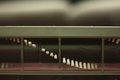
| 09/07/2009 01:10:46 PM | Tenby rmezzoComment: Greetings from the Critique Club...
This challenge is one that was rather easy to meet, so that aspect doesn't play a significant role in the results. A score of 5.69 is a little better than the 5.37 average of this challenge.
From my personal perspective, I love images that put shape and texture into the forefront of the composition. Your image does that rather well obviously due to the choice of subject. I also tend to like high contrast images, but this one seems to be just a little over the top in that aspect for me. On the other hand, what this image is lacking for me is some sort of theme that provides a high level of interest for me as the viewer. There is a good story of off balance and symmetry to go along with the shapes and texture, but it's just missing something else and I can't really put my finger on it. Generally when that becomes a problem, its a simple choice of subject that comes into play. | | Photographer found comment helpful. |
| 09/02/2009 02:57:16 PM | Helical Wavesby PaulComment: Greetings from the Critique Club...
I can't believe this photo didn't finish any better than 5.33. I think you probably got bit by the challenge topic itself. You definitely met the abstract portion with no problem, but you have to keep in mind the finicky nature of the walmart shopper. What they don't see is the definitive macro element of the challenge. Your comment from Ja-9 goes to support this idea. She wasn't willing to give you the benefit of the doubt, and I suspect that most other voters probably followed that simple line of thinking.
As for the image itself, I think you have a beautiful shot. The smooth curves create a good bit of interest in this abstract. I think it's an excellent image and would have voted it in the 8 range if I had voted on this challenge... excellent work :)
| | Photographer found comment helpful. |
| 09/01/2009 12:12:01 AM | Spiralby TerComment: Greetings from the Critique Club...
I guess a 5.67 is not a bad score for a photo that isn't abstract in any way and doesn't really show much in the realm of macro photography either :) This photo is nicely done, but I think it could be stronger in quite a few ways... Personally I think this image is stronger if you rotate it 90° counterclockwise so the flow goes from top left to bottom right. Images like this are also difficult to critique. There isn't really anything technically wrong with this image, so everything I might offer is purely subjective. | | Photographer found comment helpful. |
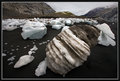
| 08/31/2009 11:45:49 PM | Spiky Landscapeby tpbremerComment: Greetings from the Critique Club...
The two comments you received in this challenge, coupled with your own feedback on the image, do a rather nice job of summing up what happened here. On this website, bugs are done and done and done and done again :) They do make good macro subjects when they are well done, but this one is not particularly well executed. This particular photo also demonstrates on of the things I hate most about digital photography. The 100% crop, or any significant crop for that matter, is just something I'd rather not even hear about. In your image, its obvious from the artifacting and noise. You could never print this image, or others like it. Digital photography has given us a medium where billions of images are created and relatively few of them ever find their way into print form. I guess we have become content with looking at an image on the computer screen instead of a magnificent matted and framed print with some substantial size. I guess coming from a background where the final image was a PRINT makes me underqualified to judge the quality of a digital photograph ;) | | Photographer found comment helpful. |
| 08/30/2009 11:38:16 PM | Vacuum by JayTroopComment: Greetings from the Critique Club...
This photo meets the challenge with no doubt, but unfortunately, it doesn't go much beyond that. In the greater scheme of things, meeting the challenge is only the primary stepping stone of a successful image in these competitions. There is simply nothing compelling about your subject choice or your perspective. This challenge required taking a look at subject choices that have interesting curves, shapes, and textures and then getting creative with a photo composition. Your vacuum cleaner has curves, shapes, and textures, but in my humble opinion, they just don't interest me from this perspective. I'm not sure what you could have done to make this into a more intriguing image.
I see that you are new to DPChallenge, so my current suggestion to you is to spend some time looking around the challenges. You will see a lot of great images :) You will also see what sorts of ideas and themes it takes to rise to the top of the pack :) |
| 08/19/2009 11:27:30 PM | The Offspringby retzComment: Greetings from the Critique Club...
Meeting the challenge in this particular contest is sort of a given, so in order to do well, there are a couple other requirements. I can see the relationship between your band name and your photo, but beyond that, the image doesn't provide any significant impact to the viewer (me). Your focus on the subject is good, but compositionally, the image simply lacks interest. The cage corner in the lower left portion of the frame blocks the subject and creates, for lack of a more refined term, a distraction within the frame. It's unfortunate that you didn't receive any feedback on this image in the challenge that is worth reading, but that seems to happen frequently on images that are not 'bad' but not 'good' either. Middle of the road images don't garner much in the form of comments from the walmart shoppers.
As with any photograph, high levels of visual and/or emotional impact are the foundations for building a strong photo. | | Photographer found comment helpful. |
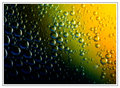
| 08/12/2009 11:58:29 AM | Lovely Bubblyby kingskingdomComment: Greetings from the Critique Club...
This photograph is excellent. I personally enjoy seeing them because they are colorful and the theme is about shapes and textures rather than a simple tangible subject. I remember a time here on DPC when photos like this one would always rise to the top of the heap, but the Walmart shoppers are getting too complacent these days and this theme and style is becoming stereotypical. I love the abstract modernism in this style, and this photograph would make a fantastic large print (18x12 or so) matted in black with a black frame to hang on a wall. 10th place out of 111 images is quite respectable though :) I just think images like this are worth more than 6.1 on a scale of 1 to 10. That aspect seems to show the complacency I mentioned earlier more than anything else. There is no critique I can offer for improvement. I like this image as presented without any modifications.
Excellent work :) | | Photographer found comment helpful. |
Home -
Challenges -
Community -
League -
Photos -
Cameras -
Lenses -
Learn -
Help -
Terms of Use -
Privacy -
Top ^
DPChallenge, and website content and design, Copyright © 2001-2026 Challenging Technologies, LLC.
All digital photo copyrights belong to the photographers and may not be used without permission.
Current Server Time: 02/01/2026 06:17:34 AM EST.
|