| Image |
Comment |
| 12/03/2008 09:24:59 AM |
|
 Photographer found comment helpful. Photographer found comment helpful. |
| 12/03/2008 09:24:46 AM |
Free Study of a Masterby Mr_PantsComment: I don't really like the post processing. I would probably have scored you higher if it looked a little more "natural". I also would prefer if he wasn't looking out of the frame. |
| Photographer found comment helpful. |
| 12/03/2008 09:24:15 AM |
|
| Photographer found comment helpful. |
| 12/03/2008 09:23:54 AM |
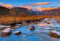
The Sourceby hahn23Comment: Beautiful scene, but oversaturated and overprocessed. |
| Photographer found comment helpful. |
| 12/03/2008 09:23:25 AM |
|
| Photographer found comment helpful. |
| 12/03/2008 09:23:08 AM |
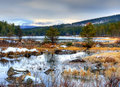
Frosty morningby TrollManComment: I really like the colours in the foreground, but I find the background colours in the trees and sky a little dull in comparison. It's like two different photos. |
| Photographer found comment helpful. |
| 12/03/2008 09:22:18 AM |
|
| Photographer found comment helpful. |
| 12/03/2008 09:22:07 AM |
|
| Photographer found comment helpful. |
| 12/03/2008 09:21:28 AM |
Beautiful Berlinby onarComment: The colours on the building are beautiful. The 2 figures obscure the building and detract rather than add anything to the image. |
| Photographer found comment helpful. |
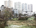
| 12/03/2008 09:18:32 AM |
Fields of Viewby ImagineerComment: I think I get what you were going for with the contrast between urban (buildings) and rural (horses), but it's too white. Overexposed? |
| Photographer found comment helpful. |
Home -
Challenges -
Community -
League -
Photos -
Cameras -
Lenses -
Learn -
Help -
Terms of Use -
Privacy -
Top ^
DPChallenge, and website content and design, Copyright © 2001-2025 Challenging Technologies, LLC.
All digital photo copyrights belong to the photographers and may not be used without permission.
Current Server Time: 04/07/2025 10:06:29 PM EDT.