| Image |
Comment |
| 05/30/2003 10:41:20 PM |
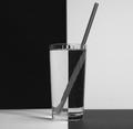
Black & white H2Oby ladpupmoeComment: Hmm, honestly I think I would have liked this better withOUT the straw. The refraction just looks very odd, probably the more so because of being in B&W -- it actually looks like a separate object completely (including in that it looks like a Twizzler underwater). |
 Photographer found comment helpful. Photographer found comment helpful. |
| 05/30/2003 10:35:02 PM |
Deep Thinkerby karmatComment: Lots of cute kids in this challenge. I guess a lot of people like duotone shots of people. I am not really big on portrait-style shots myself, but this one is well framed and the toning on it is good. Focus is nice and clear on the kid and the background fades into obscurity as it ought for something like this, becoming appropriately neutral. |
| Photographer found comment helpful. |
| 05/30/2003 10:33:14 PM |
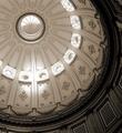
CA State Capital Domeby ChrisW123Comment: Must... fight... vertigo.
I think that makes it a good shot. And the toning on it is very nice, lovely from the deep right/bottom corner up to the bright highlights. |
| Photographer found comment helpful. |
| 05/30/2003 10:30:31 PM |
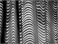
Z-sunby justineComment: I have no idea what I'm looking at . Curtains? A very well folded zebra?
Very abstract, but it does hit the topic of the challenge. (I'm not a big fan of abstract, I'm afraid.) |
| Photographer found comment helpful. |
| 05/30/2003 10:29:24 PM |
Golf Ballby STEINRComment: Yes, that is indeed a golf ball. It even looks relatively naturaly in grayscale. Nice reflection. Not the world's most interesting subject matter, but a good shot. |
| Photographer found comment helpful. |
| 05/30/2003 10:28:41 PM |
Shower Viewby timboydwhiteComment: I don't know... it's less your subject I have a problem with than the depth of focus, it's very distracting to have that much blur where the colour change is. |
| Photographer found comment helpful. |
| 05/30/2003 10:27:28 PM |
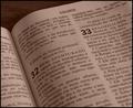
32nd Psalmsby StevePaxComment: Interessando. Um livro é naturalmente preto e branco -- por que adicione um tom do 'sepia'?
And now, for the Portuguese impaired (I can only do it with help): Interesting. A book is naturally black and white -- why add a sepia tone?
In any event, I do think a book is a natural choice for this, so definitely interesting, and a good shot of it. |
| Photographer found comment helpful. |
| 05/30/2003 10:19:23 PM |
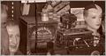
"Duo"...toneby tfarrell23Comment: Ahh, a pun. I must now whack you with this trout.
Good shot, suits the sepia toning well. I'm curious where you found this stuff. It looks like a general store in the 50s (goes along with that tone).
The sepia toning seems a little odd to me the more I look at it. A little more cool than I tend to envision sepia being, maybe. |
| Photographer found comment helpful. |
| 05/30/2003 10:17:51 PM |
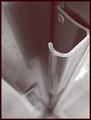
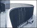
Pigeonby GolferDDSComment: Hmm, well, I had to search for the pigeon. It's an interesting walkway, mind you, but if you wanted the photo to be about the pigeon it could've either been placed more prominently or taken against a less distractnig scenery. |
| Photographer found comment helpful. |
| 05/30/2003 10:16:50 PM |
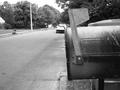
Is it here yet?by DavidLevinComment: Ahh, the anticipation of that letter or package. I know that one well... but with the mailbox taking up less than half of the photo it seems to take away from the emphasis. Looks good in B&W, though. |
| Photographer found comment helpful. |
Home -
Challenges -
Community -
League -
Photos -
Cameras -
Lenses -
Learn -
Help -
Terms of Use -
Privacy -
Top ^
DPChallenge, and website content and design, Copyright © 2001-2025 Challenging Technologies, LLC.
All digital photo copyrights belong to the photographers and may not be used without permission.
Current Server Time: 04/08/2025 04:36:48 AM EDT.