| Image |
Comment |
| 11/04/2007 08:48:44 PM |
|
 Photographer found comment helpful. Photographer found comment helpful. |
| 11/04/2007 08:39:26 PM |
Mischeviousby njsabsComment: Shame about the burnt out highlights in the background, looks accidental rather than deliverate. Skin tones need more colour balancing. Other than that, nice shot. |
| Photographer found comment helpful. |
| 11/04/2007 08:37:54 PM |
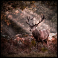
Lord of The Fall by SimmsComment: Wow! Colour balance is a little too much on the purple side for my taste but wow, great composition and light. Lovely textures and dof. |
| Photographer found comment helpful. |
| 11/04/2007 08:34:53 PM |
Lizard sunbathingby andrewtComment: Nice and sharp, but composition doesn't feel thought out and quality of light too harsh. |
| Photographer found comment helpful. |
| 11/04/2007 08:34:02 PM |
F A I R Y T A L E D R E A M Sby GueDesignsComment: Why is the focus on the chain and not on the guy's face? No sense of context, it feels like the photo is trying to tell a story and we have no idea what it is. Burnt out background bokeh not good. |
| Photographer found comment helpful. |
| 11/04/2007 01:10:22 AM |
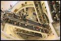
BK Bridgeby APComment: Very cartoony, not sure how I feel about that. I want to like it, as it's a striking effect but it does start to feel like graphic design. |
| Photographer found comment helpful. |
| 11/04/2007 01:08:54 AM |
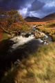
Autumnal Oasisby Ecce_SignumComment: Lovely colours, textures and feel. However, although I like the idea of your foreground, I would prefer the shot without the bottom 3rd of it as a square crop. A bit too much soft focus, is this because the shot wasn't razor sharp to start with? Also, I'd have liked a slower shutter speed to capture the water with a more smooth texture. |
| Photographer found comment helpful. |
| 11/04/2007 01:03:20 AM |
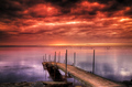
New day dawningby silverscreenComment: Some great textures and colours, even if they are completely over the top as a result of PS, so such a shame that the composition feels so unbalanced. Why put the horizon not quite in the centre? Is there really enough interest in the sky to warrant it taking up most of the shot? Not sure about the amount of negative space to the left of the shot. |
| Photographer found comment helpful. |
| 11/04/2007 01:00:47 AM |
Unsureby RosacalacaComment: I'm wondering why you would post this in a challenge on DPC... it's a family snapshot with no artistic redeeming qualities. There's nothing about this to show it was a competently taken photograph, and I don't know why you would expect a stranger to be interested in it. |
| Photographer found comment helpful. |
| 11/04/2007 12:58:52 AM |
Far, Far Awayby scalvertComment: My God that place looks hideous, is it Disneyland? Sky feels too artifical, looks like colours are as a result of PS. Shame there are no clouds, composition feels like it needs something extra in it to add some interest. Shot is too blurry. |
| Photographer found comment helpful. |
Home -
Challenges -
Community -
League -
Photos -
Cameras -
Lenses -
Learn -
Help -
Terms of Use -
Privacy -
Top ^
DPChallenge, and website content and design, Copyright © 2001-2025 Challenging Technologies, LLC.
All digital photo copyrights belong to the photographers and may not be used without permission.
Current Server Time: 04/11/2025 03:22:37 AM EDT.