| Image |
Comment |
| 01/17/2008 03:55:54 AM |
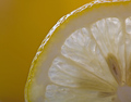
Slice of Sunshineby izadoodleComment: The background is filled with a more saturated yellow than the lemon. Given the lemon is the subject (combined with the yellow brief) I believe that it should be round the other way - stronger yellow on the lemon against a black background to maximise contrast. Pushing the levels at the top end to beef up the whites in the lemon flesh would have been another modification worth considering. Well composed although not particularly original concept |
 Photographer found comment helpful. Photographer found comment helpful. |
| 01/17/2008 03:52:39 AM |
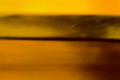
Sand and Sunby jaysonmcComment: The yellow colouring is there alright, but it just far too blurred and has no real focal point |
| Photographer found comment helpful. |
| 01/17/2008 03:50:42 AM |
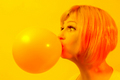
*POP*by PuckzzzComment: Almost too yellow, I'm wondering if a completely black background would have been more effective to create maximum contrast with the balloon |
| Photographer found comment helpful. |
| 01/16/2008 03:59:54 AM |
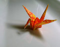
Craneby JetComment: On my display, this seems to be verging on the side of orange rather than yellow I'm afraid. A relatively low difficulty factor compared to some of the others which will prevent this scoring in the top 50% |
| Photographer found comment helpful. |
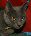
| 01/16/2008 03:58:25 AM |
Golden Eyesby chickadeezlComment: The red and blue hues seem more highly saturated on my display than the yellow of the eyes. Given the brief is "Yellow", it should be the other way round. A tighter crop on just the eyes would have achieved this and elminated the distracting background (complete with flash shadow) |
| Photographer found comment helpful. |
| 01/16/2008 03:53:18 AM |
Bananasby jere2201Comment: Reflection on the wall and flash casted shadow let this down technically. Artistically, the horizonal line on the wall, the light source on the floor and the strange banana stand all add unnessesary complications. The subject is the bananas, a simple neutral background with a clever light source would have shown them off best IMO. |
| Photographer found comment helpful. |
| 01/15/2008 10:57:24 AM |
Sourpuss by loveComment: Lovely B&W, I reckon this will make the top ten, well composed, good sharp eyes and excellent levels |
| Photographer found comment helpful. |
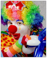
| 01/15/2008 04:00:47 AM |
Kikiby JeniYComment: Very vibrantly coloured as you might expect for a clown subject and comes across as quite a typical "portfolio" image that a clown my use in a circus programme, business card or pinned up on the notice board in the reception of an entertainment holiday camp. I worry that to score highly here, you need to sometimes do the unexpected and go against the grain. But well exectued none the less |
| Photographer found comment helpful. |
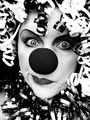
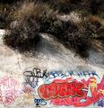
| 01/15/2008 03:57:26 AM |
Clown Head by Ewigby pointandshootComment: Not really seeing the connection to the challenge unfortunately. The thin white strip at the very bottom should have been cropped off IMO. What have the trees got to the do with it. A much tighter crop on just the graffiti might have been worth considering |
| Photographer found comment helpful. |
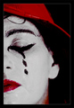
| 01/15/2008 03:55:52 AM |
Ridi pagliaccioby Rino63Comment: Red colouring on the neck is a little strange. Well composed though, the focus is slighly off on the eyelid compared to the cheak but as the eye is closed its not so noticable. |
| Photographer found comment helpful. |
Home -
Challenges -
Community -
League -
Photos -
Cameras -
Lenses -
Learn -
Help -
Terms of Use -
Privacy -
Top ^
DPChallenge, and website content and design, Copyright © 2001-2025 Challenging Technologies, LLC.
All digital photo copyrights belong to the photographers and may not be used without permission.
Current Server Time: 04/07/2025 10:06:28 PM EDT.