| Image |
Comment |
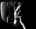
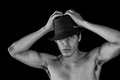
| 12/11/2007 07:56:37 AM |
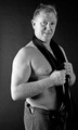
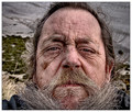
A perfect face for radio.by TacTZillaComment: cute title, but can't say I agree. I adore the lighting. Wish the image was just a tad sharper, but I can see how you may like this slightly OOF look (it goes with your hard lighting). Good use of shadow as well. |
 Photographer found comment helpful. Photographer found comment helpful. |
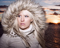
| 12/11/2007 07:55:25 AM |
Sunsetby unnevaComment: you are well lit, but the lighting on the model doesn't match the lighting on the water so it looks a bit cut and paste. Like the parka, though. Its an interesting juxtaposition to put a woman in a furry parka against a sunset, but I'm just not sure it works. |
| Photographer found comment helpful. |
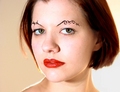
| 12/11/2007 07:54:13 AM |
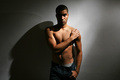
Homage to Amanda Palmerby literaryradicalComment: Lighting is smart, especially the backlighting glow along the right side of your face. Love the red lips and the fantastic expression, but some of the highlights on the face seem a bit harsh..almost blown out. Not the keenest on the crop of the top of the head, but I don't think it really damages the look of the image much. |
| Photographer found comment helpful. |
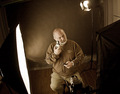
| 12/11/2007 07:52:30 AM |
selfby KrystleComment: not keen on the lighting. Compositionally, the image is a bit.. blah. Looks to me like your model (you) are a very expressive person, you should have just let some of that natural expression come across on the face, it would have done wonders for this image. |
| Photographer found comment helpful. |
| 12/11/2007 07:46:31 AM |
Aloneby iyadrallyComment: lovely tones in this image. I really like the composition and the processing. Well done! |
| Photographer found comment helpful. |
| 12/05/2007 03:13:08 PM |
|
| Photographer found comment helpful. |
| 12/05/2007 03:11:57 PM |
With one wingby nico_blueComment: like the lighting, but not the shadow created. Maybe be further from the background nextime? I don't normally like a centered composition, but it works here. |
| Photographer found comment helpful. |
| 12/05/2007 03:08:13 PM |
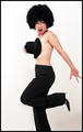
Keep touching power outlet !by fredahenryComment: great movement! Too bad parts of the leg/foot are OOF, but that's what you get when you have a moving composition and no strong flash to freeze the action. Needs a little more space for that hand on the right side of the frame. Great pose and fun model! :) |
| Photographer found comment helpful. |
| 12/05/2007 03:03:28 PM |
|
| Photographer found comment helpful. |
| 12/05/2007 03:01:01 PM |
Life in Grayscaleby FellSevenLeavesComment: you know what really would have made this photo? More negative space, no missing elbow. Otherwise, fabulous model pose and I want to say that there is something about the conversion to black and white, but I don't know what I think is wrong, so I'll leave it at that. Photo just seemed a bit underexposed. |
| Photographer found comment helpful. |
Home -
Challenges -
Community -
League -
Photos -
Cameras -
Lenses -
Learn -
Help -
Terms of Use -
Privacy -
Top ^
DPChallenge, and website content and design, Copyright © 2001-2025 Challenging Technologies, LLC.
All digital photo copyrights belong to the photographers and may not be used without permission.
Current Server Time: 04/08/2025 12:37:55 PM EDT.