| Image |
Comment |
| 01/29/2004 11:56:59 AM |
|
 Photographer found comment helpful. Photographer found comment helpful. |
| 01/29/2004 11:42:03 AM |
|
| Photographer found comment helpful. |
| 04/20/2003 07:37:14 PM |
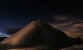
Locked in Iceby BigSmilesComment: The red/brown color showing through on the left is distracting - it'd definetly be better in black&white. |
| Photographer found comment helpful. |
| 04/15/2003 12:02:57 PM |
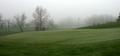
Winter rules todayby drydocComment: I like the smooth flow of lines, soft colors, and ofcourse the 'trees in the mist' thing. I would've done two things differently: 1. cropped out the dark tree in the right end of the frame, and 2. more sky, less ground. Cropping about half of the dark grass at the bottom and including just a little bit more sky for contrast. |
| Photographer found comment helpful. |
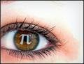
| 04/08/2003 02:23:25 PM |
'Pi' in the eye. by casualguyComment: I like the placement of the eyeball, but it's a bit shabby around the edges though. The idea is very good - trick contact lense? |
| Photographer found comment helpful. |
| 04/08/2003 01:55:27 PM |
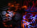
Colorful!by nathaliedooComment: Beautiful colors, and lots of movement - one of my faves so far. The metal showing through in the lower right corner is a bit distracting though. Cropping out the bottom 1/3 would improve it IMO |
| Photographer found comment helpful. |
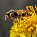
| 04/07/2003 06:04:14 PM |
Yellow by miracComment: Excellent macro shot. Having a bit more space around the flower/wasp would probably make the color contrast more interesting, but a very good shot none the less. |
| Photographer found comment helpful. |
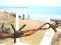
| 04/07/2003 05:53:02 PM |
"Rust"by timboydwhiteComment: An interesting idea, but it looks a bit washed out, and the background is too busy/inconsistent for my liking. |
| Photographer found comment helpful. |
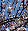
| 04/07/2003 05:48:17 PM |
Colours of springby vcosmaComment: A nice and smooth red/blue contrast, and the white works very well in it too. The green is a bit distracting though, and I think that can be fixed with simply desaturating the green color channel, although I'm not sure. This trick was discussed in the forums recently. |
| Photographer found comment helpful. |
| 04/07/2003 01:55:28 PM |
Pi and Some More Piby kandyjComment: Good idea, but it's awfully grainy. Was it on purpose?
I still like it despite the grain though |
| Photographer found comment helpful. |
Home -
Challenges -
Community -
League -
Photos -
Cameras -
Lenses -
Learn -
Help -
Terms of Use -
Privacy -
Top ^
DPChallenge, and website content and design, Copyright © 2001-2025 Challenging Technologies, LLC.
All digital photo copyrights belong to the photographers and may not be used without permission.
Current Server Time: 04/09/2025 01:23:52 PM EDT.