| Image |
Comment |
| 06/30/2006 10:16:34 AM |
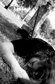
The Graveyard Wagerby escapetoozComment: Love the perspective and use of black and white on this one. People rarely like the extremely tilted horizon but I think it works in this picture especially since the headstone fits perfectly in the corner while getting a good view of the model. |
 Photographer found comment helpful. Photographer found comment helpful. |
| 06/30/2006 10:03:07 AM |
Blackeyed Peas on New Year's - Money all Year!by crikComment: Interesting superstition, I might have to give this one a try. As for the photo it seems a little flat although brightly lit. Also, I don't feel the empty space in the top right adds anything to the photo, maybe if the bills had been fanned out to take up some more of the empty space. i do like how both the calendar and money run off the edges in opposite corners. |
| Photographer found comment helpful. |
| 06/30/2006 09:59:02 AM |
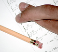
Math Final Exam...by ApeeComment: Point is clearly made with this one and I think most of us have been there. The lighting does seem a little bright (at least I've never been in a classroom that bright). Have the studio lights melted the eraser on the pencil? :) |
| Photographer found comment helpful. |
| 06/30/2006 09:57:13 AM |
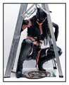
Black Cat Under The Ladder!by KitaComment: Nice setup and lighting in this one. The broken mirror and whip are really unnesessary. I think having the black cat under the ladder, probably engaging the viewer with her eyes would have made for a better photo and help keep the photo more focused. |
| Photographer found comment helpful. |
| 06/30/2006 09:53:34 AM |
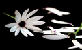
Of course he loves me and I've got the daisies to prove itby tinky2Comment: Good attempt but there seems to be something lacking in this photo. Maybe it's because the daisies appear to be in a black hole. I would also like to see more daisies that have been pulled apart to really show that she has spent some time in finding that one that ends with "He loves me". |
| Photographer found comment helpful. |
| 06/30/2006 06:42:57 AM |
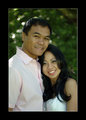
Sokpul and Victoriaby cabaComment: Wow, that is too bad about him being out of focus. Other than that though I don't see anything else you could really improve on. Very nice pose, smiles, and lighting. |
| Photographer found comment helpful. |
| 06/29/2006 02:54:28 PM |
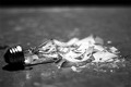
Lights out!by acrotideComment: One of the best of the lightbulb entries. Hard to decide if I like the black bar at the top but I think I'm leaning to cropping it out. |
| Photographer found comment helpful. |
| 06/29/2006 12:41:30 PM |
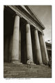
Ex Votoby Rino63Comment: I have to agree with the previous comment that the angle is great in this photo, I like how the steps balance out the sky above. And the color tone of the photograph is a good match for this photo. Only nitpick would be the small bit of bright building we see along the right edge in the middle but that could go either way. |
| Photographer found comment helpful. |
| 06/29/2006 12:36:43 PM |
nowhere but upby skewsmeComment: I think this would have made a fine entry for the Desolation challenge. A couple of things about the photo. The natural framing on the right seems to be the tree with the ladder against it so the darker area beyond it doesn't seem to fit with the picture especially since everything is so close to us but beyond the tree it is further away and in darker shadow. I would also like to see a little breathing room at the bottom of the photo, it seems to be cut quite close to the junk there.
On a side note I do like how even though you have the desolation theme we also see life springing up around it in the form of the young trees. |
| Photographer found comment helpful. |
| 06/29/2006 12:11:34 PM |
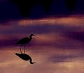
Heron 30055.jpgby kari1Comment: Nice capture on this one, great pose by the bird and great lighting. It seems there is some haloing around the bird, maybe from too much sharpening(?) if it's due to saving for web then disregard. The only change I would like to see is to crop some of the dark off the top edge, it's nice that the photo progresses from light to dark but there is just no need for that much dark space up there. |
| Photographer found comment helpful. |
Home -
Challenges -
Community -
League -
Photos -
Cameras -
Lenses -
Learn -
Help -
Terms of Use -
Privacy -
Top ^
DPChallenge, and website content and design, Copyright © 2001-2025 Challenging Technologies, LLC.
All digital photo copyrights belong to the photographers and may not be used without permission.
Current Server Time: 04/07/2025 10:15:00 PM EDT.