| Image |
Comment |
| 07/10/2006 10:38:38 AM |
Dessert in Bloomby LucidLotusComment: I love the purple tones in this picture, first of all. I'm not especially big on frames, and IMO, the purple frame isn't really helping the image. And if it's not actively helping, get rid of it. Removing the brown in the lower corner and the caramel would also help the image, IMO. For me, what I love about this picture is the cool colors, and those two sets of warmer browns are detracting from the color composition of the image.
Just what would have helped me like it a little more. As it stands, I do like the image, and if I had voted on this challenge, I probably would have been one of the people raising your avg. |
 Photographer found comment helpful. Photographer found comment helpful. |
| 07/07/2006 08:13:58 AM |
|
| Photographer found comment helpful. |
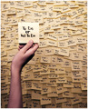
| 07/07/2006 08:13:16 AM |
... That's the Question by DjabordjaborComment: Great, and well executed idea. Is that huge peice of dust on your sensor? (As with the last guy with dust, I won't hold it against you) Great shot! |
| Photographer found comment helpful. |
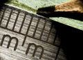
| 07/07/2006 08:11:15 AM |
Metric Metalby jimnessComment: Nice lense. Haha, the paper isn't even in focus - wonder how thick that ruler was? Maybe 1mm or something. I like the texture of the metal ruler.
GO METRIC! |
| Photographer found comment helpful. |
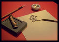
| 07/07/2006 08:09:22 AM |
Chinese love letterby kat75Comment: Tonal quality of the image is great IMO. i like the effect and the lines of the 'pens' in the image. |
| Photographer found comment helpful. |
| 07/07/2006 08:08:32 AM |
|
| Photographer found comment helpful. |
| 07/07/2006 08:05:32 AM |
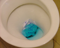
Goodbye, my Love...by pikwolComment: What I like: funny, did the ink dye the water blue?
What might improve it: Pictures of a toilet are probably really hard to get a good score on, unless maybe they are INSANELY CLEAN and sterile looking. Which would require a pure white toilet with lots of color adjustments probably. |
| Photographer found comment helpful. |
| 07/07/2006 08:05:28 AM |
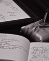
Wedding Stationeryby twm122Comment: What I like: Black and white is nice. Location of the best wishes in the image.
What might improve it: brightening the image up some might help |
| Photographer found comment helpful. |
| 07/07/2006 07:50:38 AM |
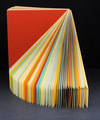
Sampler Revolvedby rioloboComment: What I like: Good composition, color, and light.
What might improve it: A more defined color scheme may have been beneficial. For instance, all primary colors or some other set of colors. |
| Photographer found comment helpful. |
| 07/07/2006 07:47:56 AM |
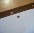
Light Slips Through Holesby right_fieldComment: What I like: the horizontal and vertical lines are nice.
What might improve it: The glare needs to go! Also, it seems like you may have compressed the image too much. |
| Photographer found comment helpful. |
Home -
Challenges -
Community -
League -
Photos -
Cameras -
Lenses -
Learn -
Help -
Terms of Use -
Privacy -
Top ^
DPChallenge, and website content and design, Copyright © 2001-2025 Challenging Technologies, LLC.
All digital photo copyrights belong to the photographers and may not be used without permission.
Current Server Time: 04/18/2025 09:26:24 PM EDT.