| Image |
Comment |
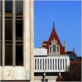
| 02/05/2008 07:27:52 AM |
2 Capitol Plazaby Donna21Comment: Very unique angle and way to shoot this. I dont know how to feel about the 2. Its different, thats for sure, but I am very interested more with the building in the background, and would play with the idea of zooming in more on that. Still technically solid and a good shot! |
 Photographer found comment helpful. Photographer found comment helpful. |
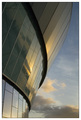
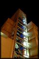
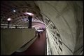
| 02/05/2008 07:26:38 AM |
Echo Arena Sunsetby pffreeComment: Very beautiful lighting, nice shape, and great job catching the reflection. Looks like a great picee of architecture, and you found a good angle to shoot it at! Nice work |
| Photographer found comment helpful. |
| 02/05/2008 07:25:32 AM |
Melbourne Exhibition Centre ("Jeff's Shed")by vladoComment: Very beautiful subject. I wish the sky was blue, to ad more contrast! I think that pulling back a little and seeing the edges of the thing leaning out of the frame may have helped. Still a very nice shot! good work |
| Photographer found comment helpful. |
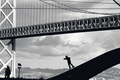
| 02/05/2008 07:20:26 AM |
Skatin' the Architectureby ShannonLeeComment: Very nice picture, though I think that the people take away from the architecture that this challenge is about a bit too much. Nice sky, and great technique. Still a very nice shot, just pulls away from architecture to much for me |
| Photographer found comment helpful. |
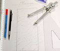
| 02/05/2008 07:18:10 AM |
Student Architectby AlexgioComment: Definately a creative approach to architecture. The only thing my eye gravitates to though, is the blue pen. I think that this takes to much attention away from the photo. |
| Photographer found comment helpful. |
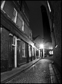
| 02/04/2008 08:33:37 PM |
Victorian Terraceby QuasimojoComment: Very cool location and lighting. Could have a bit more contrast to me. I love the street in this picture. Definately caught at the right time of day/night. Good wirk |
| Photographer found comment helpful. |
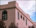
| 02/04/2008 07:02:45 PM |
Justice for Allby wardmacComment: Very unteresting approach and cool building. I think the whites may be a little hot for me. It almost looks cut out as well, as the whites seem TO perfect, and it seems to have some reflection of blue around the outside lines of the building. Regardless, nice shot and good work! |
| Photographer found comment helpful. |
| 02/04/2008 07:01:37 PM |
Stairway to Healthby missxmiseryComment: Very nice blues mixed in there, those make the shot. Maybe a little hot in spots, but still a good exposure. Good contrast and texture as well. Nice shot |
| Photographer found comment helpful. |
| 02/04/2008 07:00:32 PM |
Moroccan Afternoonby RolandBComment: I think this shot would have benefited from being a little more saturaded and had some more contrast thrown in. Good shot, and worth playing with in PS |
| Photographer found comment helpful. |
| 02/04/2008 06:59:46 PM |
Shapes and Shadowsby CreatureComment: Very cool angle, and architecture. The florescent sign with the arrow is pretty distracting. Like the lighting and exposure. Good shot |
| Photographer found comment helpful. |
Home -
Challenges -
Community -
League -
Photos -
Cameras -
Lenses -
Learn -
Help -
Terms of Use -
Privacy -
Top ^
DPChallenge, and website content and design, Copyright © 2001-2025 Challenging Technologies, LLC.
All digital photo copyrights belong to the photographers and may not be used without permission.
Current Server Time: 04/08/2025 07:50:59 AM EDT.