| Image |
Comment |
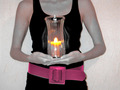
| 04/03/2007 05:59:07 AM |
Psychoby daboardergirlComment: You got three of the items in there SO well, the vase just seems a little removed- although you tie it in nicely with the title. I only would have brightened the top of the head a bit- to better show the belt. :) |
 Photographer found comment helpful. Photographer found comment helpful. |
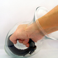
| 04/03/2007 05:50:48 AM |
Monkey Trapby jgriecoComment: Nice and clear. If anything I would have tried t get some light on the underside of the hand. |
| Photographer found comment helpful. |
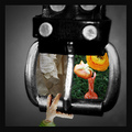
| 04/03/2007 05:49:32 AM |
The Windowby escapetoozComment: The concept is great, although it took me a second to see the belt (do'h).
But because the two different windows are showing something so different (at different distances, lighting, and angle) I just can't except the "window" concept. I'm loving the bird body part :) |
| Photographer found comment helpful. |
| 04/03/2007 05:47:14 AM |
Rawr...by LonzComment: DNMC 640x640
Great lighting though...:( |
| Photographer found comment helpful. |
| 04/03/2007 05:46:45 AM |
Not quite changed yet.by tmphComment: DNMC 640x640
This is soo good. :( It's really a creative one (way to stick to the single body part) The editing looks wonderful and the angles are capturing. If anything- I would have changed the background color a bit, but only to seperate the hand from it. Great job! |
| Photographer found comment helpful. |
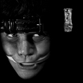
| 04/03/2007 05:42:16 AM |
Aeonium Schwarzkopfby OdedComment: DNMC- Body Part...white cloth?
Sorry to be so cut and dry. The Challenge purpose is to try and 'fit' all of those random objects into a single picture. Maybe the board didn't explain that well in the details...I can't speak for them. As far as the actual photograph goes- you placed it because it fit the 'vase' requirment- but the vase itself is underexposed and hidden. The flowers are nothing special to me- it looks like flowers that I've seen before and it's from an angle that I've seen them at.
I hope this helps a bit. |
| Photographer found comment helpful. |
| 04/02/2007 09:05:30 PM |
Shine Your Lightby kellyrc01Comment: Aside from the obvious- DNMC 640x640
The effect on the skin and the shadows on the wall are both kind of unpleasant... IMHO. |
| Photographer found comment helpful. |
| 04/02/2007 06:15:19 PM |
|
| Photographer found comment helpful. |
| 04/02/2007 06:14:39 PM |
|
| Photographer found comment helpful. |
| 04/02/2007 12:34:58 PM |
|
| Photographer found comment helpful. |
Home -
Challenges -
Community -
League -
Photos -
Cameras -
Lenses -
Learn -
Help -
Terms of Use -
Privacy -
Top ^
DPChallenge, and website content and design, Copyright © 2001-2025 Challenging Technologies, LLC.
All digital photo copyrights belong to the photographers and may not be used without permission.
Current Server Time: 04/07/2025 10:06:20 PM EDT.