| Image |
Comment |
| 02/03/2003 09:15:49 AM |
Laid Backby sahkoComment: I love this. What a cute kitten. I love the lighing on this. I hope you don't get tons of comments about the overexposed light. I think it is great, your composition and DOF are perfect. |
 Photographer found comment helpful. Photographer found comment helpful. |
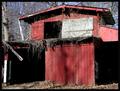
| 02/03/2003 09:12:04 AM |
Abandoned Shedby BAMartinComment: "Critique Club Comment"
COMPOSITION- Very nice subject for the challenge. The red color is great. The angle you shot this at is ok, however it feels to be leaning slightly to the left. Your lighting is good on this. You've filled the frame nicely and it works for this kind of shot.
BACKGROUND- There is not really a background here. The barn fills the frame nicely.
CAMERA WORK- As mentioned above, it is slighty tilting. I wonder how it would have looked at a different place. It might have given it more depth. Shutter and aperature are great, no super highlights or underexposed areas.
POST PROCESSING- you've done good at resizing the shot. Saturation and everything are perfect.
MY OPINION- I like photo's of old buildings. This is very nicely shot, but to me it kind of lacks some depth and just feels flat. |
| Photographer found comment helpful. |
| 02/02/2003 08:25:11 PM |
Noseyby SquiffyeitherjagComment: The angle you shoot this at is perfect. He's a beaut. My critique on it would be to have a slightly bigger DOF or focus on his eye. It looks like the camera was confused and focused right between his eye and nose. I think it would be perfect if that was done. These shots are hard to take, my parents cats always move. |
| Photographer found comment helpful. |
| 02/02/2003 08:08:37 PM |
|
| Photographer found comment helpful. |
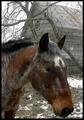
| 02/02/2003 08:06:10 PM |
A Horse is a Horseby erin_m02Comment: This is a very great photo of the horse. When the picture first loaded up I thought that the top part of the photo is a little wasted space. I think you should crop closer to the horse. The color on him is great. |
| Photographer found comment helpful. |
| 01/27/2003 10:19:55 PM |
|
| Photographer found comment helpful. |
| 01/27/2003 09:40:28 PM |
Sun Drenchedby GraciousComment: I love how you've done the color on this. I'd like to learn how you did this. |
| Photographer found comment helpful. |
| 01/19/2003 10:12:13 PM |
|
| Photographer found comment helpful. |
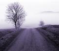
| 01/19/2003 05:19:49 PM |
Road to Fogginessby kiwinessComment: Great tones and lighting in this. I like how you've centered the road and it kind of just disappears. |
| Photographer found comment helpful. |
| 01/13/2003 02:18:30 PM |
Alle Menschen frei und gleich (New Year wish)by AzrifelComment: Hahahaha, I just got done reading your critique on my picture and came to this to critique some while I have time. This is random and I clicked on it and I got your shot.
~Critique Club Comment~
COMPOSITION- Composition is perfect on this. I like the use of thirds here and the cork is not centered. There is the same amount of space between the cork and the right of the shot and the bottle and the left of the shot. The subject is perfect for the theme of the challenge.
BACKGROUND- The aperature you used is perfect for the DOF in this shot. The choice to not go wide enough to totally blur out the writing on the bottle was good. The white was a good choice for a background. I thought of what it may look like in black but it would have been less of an impact on the black part of the bottle.
CAMERA WORK- Shutter speed and aperature are good. See comment above. I like that the bottle is still readable. The detail on the cork is very good.
DIGITAL PROCESSING- I don't see any hint of compression or artifacts. From the comments on my latest shot, you know the benifits of saving the largest file size you can for details.
MY OPINION- I had really liked this on during the voting of the challenge. It was in my top 3 or 4 in voting. I think technically it is almost perfect (the cork looks like it is tipping slightly) This is a great shot! |
| Photographer found comment helpful. |
Home -
Challenges -
Community -
League -
Photos -
Cameras -
Lenses -
Learn -
Help -
Terms of Use -
Privacy -
Top ^
DPChallenge, and website content and design, Copyright © 2001-2025 Challenging Technologies, LLC.
All digital photo copyrights belong to the photographers and may not be used without permission.
Current Server Time: 04/07/2025 10:15:22 PM EDT.