|
|
| Image |
Comment |
| 05/08/2006 07:40:41 PM | Snohomish Invitational GU-13 Finalsby margiemuComment: From the CTP MkII
Disclaimer: The following crits are personal opinions, not photographic dogmas. Please see them as suggestions, not claims of mastery nor a show of hauteur.;p
First Impression: Wow, girlie football. However, a 4 from me (sorry...-_-") as the colors are a bit washed out and the shot lacks punch.
Composition: 5. The action's nice, but the background's too distracting it takes a lot from the shot. Hey, at least the ball's there.
Subject: 6. Girlie soccer's cool, but I'm not too wild over it. You got the action, which MAKES the shot, so that's cool. Digressing, the chick in red looks a wee bit like a dude, IMO. Sorry...
Technical: 4. Focus is a bit off, coloure a bit washed out, exposure a bit over-, um, exposed, and, well, the whole thing's a bit flat -- which you, however, could improve with pp. Well, a lot of pp.
Improvement: Recompose, maybe from another lateral and/or higher angle. Also, a lot of pp: a wee bit of dodging and burning, levels maybe or curves, saturate, and sharpen.
Summary: I hope I didn't sound too harsh. It's a good shot... it only needs some refinement. I'm a number too short on screws in the head so please do not be offended.;p Message edited by author 2006-05-08 23:41:52. |  Photographer found comment helpful. Photographer found comment helpful. |
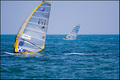
| 05/08/2006 06:39:43 PM | E-71 wins again the World Championship of Windsurfby alexgarciaComment: From the CTP MkII
Disclaimer: The following crits are personal opinions, not photographic dogmas. Please see them as suggestions, not claims of mastery nor a show of hauteur.;p
First Impression: 6 or 7, for visual appeal. Also, I can imagine it appearing alongside a windsurf article.
Composition: 4 or 5, because there's too much space behind the sails and too little in front of and above them.
Subject: 6, 'cuz windsurfing rocks. Not a fan of half-naked men images so I'm fine with having them behind the sails(j/k). It would've been another issue had they been doing acrobatics and shit.;p
Technical: 6. I'd say it's a spot-on exposure, if not very very slightly underexposed. The vibrant colors add a lot to the visual appeal. I, however, find the water a tad too green, the sky a tad too flat, and the yellow in the sails a tad too saturated. But that's just me.;)
Improvement: Re-compose to the right and below, tweak the colors, and have explosions in the background(j/k).
Summary: You're the first on the list so you're my first critiquee. I'm a number too short on screws in the head so please do not be offended.;p Message edited by author 2006-05-08 22:44:03. | | Photographer found comment helpful. |
| 04/20/2006 06:40:24 PM | | | Photographer found comment helpful. |
| 04/20/2006 06:34:28 PM | Rustby racurvComment: Had you shot this at sunrise- or sunset-time, bumped up the contrast, moved [or zoomed] in a bit closer, or cropped out the distracting white wood stuff and OOF foliage below, this would've gotten a ten from me.
Yours was such a kickass subject and would've been a kickass photo, IMO. | | Photographer found comment helpful. |
| 04/20/2006 06:21:35 PM | | | Photographer found comment helpful. |
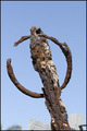
| 04/20/2006 06:15:19 PM | Rusted Frameby igameraComment: Rusty frame... for a title as such, I would expect to SEE rust, not have to look for it.
I don't think this would sit well with the general populace of this site, being as it is a photograph of a photograph. Also, there's one too many "border-haters" in this site than what is healthy and, TTYTT, borders other than black or white are marked down faster than you could say pwet so I suggest you stick to black, white, or no borders.
This photo's okay, if not a bit too washed out. I, however, find it strangely familiar and, to some extent, touching. So I am giving this a 10. | | Photographer found comment helpful. |
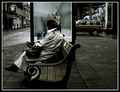
| 03/26/2006 08:23:56 PM | Bench Sitting: One of Life´s Finer Comfortsby gsalComment: yer colors gladden me eyes, but yer composition bothers me...
methinks photo would've worked better if the subject was off-centered and the focus was sharper...
bangin' photo anyways! | | Photographer found comment helpful. |
| 03/26/2006 05:09:01 PM | "Reely" Creepyby dahvedComment: too much noise for my tastes...
try using noise reduction softwares i.e. noise ninja or neat image | | Photographer found comment helpful. |
| 03/26/2006 05:05:16 PM | backby haakkyComment: i think this would've been better black and white with the tattoo being more prominent.
nice photo though! | | Photographer found comment helpful. |
| 03/24/2006 12:51:56 AM | Galeanaby gpalosComment: [rubs chin]
this church looks a bit familiar to me... | | Photographer found comment helpful. |
Home -
Challenges -
Community -
League -
Photos -
Cameras -
Lenses -
Learn -
Help -
Terms of Use -
Privacy -
Top ^
DPChallenge, and website content and design, Copyright © 2001-2025 Challenging Technologies, LLC.
All digital photo copyrights belong to the photographers and may not be used without permission.
Current Server Time: 04/07/2025 10:18:15 PM EDT.
|