| Image |
Comment |
| 12/05/2007 04:23:57 AM |
|
 Photographer found comment helpful. Photographer found comment helpful. |
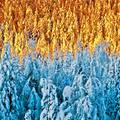
| 12/05/2007 04:22:23 AM |
Promises Madeby JeffryZComment: very nice shot, like the duo-tone color, good use of lines. horizon in middle should have been avoided. not sure what the connection to topic is |
| Photographer found comment helpful. |
| 11/29/2007 12:39:00 PM |
Colder & Colderby korpenComment: very very interesting picture, un-worldly light and great complimentary colors. on calibrated monitor even better. good use of square crop. 9 |
| Photographer found comment helpful. |
| 11/29/2007 12:29:21 PM |
|
| Photographer found comment helpful. |
| 11/29/2007 12:29:17 PM |
Can you see him, too?by shalrathComment: nice shot, like the way the colors stand out from the bw-like crowd. nice pose of the subject and clearly different from the crowd, well done. perhaps a thighter crop on top to get rid of cement would enhance it. 8 |
| Photographer found comment helpful. |
| 11/29/2007 12:29:11 PM |
A Lone Nutby PGerstComment: nice concept, good execution. works as a stockphoto aswell. like the colors and lighting, good use of oof areas. perhaps a thighter crop could work 8 |
| Photographer found comment helpful. |
| 11/29/2007 06:10:19 AM |
Always had to be differentby MelethiaComment: really like this shot, interesting composition, good use of colors to stand out. top left fish is a bit distracting as it looks closer to the camera than the rest. light a bit strong as shadows are thick. perhaps a sqaure crop using the yellow fish would enhance it. 7 |
| Photographer found comment helpful. |
| 11/29/2007 04:54:00 AM |
|
| Photographer found comment helpful. |
| 11/29/2007 04:52:42 AM |
I'm so blueby bbohComment: good idea but execution is lacking. light doesnt enhance the picture, good use of colors but the dirty whites distract. composition is too much top right imo. like the square crop. with a bit more work could really shine. |
| Photographer found comment helpful. |
| 11/29/2007 04:49:45 AM |
22 Degrees Fahrenheitby lkn4truthComment: great shot and topic, but somehow doesnt convince. the 75 girl is a bit distracting perhaps a more focussed crop on the guy and the looking child would enhance it. colors actually distract here try bw |
| Photographer found comment helpful. |
Home -
Challenges -
Community -
League -
Photos -
Cameras -
Lenses -
Learn -
Help -
Terms of Use -
Privacy -
Top ^
DPChallenge, and website content and design, Copyright © 2001-2025 Challenging Technologies, LLC.
All digital photo copyrights belong to the photographers and may not be used without permission.
Current Server Time: 04/19/2025 02:26:06 AM EDT.