| Image |
Comment |
| 12/01/2002 08:56:00 PM |
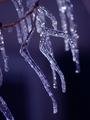
Icy Coldby RiderGalComment: disregard any other comments on how you used depth of field. i think it works perfectly. it really makes this picture. 9 |
 Photographer found comment helpful. Photographer found comment helpful. |
| 12/02/2002 07:26:00 PM |
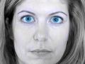
Portrait in Blueby kathleenmComment: generally, a good idea, if very common this challenge. i would have a liked a different pose (more blue looking, i guess) and the yellow in the skin is really distracting. |
| Photographer found comment helpful. |
| 12/01/2002 08:50:00 PM |
|
| Photographer found comment helpful. |
| 12/01/2002 03:27:00 PM |
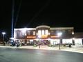
Grand Openingby ClubJuggleComment: straighten, crop. the lights are interesting, but the black sky and road would waste a lot of space on a newspaper front page. |
| Photographer found comment helpful. |
| 12/01/2002 05:13:00 AM |
Waters over Troubled Bridgeby ioComment: every once in a while a title here actually makes me laugh. the picture itself might be a little better (and funnier) if the sign were emphasized somehow, but i'm not sure how you could fit that and the bridge in at the same time because of the funny angle (without sitting in the water), and cropping it differently wouldn't yield any acceptable results. the red object on the right and the car are a little distracting. maybe a change in dof, or desaturation of the reds would help. |
| Photographer found comment helpful. |
| 12/01/2002 03:43:00 PM |
|
| Photographer found comment helpful. |
| 12/01/2002 05:00:00 AM |
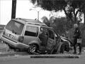
Don't Drink and Drive by byetkoComment: i know everyone else probably left the same comment, but i think the title hurts this picture. it's a great shot, well composed, and definitally the sort of thing you would see on a front page of a local newspaper. something like "Driver charged with DUI in fatal wreck" would have been a lot better. but i'm not gonna mark off for it, because this is a photography site, and not a "name that picture" site. i think i'll give it a 9. |
| Photographer found comment helpful. |
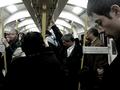
| 12/01/2002 03:31:00 PM |
More Delays on the London Undergroundby KonadorComment: very interesting photo. the contrast of the black at the bottom and white and the top really works. the angles are interesting. the overall lack of colors other than yellow and skintones, and the muting of those makes it look cold and mechanical. ...and kinda like penguins. beware the penguins. 10? yeah, 10. |
| Photographer found comment helpful. |
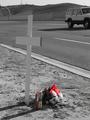
| 12/01/2002 05:27:00 AM |
Roadside Remembranceby myqylComment: nice use of channel desaturation. i can't believe people even get called on this anymore. not sure it's standard photojournalist procedure, but it definitally works for the shot. |
| Photographer found comment helpful. |
| 11/17/2002 06:53:00 PM |
|
| Photographer found comment helpful. |
Home -
Challenges -
Community -
League -
Photos -
Cameras -
Lenses -
Learn -
Help -
Terms of Use -
Privacy -
Top ^
DPChallenge, and website content and design, Copyright © 2001-2025 Challenging Technologies, LLC.
All digital photo copyrights belong to the photographers and may not be used without permission.
Current Server Time: 04/09/2025 10:01:33 AM EDT.