| Image |
Comment |
| 10/24/2005 08:26:10 AM |
|
 Photographer found comment helpful. Photographer found comment helpful. |
| 10/24/2005 08:23:43 AM |
|
| Photographer found comment helpful. |
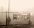
| 10/24/2005 08:22:35 AM |
Historyby A ShrubberyComment: Good subject - but IMHO it need to be moved out of the center of the image. |
| Photographer found comment helpful. |
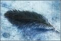
| 10/24/2005 08:17:51 AM |
Solaceby datcatComment: The feather it too centered to suit me. Showing more of the backgroud I think would improve the image. |
| Photographer found comment helpful. |
| 10/24/2005 08:16:36 AM |
|
| Photographer found comment helpful. |
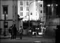
| 10/24/2005 08:14:52 AM |
Desolation by Joey LawrenceComment: hard to say what I would do here - I feel like there is too much on either edge of the image and want to crop it a bit on both sides. At the same time I think it works much better in a landscape formate - so perhaps creating more horizonal space between the man and the building would have been more appealing. |
| Photographer found comment helpful. |
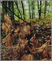
| 10/24/2005 08:12:07 AM |
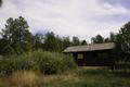
Deadfallby Bear_MusicComment: I like it much better with half or more of the brown bottom croped out. |
| Photographer found comment helpful. |
| 10/24/2005 08:07:22 AM |
|
| Photographer found comment helpful. |
| 10/21/2005 02:51:16 AM |
Fall Reflectionsby photogenixComment: A polarizing filter or something to get rid of the glare on the water would have helped bring out the reflection better. |
| Photographer found comment helpful. |
| 10/20/2005 08:00:25 AM |
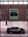
Black Noonby taterbugComment: I like the double reflections - window and car, but I would crop out the white at the top of the image. |
| Photographer found comment helpful. |
Home -
Challenges -
Community -
League -
Photos -
Cameras -
Lenses -
Learn -
Help -
Terms of Use -
Privacy -
Top ^
DPChallenge, and website content and design, Copyright © 2001-2025 Challenging Technologies, LLC.
All digital photo copyrights belong to the photographers and may not be used without permission.
Current Server Time: 04/08/2025 06:16:04 AM EDT.