| Image |
Comment |
| 08/27/2006 08:37:15 PM |
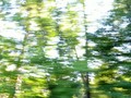
Take Me Home...by SJCarterComment: Where is this subject of your image? It looks like a nice place for a drive. 6 for this challenge, higher if it wasn't in the 'Image without a Subject' challenge, maybe the 'Free Study' instead. |
 Photographer found comment helpful. Photographer found comment helpful. |
| 08/27/2006 08:31:55 PM |
|
| Photographer found comment helpful. |
| 08/27/2006 08:18:19 PM |
|
| Photographer found comment helpful. |
| 08/24/2006 05:29:00 PM |
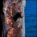
Rustic Charmby sherpetComment: Great capture of textures. I don't like the reflection in the rusted metal, but I'm not sure if anything could be done about it. I'd like to try something like this (if I could find this kind of subject) with a polarizer filter to see if it would eliminate or at least reduce the reflection. |
| Photographer found comment helpful. |
| 08/20/2006 04:54:48 AM |
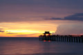
light-sunset.jpgby naplesmuscComment: Even before I read your comments regarding the composition, I was going to say that I like your choice to place the pier right where it is in the frame. It's a great sky, and the pier sets it off just right. |
| Photographer found comment helpful. |
| 08/20/2006 04:51:06 AM |
|
| Photographer found comment helpful. |
| 08/19/2006 07:22:57 AM |
'Hot Rod'by taljComment: I thought, when I saw this photo just now, that I had already commented on it. Now I remember, I posted this one in the thread "Pick your favorite pic from the person above you".
I like the simplicity of this pic along with the striking contrast between the red and the white against the black background. I also like the diagonals starting with the stem in the bottom left corner, leading towards the centered flower with the two parts of the flower also reaching diagonally towards the opposite corner. |
| Photographer found comment helpful. |
| 08/19/2006 06:08:23 AM |
Damselflyby ImagineerComment: Nice shot, good composition and great detail, especially in the wings. |
| Photographer found comment helpful. |
| 08/19/2006 05:51:35 AM |
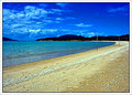
Blue Skies & Golden Sandsby sherpetComment: I like the colors and the composition in most of the photos from your vacation. However, they all look a bit over-processed. They seem very soft, but at the same time oversharpened. The colors appear to be over saturated or the contrast levels boosted too much. I've noticed that this will have a detrimental effect on the sharpness of the final pic. This is the most evident in this one and it looks like the Shadow/Hightlight tool was used a little too much also.
In a lot of your more abstract works this can be done with good artistic results, but when it comes to capturing beautiful landscapes, sometimes you've got to let the camera do most of the work. You've got a good camera, so in this case, I think "less is more".
I don't know for sure what your post-processing steps were, just that this is the way it looks to me. I apologize if I'm way off here. |
| Photographer found comment helpful. |
| 08/12/2006 07:46:58 AM |
06:49by alexgarciaComment: I like the sharpness and the contrast in the face of the clock. |
| Photographer found comment helpful. |
Home -
Challenges -
Community -
League -
Photos -
Cameras -
Lenses -
Learn -
Help -
Terms of Use -
Privacy -
Top ^
DPChallenge, and website content and design, Copyright © 2001-2025 Challenging Technologies, LLC.
All digital photo copyrights belong to the photographers and may not be used without permission.
Current Server Time: 04/18/2025 01:49:31 PM EDT.