| Image |
Comment |
| 10/01/2007 07:30:03 PM |
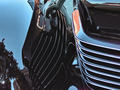
Art Deco Reflectionsby dtremainComment: Low vote, really had to work hard to figure it out, i guessed truck right away but to determine what the photo is trying to convey or show i still can't aside from a reflection and really diff perspective that doesn't work. |
 Photographer found comment helpful. Photographer found comment helpful. |
| 10/01/2007 07:27:34 PM |
Always something to smile about...by NowaytotellComment: low vote, Its a happy child's face...maybe that should deserve a 10 on its own but as for the picture itself, eh... it looks straight point and shoot (not refering to type of camera). |
| Photographer found comment helpful. |
| 10/01/2007 06:38:26 PM |
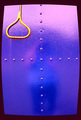
Lockby VeioletsComment: Voted low, not sure what is trying to be conveyed... i would be cautious with this type of border on future challenges as it seems to add a shape to the picture that wasn't there. |
| Photographer found comment helpful. |
| 10/01/2007 06:23:36 PM |
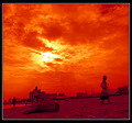
Sunsetby zxaarComment: Voted low, the sky is interesting and is nice shade. The slanting though adds nothing to the perspective and the picture seems a bit random with no subject to that stands out |
| Photographer found comment helpful. |
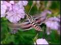
| 10/01/2007 06:20:07 PM |
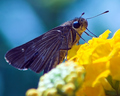
Stopping by for a Drinkby NobodyComment: Voted low, no interesting detail on the moth that is appealing.... its monochrome color pretty much and doesn't flow with brightness of the flowers and pastel background. |
| Photographer found comment helpful. |
| 10/01/2007 06:14:21 PM |
One by elizadebComment: Voted on low side,
The white contrast adds a little but the subject is not unique enough to make him appealing. He is centered on the bench and would have prefered to have him on either end. The crop cuts off just a peice of the bench, would like to see either more of the bench cut off or have it entirely visible. Can barely make out the drink and seems placed unnaturally. |
| Photographer found comment helpful. |
| 10/01/2007 05:51:24 PM |
canalby Emma_RoseComment: Voted on the low side,
Through no fault of your own, the size limitation doesn't do this picture justice... normally i can look past that if the scene is interesting enough and i can pick out enough detail.
In this case i can't and the detail would only come visible in a larger size.
2nd part is the soccer field. You have beautiful shade of purple on the horizon , soft lights and then this bright white patch on the right. Its like looking at stars and then having a car turn on its headlights in front of your... eyes flow toward the light. |
| Photographer found comment helpful. |
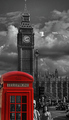
| 10/01/2007 05:39:42 PM |
Icon x2by wingyisleedsComment: Voted on low side, the selective coloring draws my attention to the phone booth, but once there does nothing. The backdrop looks dreary and uninteresting (contrary to what its like when viewing it irl). Find it cropped too tightly and maybe coloring would have worked on a wider crop or in a street candid. |
| Photographer found comment helpful. |
| 10/01/2007 05:22:12 PM |
Beautiful Mothby MoatzComment: Voted on the low side... the colors are a little on the plain side for me, I would not have known this was a moth without reading your title. I think the beauty in moths/butterflies comes from their wings which which are blurred to where you almost can't make them out. Missing sharpness on the body of the moth and flower its landing on.
Do like that it wasn't a humming bird trying to be captured again and would like to see another attempt at this. If the stop motion could be captured it could be quite nice. |
| Photographer found comment helpful. |
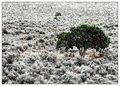
| 10/01/2007 12:14:25 PM |
Desert Topiaryby pointandshootComment: Not sure if a filter was used here or if it was standard PP, rated the picture low either way. Very blotchy and nothing really appealing. Colors (red, green, yellows etc) on the ground don't look natural or fit. Diff take on lone tree in feild type picture but doesn't work for me. |
| Photographer found comment helpful. |
Home -
Challenges -
Community -
League -
Photos -
Cameras -
Lenses -
Learn -
Help -
Terms of Use -
Privacy -
Top ^
DPChallenge, and website content and design, Copyright © 2001-2025 Challenging Technologies, LLC.
All digital photo copyrights belong to the photographers and may not be used without permission.
Current Server Time: 04/09/2025 01:23:53 PM EDT.