| Image |
Comment |
| 04/26/2005 11:22:57 PM |
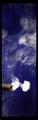
Shot Gun Smoke Ringby sofapComment: Interesting concept, and very pretty. I'm very curious to see if you get any complaints about the size, since you didn't max out the image dimensions in either direction, and have a border to boot, but it didn't bother me. |
 Photographer found comment helpful. Photographer found comment helpful. |
| 04/26/2005 11:21:10 PM |
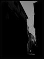
Brief encounterby jjbeguinComment: This is one of those odd images where I can go through the checklist and have everything technically correct (non-tedious background, obvious subject, sharpness), but somehow the result lacks any emotive force, despite having had shadow and light set up specifically for it. I'm not sure if that's helpful, but it's the best I can describe why I find it unappealing. |
| Photographer found comment helpful. |
| 04/26/2005 11:18:27 PM |
Exposed shellby BigMoComment: The color draws the eye immediately to the shell, and the background is interesting without being distracting. Good. |
| Photographer found comment helpful. |
| 04/26/2005 11:17:44 PM |
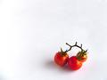
Farm Fresh!by richabhatiaComment: Nice color contrast, but the pure white is both harsh and tedious, even with the slight changes in shading and darkened corner (which actually just seems misplaced or accidental). The water drop on the tomato adds interest, and I can't help but think that if there had been beaded water droplets on the background, that would have broken the monotony nicely. |
| Photographer found comment helpful. |
| 04/26/2005 11:12:53 PM |
|
| Photographer found comment helpful. |
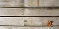
| 04/26/2005 11:12:10 PM |
The Herald of Winterby julieparsonsComment: An interesting concept. The color of the leaf immediately draws the eye, and the background avoids being tedious. My only objection is that the joining of the boards at the center draws the eye away from the subject, and the lighter boards on the left are a bit harsh. Cropping or reframing just shy of the seam would have improved the image, even if the subject took up a little more space as a result. |
| Photographer found comment helpful. |
| 04/26/2005 11:06:25 PM |
Crystal, stone and lightby rbennyComment: If that's supposed to be a crystal marble, I think you got ripped off. The light from it is dull, making it look like tarnished glass, plastic, or resin. The texture of the stone is nice, as is the shadow, and the red... something... adds an interesting note to the subject. |
| Photographer found comment helpful. |
| 04/26/2005 11:04:59 PM |
Old Manby H R VerryComment: Nice background color. The silhouette works, but isn't really evocative. |
| Photographer found comment helpful. |
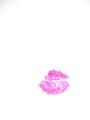
| 04/26/2005 11:04:26 PM |
Kiss!by kbhatia1967Comment: Cute, and almost funny. The bright white backdrop hurts my eyes, though, and the tedium is broken only by the upper left hand corner. Adding something to break up the background (even blue lines from school paper) would have helped. |
| Photographer found comment helpful. |
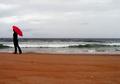
| 04/26/2005 11:03:01 PM |
a grey day in montereyby kmbr2001Comment: Nice use of color. The bright red umbrella against the desaturated sky and ocean really catches the eye, and the red sands break the tedium. |
| Photographer found comment helpful. |
Home -
Challenges -
Community -
League -
Photos -
Cameras -
Lenses -
Learn -
Help -
Terms of Use -
Privacy -
Top ^
DPChallenge, and website content and design, Copyright © 2001-2025 Challenging Technologies, LLC.
All digital photo copyrights belong to the photographers and may not be used without permission.
Current Server Time: 04/07/2025 09:55:18 PM EDT.