| Image |
Comment |
| 04/29/2007 10:32:28 AM |
Passing the Time of Dayby MAKComment: Nice, high contrast, but I really struggle with the selective colour. Is the jacket the subject of the photo or the person? |
 Photographer found comment helpful. Photographer found comment helpful. |
| 01/12/2007 08:36:16 AM |
Lips of an Angel -Hinder (#37)by annependletonComment: Bit heavy on the retouch for the eyes, they kind of look painted in to me. Then again, I guess that nothing looks "real on this image, so maybe that's the point". |
| Photographer found comment helpful. |
| 01/06/2007 12:31:16 AM |
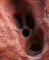
Ghostby cameraproComment: Love the pattern. Lookes a bit like a Tim Burton drawing of a face :D |
| Photographer found comment helpful. |
| 01/06/2007 12:29:08 AM |
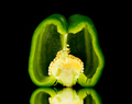
Pepperby hyperfocalComment: I was expecting alot of still life images in this challenge, so to see one that really stands out is nice :)
I love the lighting and colour. My only (and it's super picky) criticism would be that there appears to be a *slight* double reflection. I've been told that using ceramic tiles is a good way to remove this, though I haven't tried it myself.
Nice work :D |
| Photographer found comment helpful. |
| 01/06/2007 12:25:51 AM |
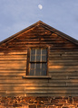
Through the window of my dreamsby quiet_observationComment: It's a shame that the building leans to one side for this image. If you'd have stepped one step to the left maybe, the image would have a much beter balance.
Including the moon is a novel touch. |
| Photographer found comment helpful. |
| 01/06/2007 12:24:45 AM |
Stuck Itby jgm5015Comment: Whether intentional or not, I like the white balance; the off white reminds me of a "pub atmosphere".
With a square crop I think this image could have had more impact. Possibly having only the one dart in the bulls eye too. The rearmost dart doesn't really work for me.
Did you try other angles of this shot? Ie Straight on etc... |
| Photographer found comment helpful. |
| 01/01/2007 11:56:58 AM |
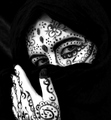
Pattern Adornesby WildcardComment: I really liked the idea for this shot. The composition is nice, with the hand in view. One thing I'm not so keen on is how high the contrast is. There is very little skin detail, especially on the hand, and he model is almost completely cloaked in black. With *slightly* more detail in the shadows and lower contrast, I'm sure this image would be received better. |
| Photographer found comment helpful. |
| 12/22/2006 02:01:13 PM |
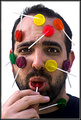
You got a little something right about there.by timfythetooComment: I like this. Growing Old is inevitable, Groing Up is optional :)
I like the concept here. I think the beard helps somehow, though I can't quite place why. Maybe adds to the childish mood in an ironic kind of way.
Getting a hand into the composition is a nice touch.
It's a shame you didn't crosslight as the dark hair I feel could do with some light from behind. |
| Photographer found comment helpful. |
Home -
Challenges -
Community -
League -
Photos -
Cameras -
Lenses -
Learn -
Help -
Terms of Use -
Privacy -
Top ^
DPChallenge, and website content and design, Copyright © 2001-2025 Challenging Technologies, LLC.
All digital photo copyrights belong to the photographers and may not be used without permission.
Current Server Time: 04/09/2025 11:18:11 AM EDT.