| Image |
Comment |
| 09/15/2002 09:10:00 PM |
Bachelorby ClubJuggleComment: This is a good photo but the angle of the shot is just not right, in my opinion. A goot attempt though. |
 Photographer found comment helpful. Photographer found comment helpful. |
| 09/16/2002 12:02:00 AM |
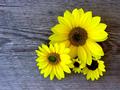
Sunflowersby SonifoComment: Nice detail, nice colours (background & flowers) nice photo. |
| Photographer found comment helpful. |
| 09/15/2002 08:57:00 PM |
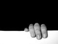
Hangin' Onby karmatComment: This is a good use of negative space and it is an interesting photo. Well-done! |
| Photographer found comment helpful. |
| 09/15/2002 11:34:00 PM |
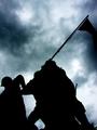
Memorialby BAMartinComment: The sky makes this shot for me... Overall, a good attempt. |
| Photographer found comment helpful. |
| 09/15/2002 08:46:00 PM |
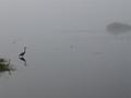
Froggy Morningby GotchaComment: Spooky atmosphere, nice detail of birds' reflections. I would have preferred just one bird as I think there is a little too much to look at. Also, I get shades of green on my monitor, but perhaps my mointor is just crap. |
| Photographer found comment helpful. |
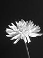
| 09/15/2002 11:49:00 PM |
Dahliaby KazComment: B&W flower? Brave and I think it paid off. This is a very good shot and I really like it. Nice composition, nice focus, nice work. |
| Photographer found comment helpful. |
| 09/15/2002 10:24:00 PM |
Open Wideby David EyComment: Almost looks like a spaceship orbiting a planet, which is not a criticism by any means. I like the colours in this photo but perhaps just silve / grey may be nicer. Have you tried it in B&W? Well-done, good job. |
| Photographer found comment helpful. |
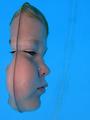
| 09/16/2002 12:40:00 AM |
Out of the Blue by JeanComment: I think this is an excellent shot, very creative and brilliantly executed. The only (minor) niggle is the grey / brown patch to the right of the child's face. If you could lose that, there would be less diversion from the subject of the photo. Good...no, excellent stuff! |
| Photographer found comment helpful. |
| 09/15/2002 11:47:00 PM |
Bring a Pen and Paperby zadoreComment: This is one of the best uses if neg. space I have seen here. The white background is appropriate (and hence makes the photo work well). Perhpaps the pen is a little too out of fcus for my liking, was the focus intentional? I like the shadow. Scores highly for use of neg. space, loses a little because of focus. Excellent work overall! |
| Photographer found comment helpful. |
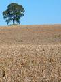
| 09/15/2002 09:23:00 PM |
Oasisby floydComment: Visually, more appealing than Noel and / or Liam. I think a more equal balance of earth and sky would improve this photo. Nevertheless, a decent shot. |
| Photographer found comment helpful. |
Home -
Challenges -
Community -
League -
Photos -
Cameras -
Lenses -
Learn -
Help -
Terms of Use -
Privacy -
Top ^
DPChallenge, and website content and design, Copyright © 2001-2025 Challenging Technologies, LLC.
All digital photo copyrights belong to the photographers and may not be used without permission.
Current Server Time: 04/06/2025 08:39:30 PM EDT.