| Image |
Comment |
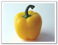
| 02/18/2003 12:50:39 PM |
Yellow Pepperby rj324Comment: Simple composition. It looks as though you tried wetting the pepper to get some interest going. A strategically placed light would have brought out the drops more. Check out the Rule of Thirds, I think thi swould be an interesting picture if the left half of the pepper took up the right third of the frame. (Did that make sense) |
 Photographer found comment helpful. Photographer found comment helpful. |
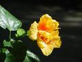
| 02/18/2003 12:48:31 PM |
Flaming Hibiscusby MagauvainComment: Crop out the green leaves and you would have a nice shot there. Also, look into The Rule of Thirds to add some zing to your composition. |
| Photographer found comment helpful. |
| 02/18/2003 12:47:32 PM |
Anarco-yellowby catpixelComment: Cute idea with an anarchist and a balloon, but it doesn't look like he is the one holding the balloon. Take the shot from a better angle to tie the two together. Also, DOF is lacking. |
| Photographer found comment helpful. |
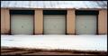
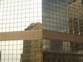
| 01/30/2003 10:01:54 AM |
Garage Squaresby alanfreedComment: With this orientation, you should have gotten much closer than you did. The road in the foreground is not parallel with any other line and thus detracts from overall composition. |
| Photographer found comment helpful. |
| 01/30/2003 06:23:53 AM |
Fifteen?by steinarknutsenComment: Positively beautiful. I have receveid several comments on mine stating that I should have spelled something. I didn't because it would have been too obvious. I love how you made the view think, even for a millisecond. It engages me well. The sunset nature of the shot is great. Your score is increasing as I look at it. (By the way, YES, this is 15 in Scrabble). Thanks for sharing this. |
| Photographer found comment helpful. |
| 01/30/2003 06:08:31 AM |
My preciousssby RefractedComment: The foreground is a bit out of focus - which is a shame because you really didn't have to worry about a distracting background in this one. Also, I think the lighting should have focused more on the square (Unless you are going for a "hide it from everyone" feel - in which case disregard my statement). I love the composition, the idea and the Lord of the Rings reference.... (7) |
| Photographer found comment helpful. |
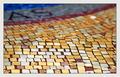
| 01/27/2003 11:37:51 AM |
squAreSby GordonComment: Nice random pattern, I think the depth of field would be less distracting lower to the ground. It is difficult to see why the squares are becoming unfocused... |
| Photographer found comment helpful. |
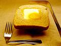
| 01/27/2003 07:29:51 AM |
Square Mealby BullwinkleComment: Nice compositon but the yellows are too harsh and doesn't make the meal look that appetizing. I don't feel like eating now (which I think should be the objective of good food photography). |
| Photographer found comment helpful. |
| 01/27/2003 07:28:46 AM |
Uniformityby kate12303Comment: Too many things going on.... to dark as well. The day looks overcast - on days such as that, you might want to try B&W to create a more "abstract" look and to take the dullness of the sun away. |
| Photographer found comment helpful. |
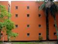
| 01/27/2003 07:27:22 AM |
Squaremaniaby pikytoComment: If you had a wide angle lens, I would have shot just four of the windows. The scope of the photos is too large. You could even have a good composition if you just took a shot of one. |
| Photographer found comment helpful. |
Home -
Challenges -
Community -
League -
Photos -
Cameras -
Lenses -
Learn -
Help -
Terms of Use -
Privacy -
Top ^
DPChallenge, and website content and design, Copyright © 2001-2025 Challenging Technologies, LLC.
All digital photo copyrights belong to the photographers and may not be used without permission.
Current Server Time: 04/09/2025 05:31:43 AM EDT.