| Image |
Comment |
| 10/01/2002 07:44:00 AM |
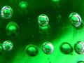
One for all, all for oneby AzrifelComment: I really like the idea and the shot itself isn't bad; I just think a splash of colour to offset the power of the green would have added balance to the shot� (7) |
 Photographer found comment helpful. Photographer found comment helpful. |
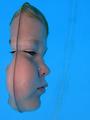
| 10/01/2002 07:15:00 AM |
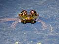
Four Eyesby vtruanComment: I like the idea � I love frogs� For me, the composition of the shot is a little too central; I'd have been temped to treat a shot like this in much the same way as the negative space challenge and used the background to focus attention onto Froggy. Maybe, zoom out a few feet and place Froggy in the top right third of the image. Hope that doesn't sound too pedantic, good luck, and hey, it's a not a bad shot anyway� (7) |
| Photographer found comment helpful. |
| 10/01/2002 06:54:00 AM |
Life Saverby DCThiessenComment: I'm sure I have seen this shot on PhotoSIG� I thought it was superb then, and I think it's superb now� (10) |
| Photographer found comment helpful. |
| 09/30/2002 07:59:00 AM |
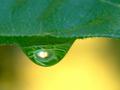
Inside the Dew Dropby mcraelComment: Love the colours; I think the biggest plus is the fact you haven't tried to make sense of what is reflected in the drop; this is a classic 'less is best' shot that really works. Awesome� (10) |
| Photographer found comment helpful. |
| 10/02/2002 02:21:00 AM |
|
| Photographer found comment helpful. |
| 10/02/2002 07:14:00 AM |
Time's Horizonby greenem2Comment: Superb shot� Great idea, great composition, vibrant and full of dramatic lines and colour. (10) |
| Photographer found comment helpful. |
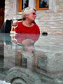
| 10/03/2002 05:53:00 AM |
white wine on clear glassby jjbeguinComment: This is a really nice shot overall, but I think that there are a few problems. Firstly, the coat on the back of the chair doesn't work within the context of the shot, in much the same way as the much darker area to the left that merges with said coat; these elements add unwanted conflict to the shot and contrast really strongly with the main subject. It's OK for the model to have the contrasting colour; but the other elements just pull the eyes away. Cropped out, I think this shot would be a lot better. Sorry to add more, but the other point relates to the models pose; it doesn't look natural � you can almost hear the photographer saying, 'No, left a bit more'� Sorry to be so negative. On the plus side, the rest of the shot works really well� (4) |
| Photographer found comment helpful. |
| 09/16/2002 08:04:00 AM |
Out of the Blue by JeanComment: Extremely ingenious shot� Like the idea, like the composition and I love the lighting� (10) |
| Photographer found comment helpful. |
| 09/17/2002 01:06:00 AM |
|
| Photographer found comment helpful. |
| 09/17/2002 01:43:00 AM |
|
| Photographer found comment helpful. |
Home -
Challenges -
Community -
League -
Photos -
Cameras -
Lenses -
Learn -
Help -
Terms of Use -
Privacy -
Top ^
DPChallenge, and website content and design, Copyright © 2001-2025 Challenging Technologies, LLC.
All digital photo copyrights belong to the photographers and may not be used without permission.
Current Server Time: 04/06/2025 10:21:21 PM EDT.