| Image |
Comment |
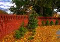
| 11/07/2004 09:52:22 PM |
Novemberby oksamitComment: Very nice Framing of the picture. The colours are nice and warm, even for a November application. Perharps would've been a little nicer without the gray darmac on the far right. Perharps with a clever croping, it could be removed without loosing too much of the wall. If a chance comes, a re-shoot of this location, but from a lower perspective would give good results, perharps in catching more of the sky to create a good contrast with the red and green... |
 Photographer found comment helpful. Photographer found comment helpful. |
| 11/07/2004 09:49:46 PM |
Novemberby dwterryComment: Colours are very nice and rich. Also really enjoy the crop, although i think i would've prefered it without the tree on the far right. Also, I would recommend bringing the 'orange' frame line a lot closer to the picture. The separation, as much as being unbalanced (bigger black spacing inside then outside) creates a void between the picture itself and 'end' of the pic. See my 'October free Study' picture "Heaven-Seen-Through-Urban-Eyes" to better see/understand what i mean (I am in no way implying that my picture is better then yours). |
| Photographer found comment helpful. |
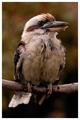
| 10/02/2004 11:40:36 AM |
Kookaburraby moodvilleComment: Intriging colours, especially in the background, which brings out the 'fall' mood out of the picture. Nice usage of shadows and highlights for the very dim colours of the picture. Its too bad for the blurry tail of the bird, which would've been more interesting "in-focus". |
| Photographer found comment helpful. |
| 10/02/2004 11:39:20 AM |
A Proud Birdby mariomelComment: Very nice image composition. The background feels somewhat plain, unfortunatly, which in turn, seems to down-tone all the colours of the picture. The usage of a Frame does help with the overall feel of the picture. |
| Photographer found comment helpful. |
| 10/02/2004 11:10:56 AM |
Parrot Portraitureby buzzrockComment: Nice composition of the picture (Central). For some reason, i feel like the picture is slightly overexposed, perharps due to the white contrast on the bird's face. Also, perharps a themed colour for the frame would've brought more punch to the picture (yellow or green?) |
| Photographer found comment helpful. |
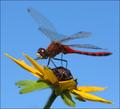
| 10/02/2004 11:09:35 AM |
Red Dragonby JackoComment: Very good use of colours. The Crop could've been a little tighter around the insect. I would've also wish for a clearer depth of view around the flower, seeing it as a whole. |
| Photographer found comment helpful. |
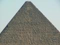
| 08/24/2004 10:19:13 PM |
The Egyptian Pyramidby hossamComment: i fail to see the point of this picture in relation to the theme.
Also, a simple "auto-level" in Photoshop would've help greatly with the colours and sharpness. |
| Photographer found comment helpful. |
| 08/17/2004 01:48:26 PM |
|
| Photographer found comment helpful. |
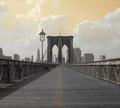
| 08/17/2004 01:47:24 PM |
coverging floraby peeteComment: Intriging view on a vanishing point. Good thinking of not showing the photographer. |
| Photographer found comment helpful. |
| 08/17/2004 01:46:38 PM |
|
| Photographer found comment helpful. |
Home -
Challenges -
Community -
League -
Photos -
Cameras -
Lenses -
Learn -
Help -
Terms of Use -
Privacy -
Top ^
DPChallenge, and website content and design, Copyright © 2001-2025 Challenging Technologies, LLC.
All digital photo copyrights belong to the photographers and may not be used without permission.
Current Server Time: 04/07/2025 09:59:53 PM EDT.