| Image |
Comment |
| 02/02/2005 11:05:29 PM |
Never leave home drunk with a cameraby BoltiComment: Unique and interesting concept. Lighting is a good idea, although not present enought for my taste (especially on the product). The sky gives a good background but stars couldve given more punch. A tighter crop near the shoes i think, wouldve given a more dramatic approach on the products (3s), as right now, i could 3 lights and 3 shoes... which arguable, could mean 6 in some fashion. It can be confusing for an audiance. |
 Photographer found comment helpful. Photographer found comment helpful. |
| 02/02/2005 10:59:13 PM |
local heroesby messerschmittComment: Interesting idea. Although i am not too fond of borrowing other peoples art, this sure brings a smile. |
| Photographer found comment helpful. |
| 02/02/2005 10:57:38 PM |
DPC inspired Insomniaby MarkComment: Very unimaginative and unartistic shot. Lighting is dull and doesnt give picture any credits. The picture is not leveled either. This shot, from a totaly darken room couldve brought better results. gl. |
| Photographer found comment helpful. |
| 02/02/2005 10:56:07 PM |
Concentricby Erin_KComment: Interesting idea, but unfortunatly, i find the very bad. Following the theme, the models face is irrelevant, and doesnt bring anything to the earing. A more direct approach to the Earing wouldve done great for the challenge. Also i find the b&w very dull. I would recommend playing with contrast slightly. |
| Photographer found comment helpful. |
| 02/02/2005 10:53:56 PM |
Sexyby cabaComment: very interesting concept. I only wished the wouldve better represent the theme (as in 3 models). This has enormous potential for a Movie poster of sort. Too bad this idea wasnt brough up for the movie poster challenge! |
| Photographer found comment helpful. |
| 02/02/2005 10:52:39 PM |
Composition in 3sby atsxusComment: I get the frame idea, which is quite unique, unfortunatly, it wouldve been more interesting if the picture followed the theme, which it doesnt. Also i find the picture a bit dull in colours (i understand its during winter). The picture is nice and well leveled, but just doesnt follow the theme or brings the exclamation it should. |
| Photographer found comment helpful. |
| 02/02/2005 10:50:50 PM |
3 lamps in a narrow portby visaksenComment: This had the potential of a great picture, but unfortunatly, the colours are weak, its missing some saturation to bring the beige to life. Also there is too much grain on the shot due to shadoes. Also, i dont like the fact that the picture is not leveled. If those balls are in fact lamps, it wouldve made for a great night shot with lighting. |
| Photographer found comment helpful. |
| 11/11/2004 11:18:37 PM |
IMG_9951.jpgby menardmamComment: Interesting angle. I think it would be a little more striking if the model was actually standing instead of on the floor. The skin and hair movement would be different, thus making the image "lighter" or more floawing. |
| Photographer found comment helpful. |
| 11/07/2004 10:47:10 PM |
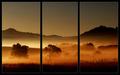
Daybreak by BradComment: The frame work is outstanding. It would not have been the same for me, without it. Not only is the picture amazing in its colours and tone, but the framing gives it a very nostalgic effect, very close to Japanese art, where they often use the same framing effect.
One thing i tried here, was to change the stroke's colour to a golden/orange instead of the gray. Found it gave the artwork a little more punch. 9 on me mate. |
| Photographer found comment helpful. |
| 11/07/2004 09:54:23 PM |
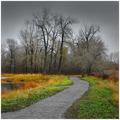
Novemberby jimmythefishComment: Amazing Contrast in colours. Perfect representation of November. The grading of colours from Rich to sad-gray is very well done. For some reason, i wish i could've seen a little more on the left, perharps a 'wide' angle shot would've helped. This place is pure delight for an 'Halloween' or 'creepy' Tim Burton feature film (Sleepy Hollow-esque). I would really like to know where it was taken! |
| Photographer found comment helpful. |
Home -
Challenges -
Community -
League -
Photos -
Cameras -
Lenses -
Learn -
Help -
Terms of Use -
Privacy -
Top ^
DPChallenge, and website content and design, Copyright © 2001-2025 Challenging Technologies, LLC.
All digital photo copyrights belong to the photographers and may not be used without permission.
Current Server Time: 04/07/2025 10:09:16 PM EDT.