| Image |
Comment |
| 02/02/2005 11:20:59 PM |
|
 Photographer found comment helpful. Photographer found comment helpful. |
| 02/02/2005 11:19:04 PM |
Winters Last Leavesby CamComment: good idea, and cool use of DOF. Lots of lighting missing on the leafs, unfortunatly. A slightly tighter crop and a small frame couldve helped bringing more life into the shot. 5. |
| Photographer found comment helpful. |
| 02/02/2005 11:18:11 PM |
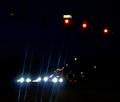
Three cars versus Three Stop Lightsby roonieComment: Athough i understand the 3 redlights concept... the fact that there are other red lights in the shot doesnt help the theme, plus all the other lights. Bad Crop (or lack of). This picture feels very boring, sorry. 3. |
| Photographer found comment helpful. |
| 02/02/2005 11:16:46 PM |
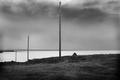
three in a rowby biggisComment: This shot has some good potential. Its perharps missing a little contrast to bring out the poles a little more tho. I wouldve wished for a filter to really enclose the subjects. Also a frame wouldve punched the picture quite a bit giving it a good dramatic feel. 6. |
| Photographer found comment helpful. |
| 02/02/2005 11:13:52 PM |
Three Currenciesby NazgulComment: Interesting frame. Dont like the lighting so much, it feels a little too dark in addition to the dark background. 5. |
| Photographer found comment helpful. |
| 02/02/2005 11:12:51 PM |
Three basic colorsby gthbComment: Good idea of the usage of the items. Unfortunatly, the colours displayed (especially from the paper) doesnt bring closure to the colour selection (bad palette). Also the darker tones of the upper part of the picture screams for a crop, as it just makes the picture more dull to look at. 5. |
| Photographer found comment helpful. |
| 02/02/2005 11:11:22 PM |
Glassesby KiwiChrisComment: Nice composition and displace of the items. A bit dull in colours (of lack there of) even as a desaturated picture. Perharps a little more contrast and a dark frame wouldve given the pic more depth and drama. 7. |
| Photographer found comment helpful. |
| 02/02/2005 11:10:18 PM |
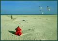
As The Sunbather Sleptby muur88Comment: Interesting idea. The angle is neat with the static elements versus moving models (birds). I wish the birds wouldve floan closer . Perharps a tighter crop from the left couldve brought them a little closer. The sand colour saturation is a bit boring tho. I do not like the frame, as it too much with the picture, instead of give it more drama. 6. |
| Photographer found comment helpful. |
| 02/02/2005 11:08:23 PM |
sexy old keysby coldaComment: Very nice composition for the items, good placement and DOF. I love the effect and the sharpness yet fuzziness of the shot. The Frame also helps the crop in making a more dramatic effect. Nice work! 8. |
| Photographer found comment helpful. |
| 02/02/2005 11:07:14 PM |
Tri-Candle Glowby TommyMoe21Comment: NIce lighting. Unfortunatly, i wouldve wished for a little more sharpness, since this picture kind of wants to a product, which appears rather blurred. Nice composition and redish background. I think a Frame using a tin redish line wouldve punched a bit more on this. 6. |
| Photographer found comment helpful. |
Home -
Challenges -
Community -
League -
Photos -
Cameras -
Lenses -
Learn -
Help -
Terms of Use -
Privacy -
Top ^
DPChallenge, and website content and design, Copyright © 2001-2025 Challenging Technologies, LLC.
All digital photo copyrights belong to the photographers and may not be used without permission.
Current Server Time: 04/07/2025 10:11:57 PM EDT.