|
|
|
Showing 141 - 150 of ~236 |
| Image |
Comment |
| 11/06/2005 02:55:37 AM | Kittersby bs-photosComment: Greetings from the Critique Club:
Kitters was your entry for the 'Delicate' challenge or should that be 'DeliKat'.
Technical:
A square format image using the maximum allowable size, always a good start. Nicely picked highlight in kitten's eye and luckily she didn't look at you or you would have had massive red-eye! The background is too cluttered and image looks tightly cropped. Of course this is the only possible crop you could use as the subject needs to be centre of attention. I am not sure where you used colour balance or blur? Was it too sharply focussed? DOF is good considering your aperture used.
Composition:
My biggest problem with Kitters is the blandness, your composition is fine, except for the table leg and camera bag in the background. It is the colour that lets the image down - Kitters seems to blend into the carpet and while a very attractive kitten, this image doesn't really do her justice.
Overall:
A good effort, Kitters was very good to keep still for you. You have captured her very well, she is well focussed. Why not try to reshoot and find her a more contrasty background. Practice and patience are what you need to capture good animal portraits. The score is on the low side, but reflects much I have mentioned. Move onwards and upwards, back towards those 5's. I hope this is helpful and constructive.
Steve |  Photographer found comment helpful. Photographer found comment helpful. |
| 11/06/2005 01:57:31 AM | Miniby livitupComment: Greetings from Critique Club:
The challenge was Light On White II and you provided exactly what was asked for with this entry. However it meets the challenge brief in two ways, the literal sense - a light on white - and a light coloured object on a white background.
Technically it is very crisp and clean. Not a great DOF used, but it has the desired effect, there was no need to have the whole torch in focus as it is prefectly obvious to the viewer what it was. Also, had you used a deeper DOF you would have brought the background material more into focus and destroyed the softness of the material. Shooting an object like a Mag-Lite using strobes or any other kind of lighting will always give the highlighted area on the body, yet you managed not to blow it out.
The composition will be disliked by some voters due to it being centred rather than Rule of Third, which seems to be vogue at the moment. Using an object like a torch means you can't avoid leading the eye towards the centre of the image. The colour of the torch gives it a hint of an advertising image, which is no bad thing.
My overall impression is of a simple, clean image that meets the challenge head on. I like the way the torch comes into focus so the writing is sharpest. Using Neat Image has produced a smooth look and it is not over sharpened. A worth entry that should, IMO, have scored 5+. I hope this is helpful and constructive.
Steve | | Photographer found comment helpful. |
| 11/05/2005 11:09:19 AM | Ecosystemby aaronwaveComment: Greetings from Critique Club:
First entry into a challenge and a 5.9 score...not a bad start.
Technical:
You did not post your processing steps, so I will have to try to guess what you have done. The shutter speed and ISO suggest that you have either contrasted the image or saturated it to get the darkness and colour, and it worked. Perhaps there is a hint of USM/sharpening also, but it has not been overdone. Also, there is a touch of grain/noise showing which might affect how this prints up at full size.
Composition:
A good composition using 50/50 technique and this work nicely with the reflective quality of the water. A well balanced image, clean and striking.
Overall:
There are a few landscape photogs here who will need to watch their laurels! A good, clean and colourful scene. The 50/50 format allows the water to reflect the sky beautifully. You were approaching the limit of your camera here with the noise/grain beginning to show, but it doesn't spoil what is a good image. It is a different angle on the delicate challenge and I agree that Nature is more delicate than many believe. I look forward to seeing more in the future, this is good start and will get better. I hope this is helpful and constructive.
Steve | | Photographer found comment helpful. |
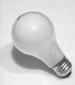
| 11/05/2005 10:28:09 AM | lite on whiteby photoventurerComment: Greetings from the Critique Club:
Light on White challenge entry and yep, it is a light on white.
Technical:
A good square image using the maximum size allowed. Focussed for the top of the bulb and DOF hangs on to the screw fitting of the bulb. Lighting appears to be from on-camera flash and has left two bright spots on the glass of the bulb. It is very hard to avoid this without using off camera flash or studio setup. A simple, but effective setup.
Composition:
The simplistic setup means that the positioning of the subject is crucial because that is all there is. The bulb starting from the bottom right corner, leads the eye towards the centre of the image. A lot of people frown on centrally placed subjects, mainly because someone told them about the Rule of Third...it is quite refreshing to see a centre weighted image.
Overall:
A light bulb on polystyrene/styrofoam. Not the most imaginative image nor the only one to use the idea for this challenge. The misspelling of light in the title could well have cost some higher votes. It might seem picky, but the title is so important and I know, that 'lite' is the US way of spelling. The shadow under the bulb is a little harsh, but there isn't much wrong with image. It is a competent, clean image that didn't hit too many touchy spots with the voters. Sometimes simple just doesn't work when it comes to votes, so it's a case of learn and move on. I hope this is helpful and constructive.
Steve | | Photographer found comment helpful. |
| 11/05/2005 07:16:46 AM | untitledby micluinenburgComment: Greetings from the Critique Club:
The challenge was to take a photo that would convey 'Delicate' to the viewers and voters. In a strange way this ornamental cabbage just about does that. You have not included any information on processing, so I can't comment on how it may have altered the original. I am guessing that this is near enough straight out the camera, perhaps a bit of sharpening was used.
My biggest problem with your shot is the size, although not really small, it is not using the maximum permitted - 640x640. To create an impact, you need to get your photos to 640x640 and 150k to do well in challenges, you will suffer if you enter small photos. The cropping is very tight, but I assume that was to eliminate the soil that is just visible in the top right of the shot. Also, clean up the subject before shooting, the dead leaves do not add anything to the shot. The spot of water in the centre is distracting and either focus right in on it or get rid of it before taking your picture.
I like the fractal-like patterns created by the leaves and also the colouring, especially where the purple veins run into the green/blue. For a first effort this scored well and I am sure if you use size properly next challenge you will do well. I hope this is helpful and constructive.
Steve | | Photographer found comment helpful. |
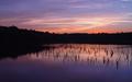
| 11/04/2005 11:41:13 AM | Painted Skyby PhilosComment: Greetings from the Critique Club:
This was your entry into the 'Delicate' challenge. I will discuss faults, tecnical errors and overall view later. My biggest problem with this photo is that it conjures up images of square pegs and round holes:)
Technical:
It is technically A1. You have provided every piece of information anyone could want. Not sure but that cigarette glow could have affected your exposure and made it a tad over exposed by at least a millionth of a second!
Composition:
I can't fault the composition can I? However, it is a pity there was a patch of weeds? whatever by the reflection of the first windmill, Without this and all reflections on the water clear...wow, now that would have been the ultimate photo. I guess the weed was static and not floating past, if it was floating past then it was lax of you to take the shot when you did. Marks will be deducted in future.
Overall:
This is a seriously stunning photo. But it is time you left the windmills alone for a while as everyone knows they are your photos. I think it was ribbon material, but you really must give up smoking!!
Steve | | Photographer found comment helpful. |
| 11/04/2005 11:18:01 AM | Delicate Soulby joynimComment: Greetings from the Critique Club:
This was your entry into the 'Delicate' challenge and appears to meet the brief for the challenge. As there is no information on settings and processing, I cannot comment accurately on how you got this photo to entry level without a certain amount of guesswork.
I am going to start with critical issues, there is a colour cast on the left cheek and jaw of your subject. I was going to say that the focus appears slightly soft, but judging by the eyebrows, there are signs of the image being sharpened. This suggests that the original was out of focus and sharpening rescued it but still left it soft. There is noticeable grain and I assume you used on camera flash which has lifted the exposure on the nose and round the mouth. Faces are really hard to light, and almost impossible using on camera flash.
Okay, now it's time to be kinder, the tight crop works very well as does the wispy hair. The subject looking down conveys innocence and as a childs skin is usually soft looking, it does give that delicate impression.
Overall it is a good portrait that captures what childhood is all about. The score is about where I would have placed the photo and I note that other commentors state a softness in focus. I hope this is helpful and constructive.
Steve | | Photographer found comment helpful. |
| 11/04/2005 10:50:26 AM | Shadowlightby RasmusComment: Greetings from the Critique Club:
Your first challenge entry with a reasonable score and a few comments. Let's take a deeper look and see where we go.
Technical:
The square format works well as does the lighting. The horizontal line across the photo does not look level, but this could be an optical illusion as I have measure it and it is very slightly out, but not enough to notice. The shot looks like it has been converted to negative, but you have stated that this was caused by using curves. You have cropped too tightly on the candle and removed a section of the shadow which does detract from the overall effect. Next time, less tight cropping and you will note an improvement in both end result and score.
Composition:
As already stated, too tightly cropped. This is a composition fault as well as a technical fault. Other than this, there is not anything else wrong.
Overall:
This photo has potential, but some of it has been killed by the cropping and the negative effect. Yet the negative effect is also what makes the photo stand out. I think what bothers me more about the negative effect is the candle wick, it becomes the focal point of the photo and looks like it was added later. This is just an artifact of the process. I really like the flame and its shadow. Your photo score in the range I would have expected and with less tight cropping would have possibly gone 5+. Good work and I hope to see more of your entries in the future. I hope this is helpful and constructive for you.
Steve | | Photographer found comment helpful. |
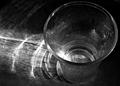
| 11/04/2005 10:08:44 AM | Fragile Glass/Lightby justin_hewlettComment: Greetings from the Critique Club
Having studied your entry for Delicate Challenge, I feel that a lighter weight glass would have conveyed the delicate impression more suitably. The chosen tumbler is a bit on the heavyweight side and this is accentuated by your choice of angle, looking onto the rim. Perhaps a different angle would have given the impression of a more delicate glass.
The use of on camera flash has blown an area at the base of the glass, but this is not too intrusive.
The conversion to B&W works well with the reflections of the light through the glass onto the wood. This had an added effect of highlighting the grain, although I don't know if this was intended or accidental, but it looks fine. Focus on the rim is sharp and you have a pretty good DOF.
I would like to have seen the droplets feature more prominently in this photo, but the composition is good with the main subject situated to the right of the photo. I think this scored about right in the challenge and had the glass been more 'delicate', it could have upped the score to 5+. Nevertheless, a good entry and although lower than your usual scores, not too bad considering the low voting in this challenge. Hope this is helpful and constructive for you.
Steve | | Photographer found comment helpful. |
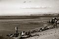
| 11/03/2005 12:03:01 PM | A Cast Awayby OlyuziComment: Greeting from the Critique Club:
This is a good photo that could have said so much more. The sepia effect works, but on what? I want to see what that fisherman has caught, if anything.
The grain works well in the lower section of the picture, but the sky seems more in need of colour. I don't know what your processing steps were, but obviouxly you converted from colour to B&W or sepia. I think the main problem is that the shot falls between to two genres, it is neither landscape nor portrait. As a landscape it would work better as a straight colour shot with saturation, those cliffs jutting out into the sea are great. The man on the spit shows as just a pixelated form. Could a close crop of either the one fisherman or perhaps almost a panoramic with both fishermen in have worked better?
I like grain in a sepia/B&W shot, but it didn't quite work this time, the subject just aren't large enough. I don't want to sound too harsh, but it doesn't grab me. I think it scored about right for the challenge, but has the potential to have scored better. Hope this has been helpful and constructive.
Steve | | Photographer found comment helpful. |
|
Showing 141 - 150 of ~236 |
Home -
Challenges -
Community -
League -
Photos -
Cameras -
Lenses -
Learn -
Help -
Terms of Use -
Privacy -
Top ^
DPChallenge, and website content and design, Copyright © 2001-2025 Challenging Technologies, LLC.
All digital photo copyrights belong to the photographers and may not be used without permission.
Current Server Time: 04/08/2025 06:16:18 AM EDT.
|