|
|
|
Showing 131 - 140 of ~236 |
| Image |
Comment |
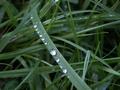
| 11/08/2005 10:17:26 AM | Dewby bamihooComment: Greetings from the Critique Club:
Dew was your entry to the Delicate challenge and it works quite well, though a closer shot of the droplets would have improved your score, but then is grass!
Technical:
As you have no processing steps included in your comments, I have to assume you used very little. Perhaps sharpening and curves. The image appears a little dark due to it being predominantly green. You managed a good DOF whilst using f2.8. The largest drop is the focusing point and the veins of the grass show quite nicely at this point. When entering a challenge or posting on DPC, please use the maximum size allowed 640x640, or 640 on the longest size. It looks as though you have used on-camera flash.
Composition:
Due to the nature of the subject, the background is a little messy. The focal point in central to the image and some do not like this format, placing the main subject off centre is more appealing to viewers.
Overall:
As previously stated, the messy, dark background fails to lift the image to its full potential. Try reshooting using a larger leafed plant, the results will be easily visible to you. Ensure you use maximum size for entries, your score will be better and your images will have greater impact. There are no major faults and with more experience of challenges you will develop an eye for those tiny things that can make or break an image. This image must have been close to what the viewers were seeking as the score is better than average for this size image. I hope this is helpful and constructive.
Steve |  Photographer found comment helpful. Photographer found comment helpful. |
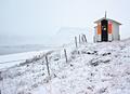
| 11/08/2005 09:25:17 AM | Guiding Lightby bbrightComment: Greetings from the Critique Club:
Guiding Light was your entry in the Light On White II challenge and you have met the challenge with an unusual image.
Technical:
AS you haven't shown your processing steps in your comments, I will have to try to guess your steps. You have made good use of the sizing allowed. Your choice of aperture has given a good DOF. There appears to be a hint of sharpening and use of curves. With so much white in your image, you have done well to avoid getting blown out areas.
Composition:
Using landscape format, you have placed your main subject to the right, upper corner of the image. This allows the background to encroach upon the main subject. The main distraction is the fence leading from the left bottom corner to the subject. Whilst some will complain about this, I think it helps guide the eye across the image. Without the fence, the shed would have looked too isolated in all the snowy scenery. I am glad you resisted the temptation to crop this image, that would have killed the shot.
Overall:
I did have reservations when I first saw this image, but after studying it, I see an unusual subject for the challenge. It works well, but some of the snow does have a slight grey tinge to it. The orange shutters by the door are dominant, but without them, and the light, the image would have had a bland feel. You don't say what lens you used, I would guess at the 18-55mm kit lens and it gives a nice open feel to the shot. Your score is a fair one, but lower than some of your other entries. I hope this helps and constructive.
Steve | | Photographer found comment helpful. |
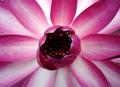
| 11/07/2005 11:50:47 AM | A Bloom of Graceby catnComment: Greetings from the Critique Club:
A Bloom of Grace was your entry for the Delicate challenge and it fits well. It appears to be a Water Lily? no too sure though :)
Technical:
Focus is spot on and by using f2.8 you have obtained a shallow depth of field that produces a sunburst of petals as a background whilst bringing the centre into clear focus. I think there is a hint of sharpening. It is a useful tip to include your processing steps in your comments, these help other replicate your process and help when doing a critique as CC can follow your steps and understand more clear if there are things that need working on. A lot of voters do not like centred images, but this works in that format. You have wisely used maximum sizing to increase the impact. Perhaps, at another time, try using fill flash to open out the centre of the plant more.
Composition:
A central weighted format using a single flower as the focal point. The background is very natural, but the two green areas visible through the petals tend to pull the eye away at times. Very good overall.
Overall:
There are few things more delicate than a flower head. This is a very deceptive image as it has to be studied carefully to get the full impact. I have a feeling that you have a leaning towards Macro photography, a very rewarding genre to aim for, it is my favourite as well. Your score is about what I would have expected for the image and now you have the task of matching it the future. Over 5 is good and even if you drop below, use every challenge you enter as a lesson in your hobby/work/torture. I hope you didn't get your feet wet getting this shot! I hope this helps and is constructive.
Steve | | Photographer found comment helpful. |
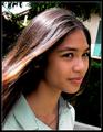
| 11/07/2005 11:04:00 AM | Amandaby casmComment: Greetings from the Critique Club:
Amanda is your entry for the Delicate challenge and whilst being a portriat of a very attractive woman, I'm afraid it does not convey delicate to me.
Technical:
The backlighting is lovely on her windswept hair, but it does cast deep shadows at the nape of her neck and side of her face. I have looked for traces of fill flash, but see no highlights in her eye. The background is really distracting and messy, you must be careful to ensure your horizons are level with such a closely cropped portrait. Focusing is really good as is DOF. I don't know what processing steps you have used, perhaps a hint of USM/sharpening. Including processing details in your comments prove really helpful to others.
Composition:
Her pose is very good with her hair leading the viewer into the centre and to her face.
Overall:
A good effort and you are sure to get better with more practice.
Steve | | Photographer found comment helpful. |
| 11/07/2005 10:39:20 AM | Christinaby ajgardnerComment: Greetings from the Critique Club:
Christina was your entry for the Light On White II challenge and your image does fit, but would not be to everyones' taste for this challenge.
Technical:
By using a small aperture and high ISO you have introduced an amount of grain/noise into the image. Judging by this combination, I would guess you were handholding the camera. If you were using a tripod, you could have backed off on the ISO and produced a much crisper image. The use of a single lighting position has created a distinct cut off between the sides of your model's face leading to blown out detail on left and unflattering shadow around her nose and cheekbone. Sharpening has created artifacts on her hair. Cropping is extremely tight and brings the viewer's focus on to her lovely eyes.
Composition:
Nicely composed with maximum impact on model's eyes and the slightly downward tilt of her face makes for an interesting portrait, using landscape format.
Overall:
Your second challenge entry and not a failure by any stretch of the imagination. Being a new camera and eagerness to enter challenges mean we sometimes overlook faults that at any other time would be corrected. My technical comments may seem over critical but if I didn't comment on these things there would be little point doing a critique, this should give you tips, ideas and help for future images. On the matter of your score, I expect voters didn't like the contract between light and dark. I didn't vote on this challenge and I think your score was pretty fair. I hope you find this helpful and constructive.
Steve | | Photographer found comment helpful. |
| 11/07/2005 10:07:27 AM | Lonely go-go dancerby JinjitComment: Greetings from the Critique Club:
Lonely go-go dancer was your entry for the Light On White II challenge and it fits pretty well.
Technical:
You haven't put any processing steps in your comments, so I will have to try to work out what you did and how it affected your image. The first thing that strikes me is brightness which suggested your either used curves or upped the brightness. This has caused almost a high key effect but has also distorted the headgear so it has lost its definition. The other part it has affected are the shadows on the dress around her bust and waist. I have to assume that the material was silky and the process you used has made it appear grainy/noisy with no clear shadows. There are a couple of dark areas on the background which are distracting. Parts of her face, neck and arm are blown out due to the brightness. Focussing is very precise and the image is crisp.
Composition:
It is a nicely composed image and her face provides a focus point. Her pose looks slightly awkward, but I am guessing that you captured this at a festival or similar so you would not have had any control over her pose.
Overall:
A clean, well executed image that falls down on some of the processing IMO, although it is clear that you needed to lighten the image for it to fit the challenge. Her headdress is distracting and indistinct, these are probably feathers but have lost their texture. The strange shadow effect on her dress could have been caused by the resizing and saving for web. I like the idea, the B&W and sharp focus. A very good entry and due to what I had said, I think it scored at about the right level. I hope this is helpful and constructive.
Steve | | Photographer found comment helpful. |
| 11/06/2005 11:06:26 AM | Delicate Securityby donwComment: Greetings from the Critique Club:
Delicate Security is your entry into the Delicate challenge, in fact your first challenge entry.
Technical:
The first thing I noticed was the noise/grain in your image, this is due to the ISO you used. I am assuming this is a tightish crop and resizing has brought up the noise. I don't want to teach my grandmother to suck eggs, but I have to assume you are new to photography. It is useful to include processing steps in your comments, this helps with tracking your steps to a finished image. I like your choice of aperture, f5.6 means that only the subject is sharp. Your focus on the stag's head is super. The colours look a bit washed out, but then early morning light can produce this effect. Not sure if you have used USM, but will guess there is a bit.
Composition:
I just love this image and wish I could get one as good...but then I don't have access to a ranch where I could see one. You couldn't have posed the stag any better coming in from the left and looking straight at you. Is this the only one? If not, put the others in your portfolio.
Overall:
A good first challenge entry and the score is middling. I think it finished here due to the noise, the slight washing out of colours and the fact that to some it does not depict delicate. We all know that the balance between nature and man is very delicate, as it is between the hunter and the hunted. Try making some adjustments in PS or whatever programme you use, sharpen, saturate and curves. If you like what you get, put it up for others to comment. I hope this is helpful and constructive.
Steve | | Photographer found comment helpful. |
| 11/06/2005 09:48:16 AM | Balanceby dahvedComment: Greetings from the Critique Club:
Balance is your entry in the 'Delicate' challenge and you have landed this image fair and square in the middle.
Technical:
Using portrait format and maximum size, you have given your image a powerful punch. Focusing is spot on, had you focussed on the tines of the fork you would lost the little detail left on the fork handle and a lot of the impact would have been lost also. The background is not an even, clean colour, but that was never a part of the challenge and I think this adds to the overall image. The shadows of the tines on the inside of the glass are a little surreal. The colour of the glass is very effective.
Composition:
Great composition, the colour is fine. The tines have an almost 3D effect.
Overall:
Nothing bad about it, would like to see more. I note you do a fair bit of this type of image. Good work. I hope this helps.
Steve | | Photographer found comment helpful. |
| 11/06/2005 08:48:18 AM | Orchidby sabphotoComment: Greetings from the Critique Club:
'Orchid' is your entry into the 'Light On White II' challenge. As you mention in your comments, you were actually shooting this for the Delicate challenge and I think it fits that challenge better, however:
Technical:
You have used maximum size and this helps a lot in a challenge. The crop is not too tight and the image has not been overly sharpened which would have made it really overpowering. The background could be anything, there is no hint of any texture, but then the challenge did ask for a white background. Focussing and DOF are good with the centre of the orchid being the focal point.
Composition:
Subject leads in from bottom right corner to a central format image using portrait setup. The cropping works well, there is a satisfying white border on the sides. With no shadows, there is an unnerving starkness about this image, possibly because the colours of the flower are so striking.
Overall:
I like the shot, but I don't think it quite fits the challenge and hence the lower than normal score. There is nothing terribly wrong, nothing that deserves harsher critique. I think you are well aware that you have misjudged the challenge and therefore faced a lower score when entered in a different challenge, would have attained a much higher score. I hope this is helpful and constructive.
Steve | | Photographer found comment helpful. |
| 11/06/2005 06:24:34 AM | Morning Treatby davidus428Comment: Greetings from the Critique Club:
Morning Treat was your entry for the 'Light On White II' challenge and it fits quite well into the given brief.
Technical:
Your focus is spot on, as is the DOF which just starts to blur out when it gets to the plate. Lighting is superb, the shadows by the egg and also the plate are wonderful. Had the lighting been any harsher, it would have killed the image. It is a shame you haven't included any of the processing steps used as these really help other photogs reproduce similar effects. And they help when doing a critique as we can follow your steps.
Composition:
This is the only down side of your image, to me and it is only my opinion, the corn does nothing for the image. It makes the image cluttered. I like the positioning of the egg and plate. Many would have been tempted to not include the plate and then crop tightly, your idea works better.
Overall:
Taking the image as a whole, I think it scored about right due to the inclusion of the corn. The corn introduces yellow into the picture and seems to dominate what is a super soft image (not focus). The plate and flower in the top right corner is pure genius and would have a much greater impact if it weren't for the corn. I know I gone on about the corn, but it jars, it dominates and spoils a wonderful image. Try reshooting it, reproducing the original steps, but leave out the corn. I think you will agree then that without the corn you would have had a high scoring image that matched your other high scorers. I would like to see the reshoot:) I hope this is helpful and constructive.
Steve | | Photographer found comment helpful. |
|
Showing 131 - 140 of ~236 |
Home -
Challenges -
Community -
League -
Photos -
Cameras -
Lenses -
Learn -
Help -
Terms of Use -
Privacy -
Top ^
DPChallenge, and website content and design, Copyright © 2001-2025 Challenging Technologies, LLC.
All digital photo copyrights belong to the photographers and may not be used without permission.
Current Server Time: 04/08/2025 06:16:14 AM EDT.
|