| Image |
Comment |
| 11/26/2004 10:50:53 PM |
|
 Photographer found comment helpful. Photographer found comment helpful. |
| 11/26/2004 10:49:47 PM |
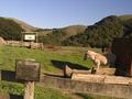
Don't Ask Don't Tellby bobgaitherComment: this is a pretty, homely scene, but the shadows on the left are a little too stong (plus the horizon tilt is distracting - whether its an actual slope or not) Also it feels as if the sign (i.e the link to the challenge) is really just an afterthought. Though thankyou for not photographing anything police or religion related... it's a nice change. |
| Photographer found comment helpful. |
| 11/26/2004 10:46:46 PM |
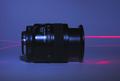
Musikby rocco22Comment: well this is a really great image.... a week or so too late for the music challenge which is a real shame. 6.
|
| Photographer found comment helpful. |
| 11/26/2004 10:43:50 PM |
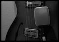
793by jjbates4Comment: I like the grainy feel here - suitably moody, to add to the authoritative feel of the boat....I do feel that you shot a little too far into the sun on this one, the overexposure is a little distracting. 7. |
| Photographer found comment helpful. |
| 11/26/2004 10:42:14 PM |
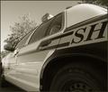
Squad Carby sfarrell23Comment: I like the sepia tone here, but there isn't much to set this apart from the other squad car/ law enforcement type pictures. I guess it's not the easiest challenge to surprise people with an inventive idea. 6.
Good Luck! |
| Photographer found comment helpful. |
| 11/26/2004 04:31:53 PM |
dominationby coldaComment: Ouch... for some reason Im kinda disturbed you just had this lying around. he lighting here is nice but the set up appears a little artifiical. 6. |
| Photographer found comment helpful. |
| 11/26/2004 04:30:26 PM |
|
| Photographer found comment helpful. |
| 11/26/2004 04:25:57 PM |
U N Flag.by H R VerryComment: Given the current (sad) state of world politics I'm not sure that the UN is exactly a great embodiment of authority :), but this is a relatively nice flag shot (if A little uninspiring). |
| Photographer found comment helpful. |
| 11/25/2004 07:42:45 PM |
|
| Photographer found comment helpful. |
| 11/25/2004 07:34:57 PM |
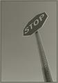
I dare you!by twentyfivesComment: I like the use of the angle here.... makes it considerably more interesting than it would have otherwise been. The over saturation makes the sign look great but the sky is much tooo blue in the top left. |
| Photographer found comment helpful. |
Home -
Challenges -
Community -
League -
Photos -
Cameras -
Lenses -
Learn -
Help -
Terms of Use -
Privacy -
Top ^
DPChallenge, and website content and design, Copyright © 2001-2025 Challenging Technologies, LLC.
All digital photo copyrights belong to the photographers and may not be used without permission.
Current Server Time: 04/07/2025 10:17:51 PM EDT.