| Image |
Comment |
| 12/20/2002 12:28:56 PM |
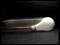
The Speed of Lightby karmatComment: Critique Club Comment
Composition : I have to agree with the other commenters that the tilt of the floor distracts. Also, finding a way to eliminate the "seam" of the wall and the floor would have helped tremendously.
Exposure/Lighting : The upper right hand background has more light than I think you intended. I got more caught up in the texture of the background then in the motion of the bulb.
Focus : I love the sharp focus on the threads in the bulbs starting place. Excellently done.
Post Processing : B/W was a excellent choice for this shot. It seems a bit grainy, but I like that aspect :)
Emotion/Challenge : You met the challenge and more :) Very interesting concept and extremely clever use of title. (Some folks say a title doesn't matter, I say some folks are wrong :) )
Opinion : This is a wonderful concept and I hope you revisit it, make a few small changes, and share the result :) I find a piece of fabric sometimes is the best background since it can be seamless... No tell-tale line where the floor ends and the wall begins. Just a thought :) |
 Photographer found comment helpful. Photographer found comment helpful. |
| 12/20/2002 12:07:11 PM |
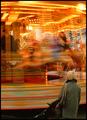
Still/Spinningby MarklaneComment: Critique Club Comment
Composition : The inclusion of the still woman with the stroller definitely made this shot for me. She is placed perfectly. Also, the inclusion of the ride operators "inside" the motion worked very well in my opinion. The empty space at the bottom concerned me and I have to wonder if you had shot from a lower vantage point, could you have included the stroller (an important element to me) but excluded the not so interesting ground under the carousel? Just a thought :)
Exposure/Lighting : Again, the only issue I have is with the ground. It is so dark, especially in comparison to the lights of the ride, that I wonder if the shot suffered for it.
Focus : Excellent job here. The sharp focus of the "mother" watching the ride plays excellently against the action blurred ride. I especially like the timing that placed what appears to be an older child holding an infant. The infant and the "mother" seem to be making eye-contact. Wonderfully done!
Emotion/Challenge : Absolutely nailed it. Great shot!
Opinion : I was surprised to see this place 37th. I thought it was going to be much higher (although 37 is nothing to sneeze at). Great effort! |
| Photographer found comment helpful. |
| 12/13/2002 02:08:11 PM |
Christmas Tree Ornamentby MustbelostComment: Critique Club Comment
Note : I'm somewhat biased here because I am a HUGE DeGrazia fan... I will try not to let that effect my critique :)
Composition : Nicely positioned, although it may have worked better zoomed out just a hair and a tad to the right and higher. I would have liked to see what this looked like if you left the same space the ribbon takes on the top with empty space on the bottom. (But that's just me) Also from a further zoom, the tree might not have been as easily identified as "artificial". That part didn't bother me, but from the comments, it seems to have troubled some folks.
Exposure/Lighting : As noted, the lighting (flash?) was a bit strong. If you look at the left hand side of the ribbon, I think you'll see what I mean. There are ways to "tone-down" a flash, including laying a thin tissue over it. It diffuses the light and can make for a nice effect.
Focus : Nailed it... Beautiful :) Did you try any with a very shallow DoF so the 'tree' was a softer focus than the ornament? It might have been interesting.
Emotion/Challenge : There is no doubt you were on target for the challenge. Emotionally, this one triggered a memory of Christmas Past. My father gave my mother a DeGrazia ornament every year until she passed away.
Opinion : Wonderful shot. |
| Photographer found comment helpful. |
| 12/13/2002 01:47:04 PM |
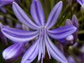
Agapanthusby sulamkComment: Critique Club Comment
Note : I do not know the names of the parts of all flowers so I might call something a petal when it's some latin thing I can't pronounce... Please bear with me... :)
Composition : Nice macro. I have to agree with the comments that suggested it would have been helped by including the entire petal. Without them, my eye is dragged off the edge of the picture too often.
Exposure/Lighting : Beautifully lit and well exposed. The colors are rich and vibrant.
Focus : The three petals in the upper-right seems a little soft, but not to the point of distraction. DoF was handled well here in my opinion.
Emotion/Challenge : As noted in some of your comments, purple was the first color I thought of here. I certainly feel that there is enough blue to meet the challenge, but here it's risky to stray from the letter of the challenge. You didn't lose any points from me for it, but I'd bet you lost some from some folks.
Opinion : Very nice macro and inspirational (I plan to try a few flower macros myself now)... I think if you had included the whole of the flower and possibly played with Hue a bit to bring out more blue, this would have place quite nicely :) |
| Photographer found comment helpful. |
| 12/13/2002 01:10:20 PM |
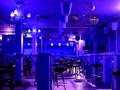
Blues Barby mariomelComment: Critique Club Comment
Composition : There are a lot of nice strong lines leading deep into this shot. I found the one table(sort of) in the front a little distracting, but there isn't much you could have done about it. There is a nice repetition of 3's here too... The groups of 3 lights leading to the back wall. Nicely done :)
Exposure/Lighting : Very nicely done. Especially considering you had no tripod. I like the shadows.
Focus : A little soft overall, but certainly not a problem (at least for me :) )
Post Processing : So this was a red bar? I never would have known it if you hadn't said it, which tells me your post processing was successful.
Emotion/Challenge : Nailed the challenge. It didn't have as much Wow as it could have, but I don't know what is missing.
Opinion : I enjoyed this shot and was a little surprised not to see it place higher. |
| Photographer found comment helpful. |
| 12/08/2002 01:20:59 PM |
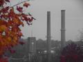
Fading Factories in the Mountainsby nards656Comment: Critique Club Comment ~ Mike (MyQyl) Clark
Composition : Strong use of framing with the factory framed by the color of the turning leaves. The clock is positioned well for the 'rule of thirds' and the time on the clock (4:40) adds to the feeling you wanted to convey. It's almost quiting time, if you like it or not.
Exposure/Lighting : The somber, grey feel expresses what you wanted to say well. It just doesn't help much for a photograph. But I think what you were saying is more important to this picture then an eye pleasing exposure would have been.
Focus : The leaves in the forefront are very soft, but I assume you chose to do it since you used F2.8... Personally I'd like to see what would have resulted from a longer exposure with a greater DoF.
Emotion/Challenge : I can certainly see this accompanying an article like you described, but without that description, I had a hard time making the connection. While many folks claim titles shouldn't be considered, I think a more descriptive 'headline' may have helped... 'Small Town Plant Closure' or something similar might have given people more connection with the shot. Emotionally this is very strong.
Post Production : I'm curious if the grey-scale on the building is a result of the day or of turning down certain channels. Either way, it's well done.
|
| Photographer found comment helpful. |
| 11/26/2002 08:10:00 AM |
Astro,VA : Vol 13-4: Truth out there, The Leonides notby lionelmComment: Composition ~ The horizon slope sharply to the left. Sharply enough so I assume it was intentional. I'm not sure if it works for me though. The large 'negative' space of the sky works well, but would have worked better if the stars had shown up better. Perhaps this kind of shot really need to be taken away from the lights... ~ Exposure ~ Again I think the sky was doomed to be underexposed by the surrounding street lights... ~ Focus ~ The transparent image of the person seems to lack focus... ~ Challenge ~ I'm not sure I see where you are going with this. I'll give it some thought and try to revisit this later in the week and see if I get it... ~ Myqyl ~ |
| Photographer found comment helpful. |
| 11/26/2002 04:49:00 PM |
|
| Photographer found comment helpful. |
| 11/26/2002 04:14:00 PM |
|
| Photographer found comment helpful. |
| 11/26/2002 04:28:00 PM |
Waters over Troubled Bridgeby ioComment: LoL! The sign REALLY nails it down :) Clever use of title too... If I were to nitpick (and I almost always do) I'd have to wonder if a closer crop that lost the sky in the upper left would have made this an even better shot... But that's just me :) ~ MyQyl ~ |
| Photographer found comment helpful. |
Home -
Challenges -
Community -
League -
Photos -
Cameras -
Lenses -
Learn -
Help -
Terms of Use -
Privacy -
Top ^
DPChallenge, and website content and design, Copyright © 2001-2025 Challenging Technologies, LLC.
All digital photo copyrights belong to the photographers and may not be used without permission.
Current Server Time: 04/17/2025 06:35:25 PM EDT.