| Image |
Comment |
| 07/21/2004 03:53:36 AM |
Balanceby Dim7Comment: The composition and the depth of field work really well. |
 Photographer found comment helpful. Photographer found comment helpful. |
| 07/21/2004 03:52:21 AM |
The Ballerina...by jmleliiComment: Beautiful image. I love the gracefullness of the curve along her shoulder and arm. The colouring is lovely and the soft focus works really well. |
| Photographer found comment helpful. |
| 07/21/2004 03:48:18 AM |
Now THAT's What I Call a Balanced Diet!by GeneralEComment: The lighting is done well and the image is really crisp. I feel that perhaps more could have been done with the composition to make the image a liitle more interesting. The writing on the T-shirt distracts my attention from the ice-creams. |
| Photographer found comment helpful. |
| 07/21/2004 03:42:39 AM |
two become one by grigrigirlComment: Lovely Image. The central composition really works. The lighting is awesome. The sepia tones really enhance the image. |
| Photographer found comment helpful. |
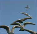
| 07/21/2004 03:41:20 AM |
Birds in Balanceby coolharComment: Great Idea. I love the starkness of this image. The composition is great. You caught the lighting at a really good time too. |
| Photographer found comment helpful. |
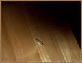
| 07/19/2004 03:45:47 AM |
"Balancing Act"by tfarrell23Comment: I really like the colouring and lighting. I think they work really well, including the border. The texture of the wood works really well here too. The shadow across the top adds an effective contrast to the wood. The minimalist style of this image is quite appealing. I don't know if the coin is strong enough by itself as a subject to offset the open spaces. I wonder if a lower angle to show more of the coin would make it a stronger contrast. Or a couple of coins lying down next to the one standing on its edge to provide another texture. This image does have a "feel" about it that really works. |
| Photographer found comment helpful. |
| 07/19/2004 03:38:00 AM |
Libramenby NazgulComment: I think the centred composition works well and the border too. The lighting is excellent and the depth of field works well. I also like the way the background is split between light and dark across the middle on the same plane as the large flat rock. |
| Photographer found comment helpful. |
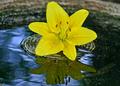
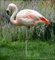
| 07/19/2004 03:28:15 AM |
Balance in Pinkby Faye PekasComment: The colour and light are really striking. I personally would have gone for a little more space above the bird. |
| Photographer found comment helpful. |
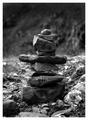
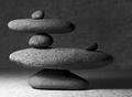
| 07/19/2004 03:26:47 AM |
stonesby slonkoComment: I think this works really well. The depth of field is perfect. The composition adds well to the sense of balance. I think a little bit of light on the small stone on the right would have helped also. I think it gets just a little bit dark on the right hand side. I really like the textures. |
| Photographer found comment helpful. |
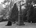
| 07/19/2004 03:20:53 AM |
Nature's Balance : Life and Deathby Resusit8uComment: I love the choice of black and white. The composition is interesting the way that the monument sits next to the tree. I would have rotated the image to get the monument exactly vertical. This is a very evocative image. |
| Photographer found comment helpful. |
Home -
Challenges -
Community -
League -
Photos -
Cameras -
Lenses -
Learn -
Help -
Terms of Use -
Privacy -
Top ^
DPChallenge, and website content and design, Copyright © 2001-2025 Challenging Technologies, LLC.
All digital photo copyrights belong to the photographers and may not be used without permission.
Current Server Time: 04/08/2025 06:16:45 AM EDT.